
Multi Timeframe Currency Strength Panel
- Indicators
-
Narayanan Mohanan Mohanan Krishnan
 I build measurement tools for MetaTrader. They describe what the market has done, and state the limits of each measurement rather than hiding them.
 - Version: 1.10
- Updated: 7 August 2026
MTF Currency Strength Panel for MetaTrader 5
A multi timeframe currency strength meter covering all 28 major forex pairs on one chart.
This currency strength panel shows where the eight major currencies stand right now, and how each of the 28 major pairs has been moving across nine timeframes at once — M1 to MN1. Both readings sit on one chart, updated on a timer.
Ranking pairs on their own is misleading. When a single currency moves, every pair containing it moves with it, so the top of a pair ranking is often the same currency repeated seven times. This multi timeframe panel separates the driver from the duplicates by decomposing the whole matrix into individual currency strengths.
How the decomposition works
Each of the eight currencies appears in seven of the twenty-eight pairs. Its strength is the average of those seven readings, with the sign inverted wherever it is the quote currency — a falling AUDJPY means a strengthening yen, not a weakening one.
Every pair contributes to exactly two currencies — positively to its base and negatively to its quote — so across the full set of twenty-eight those contributions cancel and the eight strengths sum to zero. The panel uses that as an internal check: if the values did not balance, the decomposition would be wrong. It also means the readings are relative to each other rather than absolute. A currency is not strong on its own, only strong against the rest of the set.
The practical effect is that eight clean numbers replace twenty-eight overlapping ones. Instead of reading seven yen crosses at the bottom of a list and inferring the common cause, you see the cause directly.
What the pair rows show
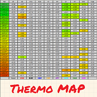
Each pair row carries nine coloured blocks, one per timeframe from M1 to MN1, showing the direction and size of the most recently completed move on that timeframe. By default green is a strong advance, yellow a weak one, grey is flat, orange a weak decline and red a strong one. All five colours are inputs and can be changed.
Reading the row left to right tells you whether a move is confined to the shorter timeframes or has carried through to the longer ones. A row that is red across M1 to M15 but green on H4 and above is a recent move that has not yet turned the larger picture.
The score at the end of each row is the weighted average of those nine readings. Rows are sorted by it, strongest at the top.
The divergence marker
If the decomposition explains the matrix perfectly, a pair's score should equal the strength of its base currency minus the strength of its quote. Where a pair sits well away from that, its movement is not fully accounted for by either currency, and the panel marks it.
The threshold is set in standard deviations across the whole matrix rather than as a fixed number, so it adapts to quiet and busy conditions alike.
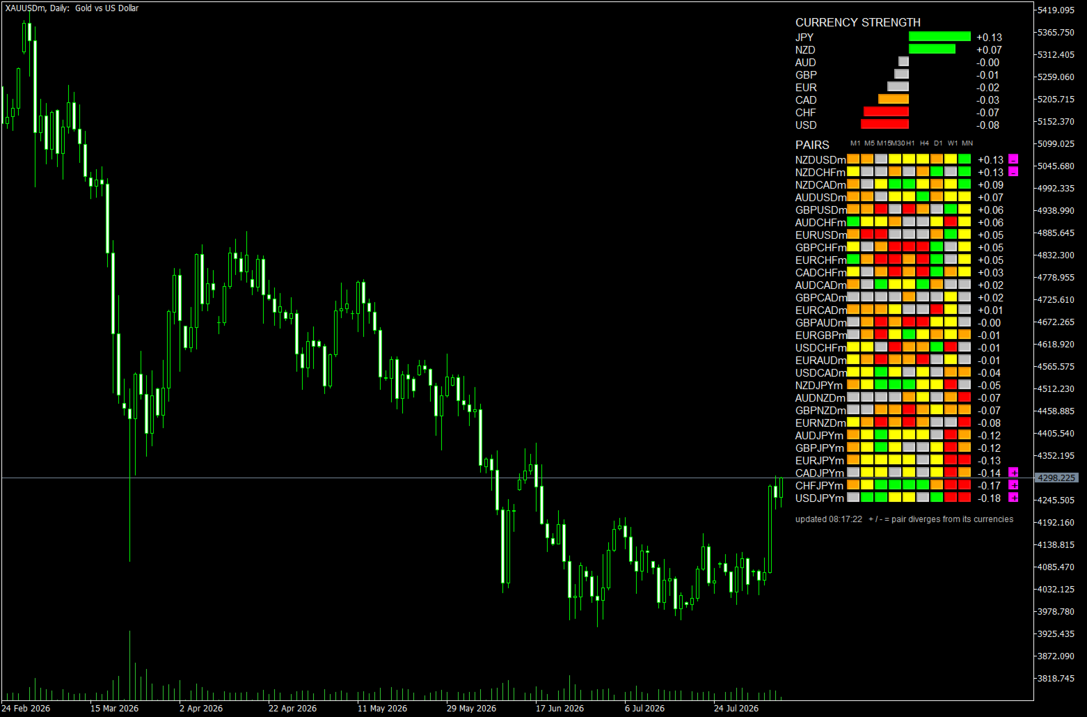
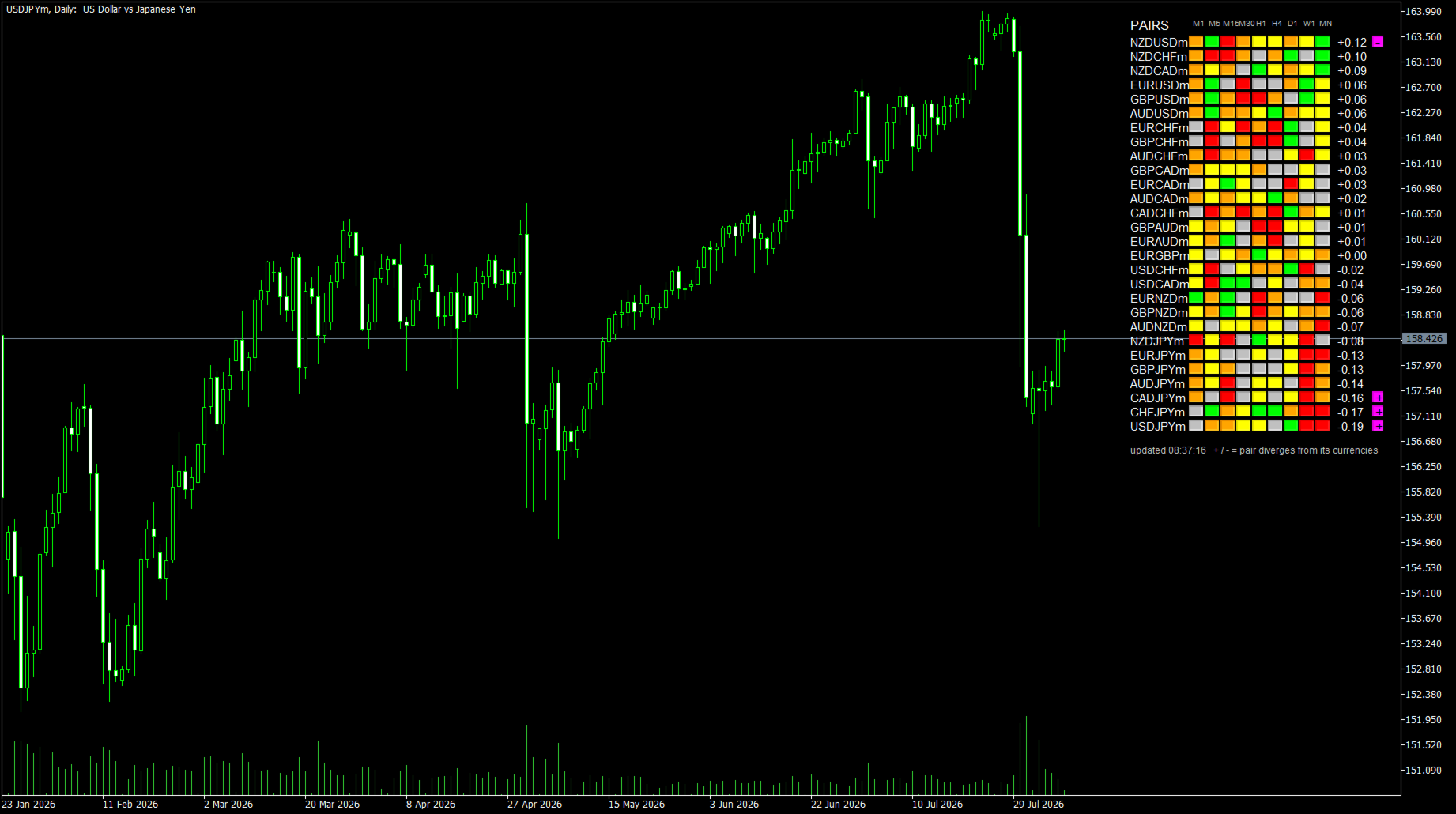
It is worth tuning to taste. A high threshold isolates only the most extreme cases; lowering it distributes the marks across the matrix and shows the smaller discrepancies that a strict setting hides. One of the screenshots was taken at a low threshold to make this visible — the marks appear at the top of the panel, in the middle and at the bottom, rather than only on the pairs that had moved furthest.
One thing to expect at higher thresholds: when a single currency is moving hard, its pairs will tend to flag together. The averaging that produces eight clean strengths cannot fully absorb an outsized move, so the whole group reads as partly unexplained. The marker is most informative in ordinary conditions and least so during a violent single-currency move — which is the opposite of what you might assume, and worth knowing before you rely on it.
Inputs
- Panel content — currencies and pairs, currencies only, or pairs only
- Panel corner — any of the four, with horizontal and vertical offsets in pixels
- Font size, row spacing, block width and height — the panel scales to suit your chart
- Pair rows to show — 1 to 28, for smaller windows
- Compress strength bars — a square-root scale so one dominant currency does not flatten every other bar to a stub
- Show last-update time — a visible stamp, so a frozen panel is obvious rather than assumed live
- Flag pairs diverging from their currencies — on or off, with an adjustable threshold in standard deviations
- Refresh interval — in seconds
- Freeze when market is closed — stops redrawing an unchanging panel
- Symbol suffix — detected automatically; can be set manually for unusual broker naming
- Colours — all five block states, the divergence marker, and the text
Fitting your chart
Text colour is taken from the chart background by default, so the panel stays readable on a light or a dark scheme without being reconfigured. Changing scheme repaints it immediately rather than waiting for the next refresh. Scrolling and zooming do not trigger a redraw.
The currency strength panel is anchored to the corner you choose and offset in pixels, so it stays where you put it when the window is resized.
What the screenshots show
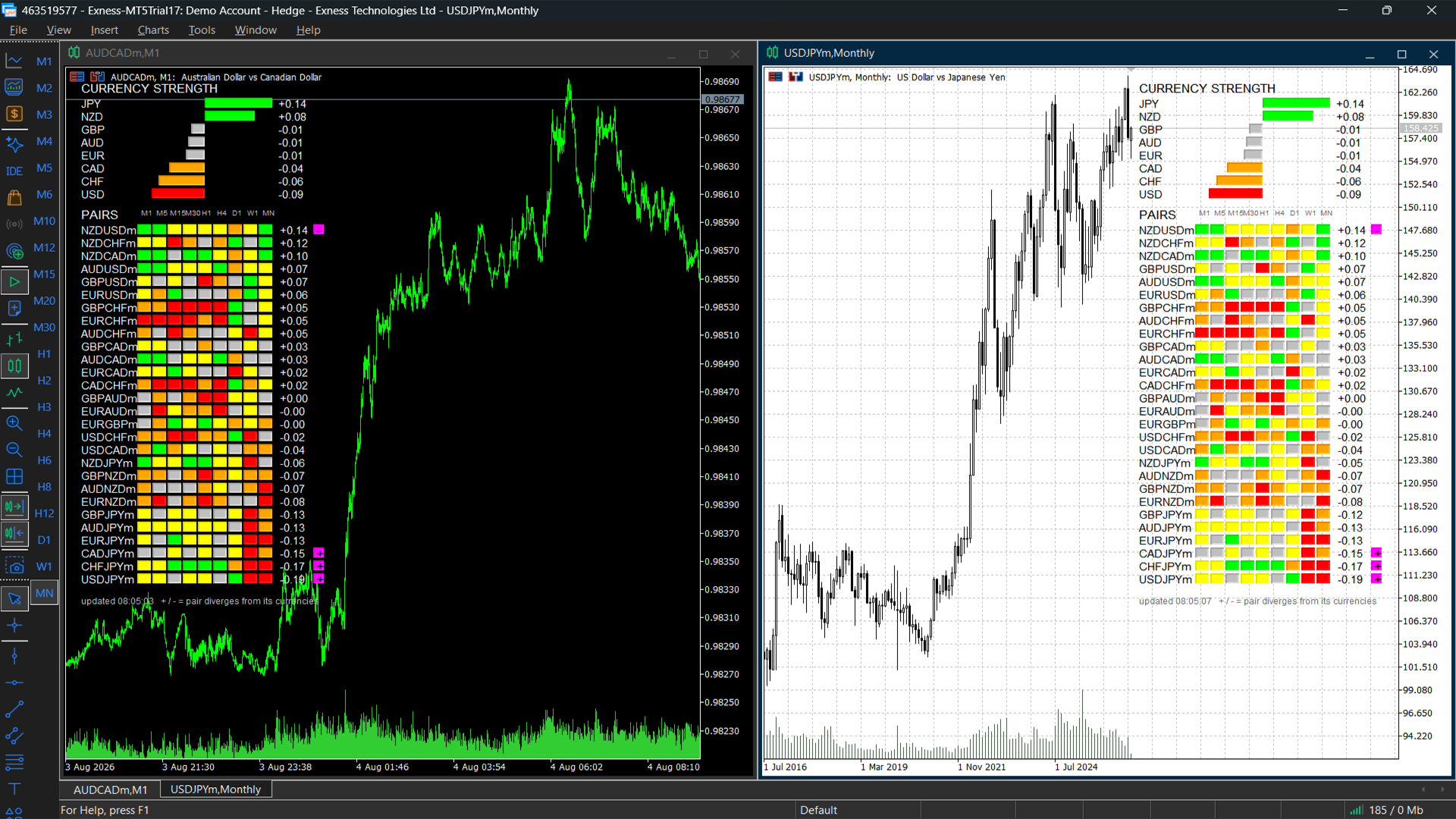
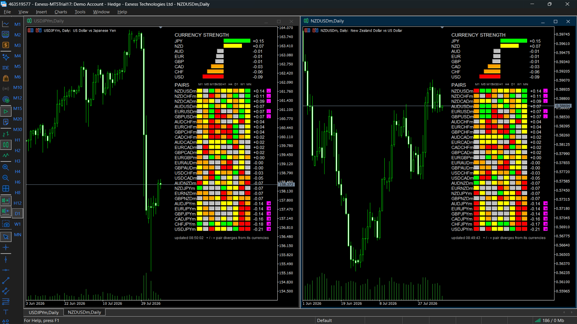
- Two charts as far apart as the terminal allows — AUDCAD on the one-minute chart with a dark background, USDJPY on the monthly with a light one. Different symbol, opposite end of the timeframe range, opposite colour scheme, and both panels report the same eight currency strengths. The panel describes the market, not the chart it sits on.
- The full matrix — every column carrying information, because each timeframe is coloured against its own normal movement rather than a fixed percentage.
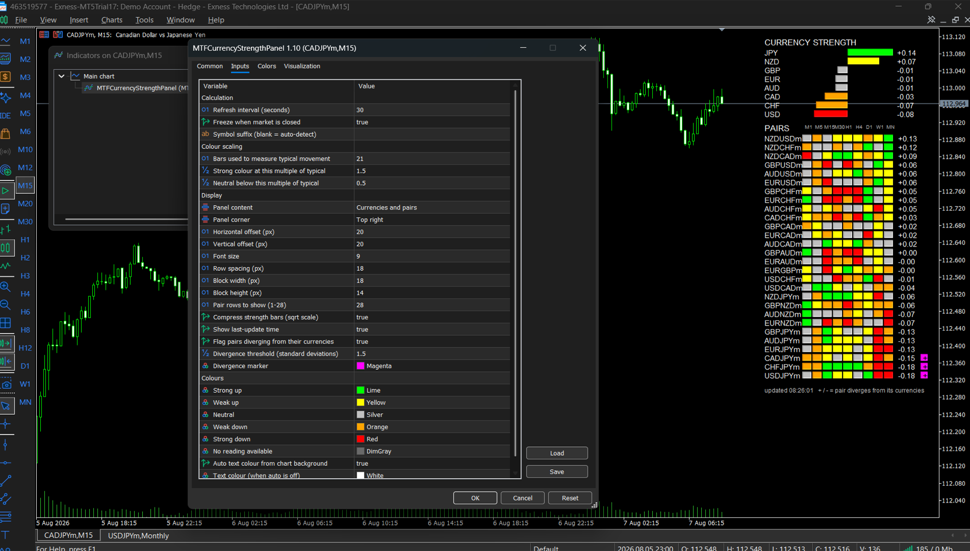
- The inputs dialog — the settings that decide the numbers, then the settings that decide the look, in four labelled groups.
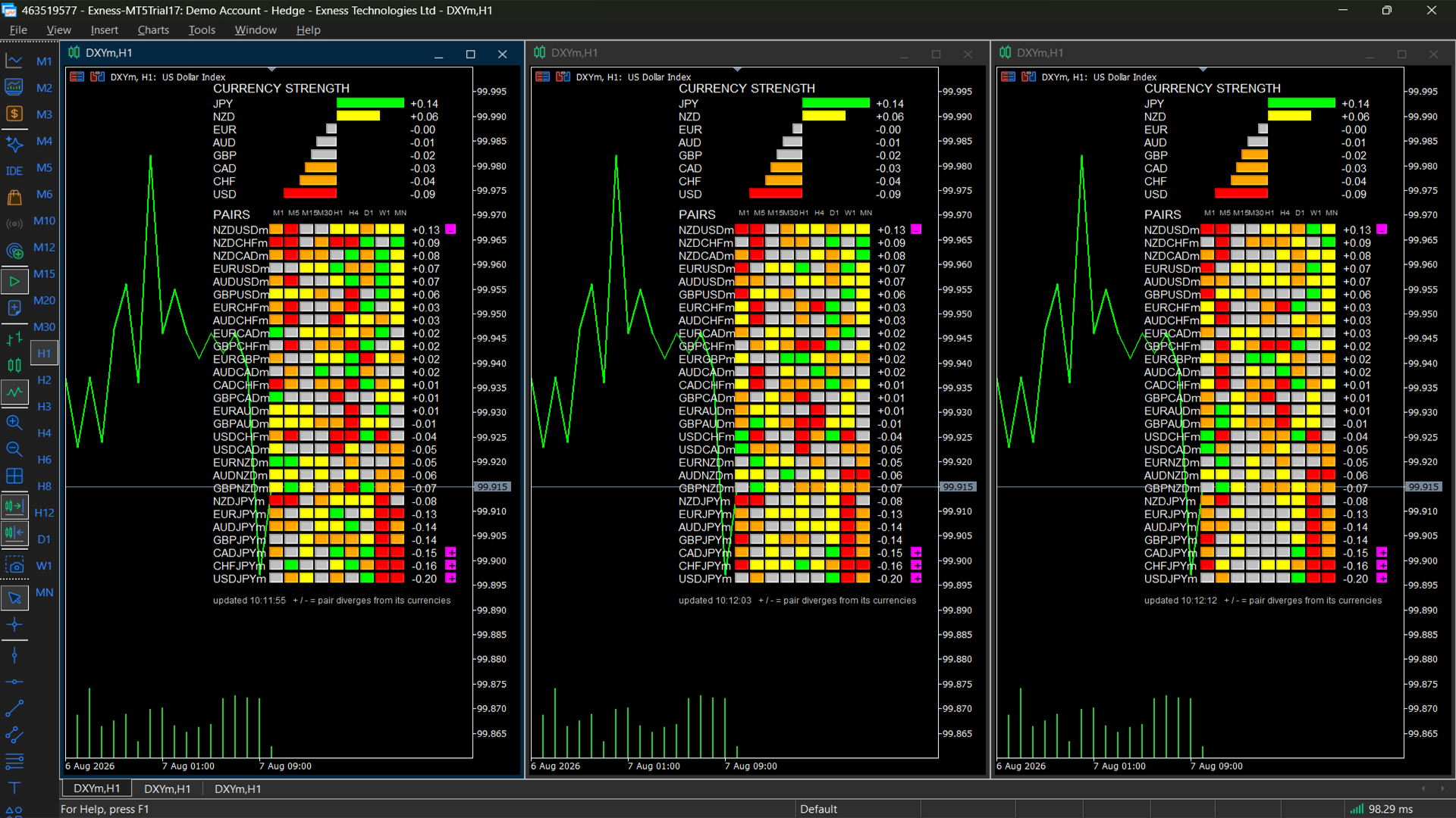
- Three lookback settings side by side — the same chart with the colour scale set to 5, 50 and 200 bars. The colours change; the currency strengths do not, because the lookback decides what counts as a lot rather than what is measured.
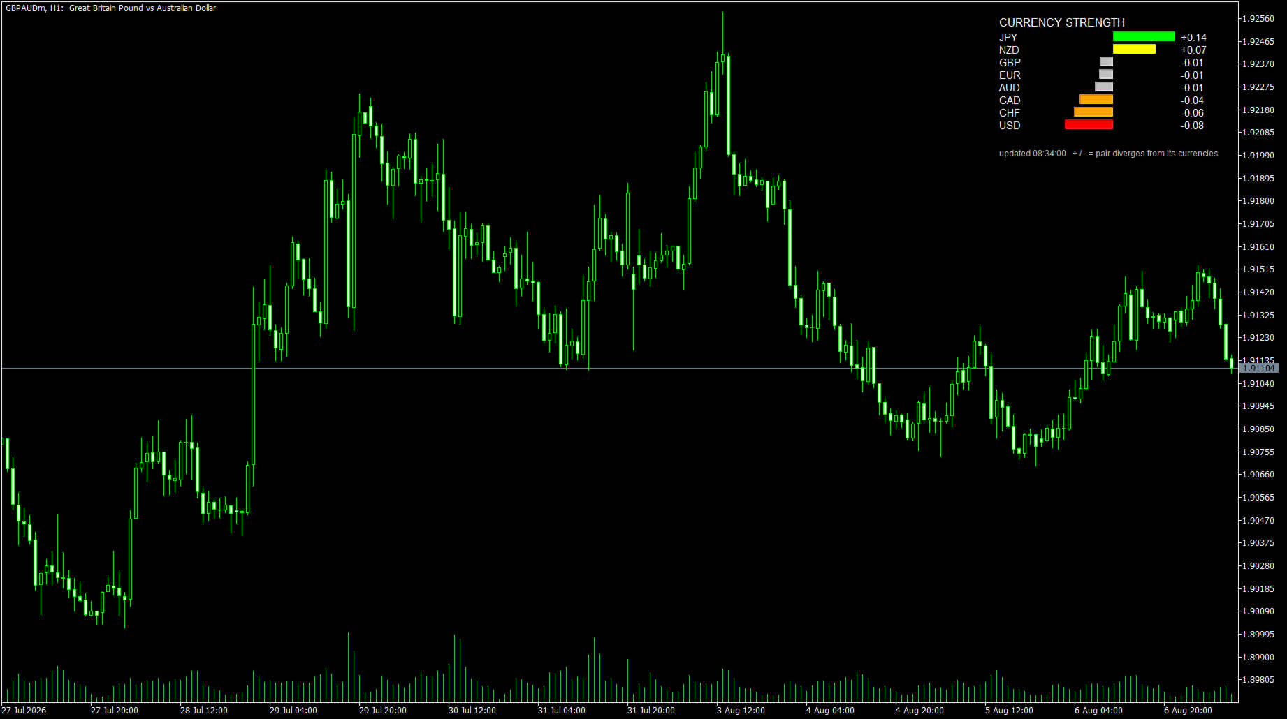
- Currencies-only mode — the compact eight-row panel, for a chart where the pair grid is not what you need.
- Pairs-only mode — the full 28-pair ranking with the currency block hidden.
- Divergence markers — taken at a lowered threshold, so the markers spread across the matrix rather than sitting only on the pairs that had moved furthest.
Calculation behaviour
Each timeframe reading blends the currently forming bar with the last completed one, so the panel responds to live movement while remaining anchored to closed data. Where a timeframe's history is unavailable for a pair, that timeframe is excluded and the score is normalised across the timeframes that were actually read — a pair is never pushed down the ranking because data was missing rather than because it moved. The block for that timeframe is drawn in a separate colour so a missing reading is visibly missing rather than indistinguishable from a quiet market.
Block colours are scaled by each timeframe's own recent movement. The scale is the average size of a close-to-close change over the last 21 bars on that timeframe. A bar moving more than 1.5× that size reads as strong, less than 0.5× as neutral. This is why the same colour means the same thing on the one-minute column as on the monthly: a fixed percentage cannot, because a monthly bar moves on the order of a hundred times what a one-minute bar does. The window and both multiples are inputs.
The panel refreshes on its own timer rather than on chart ticks. This matters on a 28-symbol display: driven by the chart symbol, an illiquid cross during a quiet session would stall the whole panel while the rest of the market moved. The freeze check reads the last quote time of any symbol in Market Watch, so it pauses only when the whole feed does.
What the ranking does and does not tell you. The ends of the currency ranking carry the information. When several currencies sit within a few hundredths of each other their order is not meaningful — they are close because little is separating them, and a small difference there is closer to noise than to a signal. Compared against MetaQuotes’ own published currency heatmap, this panel agrees on the strongest and weakest currencies and disagrees in the middle, which is what two different methods should do when there is little to resolve.
Notes
- Draws on the price chart as objects. No indicator buffers, no plots, no separate window.
- All 28 major pairs must be available from your broker. The panel reports any that are missing by name in the Experts log.
- The currency section is hidden if fewer than 28 pairs are available, since a partial decomposition would be misleading.
- The panel reads fixed timeframes from M1 to MN1. It does not follow the timeframe of the chart it is attached to.
- No external dependencies. Every value is calculated inside the indicator. It does not call any other indicator, so there are no handles to fail, nothing to install alongside it, and no dependency on the state of your standard indicator folder.
This currency strength panel is a tool for technical analysis and market-condition filtering. It is not a trading system, it does not generate trading signals, it does not provide investment advice, and it does not open or manage trades automatically. It describes where the market has moved; it does not predict where it will go. No performance claims are made for it.
Free to download and use. If you find it useful, a rating helps other traders find it.
| More tools from this developer I build MT5 indicators and Expert Advisors with an emphasis on clean, documented, no-repaint code — closed-bar logic and no dependencies on other indicators. Questions about the calculation, the decomposition, or using this alongside your own tools? Send me a private message — I am happy to answer. |
Developed and maintained by Narayanan Mohanan, MT5/MQL5 Developer.
























User didn't leave any comment to the rating