Volumes, volatility and Hearst index
Among TA indicators there are 5 indicators associated with volumes: A/D (Accumulation Distribution), MFI (Money Flow Index), OBV (On Balance Volume), PVT (Price and Volume Trend ), VROC (Volume Rate of Change). Each of them is supposed to allow a trader to make some conclusions about price movement. However, except for MFI, all these indicators have no clear meaning. That is, in fact, their use allows only the analysis of the patterns of these indicators. And these patterns, due to their calculation algorithms, in general repeat the price movements. But the most important argument "against" is the fact that the price cannot be changed arbitrarily by a broker, and the volume can be changed elementary. It is enough to change the tick-flow filtering parameters, which each broker sets independently.
Another aspect related to volumes is that they significantly depend on the time of day and session. Everyone knows this, but it also makes the use of volumes via standard indicators quite questionable. In order to compensate for this periodicity, we should at least compare the volumes not with previous values, but with a standard that is typical for the time of day, day of the week, and session.
The simplest formulation of the problem is as follows.
In forex there are only 5 working days, let's say from Monday to Friday. Of course, for each broker, depending on their time zone, this interval may move forward or backward. However, since forex is a worldwide market, the process is the same for all and its duration is the same everywhere.
Let's assume that trading starts at 00:00 on Monday and ends at 23:59 on Friday after the last minute of trading. It means we have a total of 5x24 = 120 hours per week.
Now let's sum up the volume of first hour trades of all Mondays and divide the result by their number. We obtain the average volume of the first hour on Monday. Similarly, we obtain the average volume of the second hour of Mondays, and so on, the average volume for each of the 120 hours of the working week. Presenting this data as a graph will show the cyclical changes in average volumes over the week. Comparing this graph with similar graphs constructed for previous years will allow you to see how this aspect of the market changes over the years.
This was the simplest version. If we take 10 minutes instead of 1 hour as the minimum interval, we will be able to use a somewhat more intensive, but similarly simple chart. This would give 6 times as many points in the plot, i.e. 720 points. And the most capacious if you take a 1-minute interval. In this case there will be 7200 dots. This last option only makes sense if there are enough ticks per minute.
What for? The market is known to have a fractal structure. At each level of this structure there can be its own effects. To find them each level should be examined separately. That's actually what has been done.
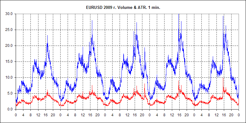
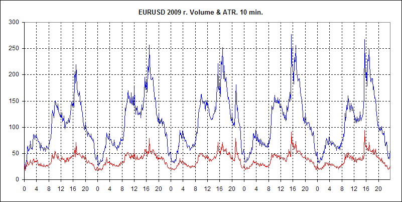
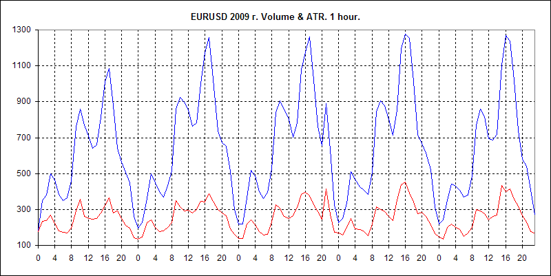
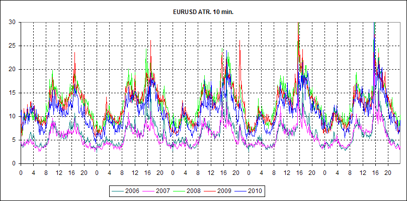
Below are 3 charts for EURUSD, 2009. GainCapital data.
They show average weekly volumes behavior for H1, M10 and M1 intervals, as well as similarly calculated average ATR values for these timeframes.
AvrVOL - average volumes, blue line.
AvrATR - average ATR values, red line.
On the ordinate axis - Volume in ticks (for AvrVOL) and High-Low in points (for AvrATR).
The abscissa axis is the hour numbers of the day, from 0 to 23. The mark is at the beginning of the hour.
In order to keep the visualization, the AvrATR values are multiplied by the ratio k=8(for H1), k=3(for M10), k=1(for M1). That is, in order to estimate the real value of AvrATR you need to divide the value on the graph by this coefficient.
I should also mention that for H1 and M10 AvrVOL values are used directly for plotting. And for M1 I averaged the calculation results over 5 points. I should note right away - this is not quite the same as calculating volumes for M5. It allows to decrease spread of values a little, but preserves all fine details of the chart. The averaging formula is slightly different from a simple SMA. Here it is : AvrVOL[i] = ( AV[i-2] + AV[i-1] + AV[i] + AV[i+1] + AV[i+2] )/5.
Here AV[i] are the results of the average volume calculations for the i-th minute of the week.
What is interesting, personally, that I see on these charts?
1) The behaviour of volumes is fully consistent with the behaviour of the ATR. This correspondence concerns both local curve behaviour and timeframe changes. However, the volumes behaviour is more distinct and their values at higher TFs increase proportionally, what cannot be said about the ATR values, for which this dependence on the TF is more complex.
2. ATR, along with RMS, is used as a measure of market volatility. The above charts, imho, look convincing enough to conclude that volumes can also serve as a measure of volatility, and not a worse measure than traditional ones.
However, the same conclusion makes volumes unsuitable for any assessment of price direction. Volatility gives an indication of the nature of price movement, but not of its direction.
3. low volatility is interpreted as more of a return character of the market, while high volatility is interpreted as more of a trend character. A similar measure is the Hearst index. In this sense, it will be interesting to compare the above charts with the corresponding Hearst index chart. But that will come later.
4. The charts clearly show the division of each day of forex trading into three waves - three sessions: Asian, European, and American. For each of them the session's beginning is associated with the increased volatility, which gradually decreases by the end. Each session is characterized by its own volatility range. Asian session is characterized by the minimum, while the American one - by the maximum. Volatility burst before the American session on news release, and then even bigger burst at the session start is clearly seen. There is a similar pattern for the preceding two sessions, but not as noticeable.
5. An interesting phenomenon is observed in the American session on Wednesday. Somewhere in the 21-22 hour range there is again a decent spike in volatility. There is no such thing on other days or in other sessions. As far as I know, apart from the FED statement, which happens 8 times a year (and the average is actually 52 things), there are no other events at that time. It's hard to believe that those 8 times have such an impact on the overall average total. However, for volatility the FED statement is probably the most influential event. So anything is possible.
6. As you can see, the 3 charts above are very closely aligned. That is, there are no effects on any of them that are missing on the others. On the one hand, maybe it is not very nice (no gold veins could be found :-), but on the other hand it is very optimistic. This confirms the fractality of the market - each level is similar to the others - and makes it possible to confidently use volumes as an adequate measure of volatility even on the smallest TFs.
Volumes are not often used by traders in their TS, as far as I know.
Indicators are a marketing ploy - a pretty cover. For those who are interested in pictures rather than statistical indicators and mathematical models.
In order to see the dynamics of volumes and ATR by year, I have made the 2 charts below.
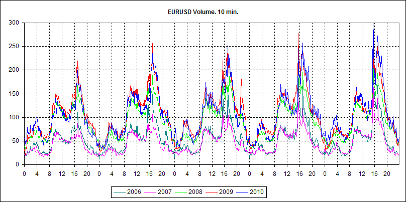
They generally show that the nature of the market has changed in the sense that it has become much faster. Judging by the daily session peaks, volumes have roughly doubled. The same can be said about ATR. The curves in the charts are divided into two groups: 2006-2007 and 2008-2009-2010. That is, the crisis has had the machine spinning at full speed since mid-2008. I think that brokers just had to upgrade the hardware and software to keep up with the times. And now there is no turning back.
However, everyone knows about the increase in volumes without these charts. But not all paid attention to the fact that the ATR has increased in approximately the same proportion. And it is an interesting fact.
Another significant fact, imho, is that the nature of the daily cyclicality of the markets has not changed. The crisis, and everything that followed it, has not changed the behavior of volatility of the Forex market either within sessions, or sessions in relation to each other, or its change by the days of the week. Even the volatility spike after 8 PM on Wednesday remained unchanged. And small details of its behavior do not matter. Anyway, they were not in my list of objectives. So, this casual process has a lot of stable aspects and it means that the search of regularities in it is not such a lost cause.
The question is how to use it. Here is a simple picture: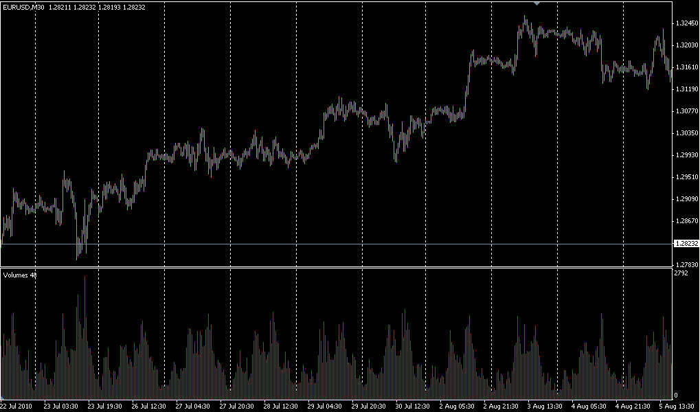
It is easy to see that mid-day trading activity goes up and the price ticks up, at night it goes down, and so on every day, the picture is about the same. My point is that if you look at the subject head-on, it makes no sense. There is a sense to look in the real volumes provided by many brokers as real ECN values and see what happens. As for ataers and stuff like that, in my opinion it's bullshit and useless.
Now back to volumes and ATR as measures of volatility. Graphically, they reflect its behaviour quite adequately. There is, however, a disadvantage. Both values have dimensions, their average values are changing as the market technologies are improving. It substantially complicates their use as a measure of volatility, as the scale of these magnitudes is constantly changing. And using them only as qualitative characteristics is not interesting. It is not much better than using the standard TA indicators on the volumes, which we have already abandoned.
The similar nature of changes in volumes and ATR over the years (both peaks have approximately doubled their value) suggests that a quantitative measure of volatility could be the ratio of these two values. At this point, some will definitely recall the Hearst index. And rightly so. :-)
A word or two about the Hearst Ratio.
Skipping the history, let's only mention that the spread of a random series, according to Hearst's assumption, is determined by the ratio R/S = c * (T)^h. Here R is the spread of a random series, S is its RMS, T is the time elapsed from the starting point, c is the constant defined by the given process and h is the Hurst exponent. If the RMS of a process does not change, then it too can be tucked away in the constant c.
For Brownian motion, whose increments are described by a normal distribution, Einstein obtained this formula explicitly. For this particular case h = 1/2. For other distributions obviously h will differ from 1/2 more or less. My personal opinion is that Hurst's formula is not correct at all. I mean for the case of an arbitrary distribution. Yes, lucky for the normal distribution, it curls up to such a simple form. But for the arbitrary case it can be incommensurably more complicated. However, this formula is quite suitable as a first approximation (any function T can be expanded into a power series by its argument).
In order to apply this formula to our case, we need to determine a few things. Firstly, what is T ? Imho, the optimal one is the intrinsic or, as they say, operational market time measured in ticks. It is a counter, very important - dimensionless, of real process events - price changes. Therefore it is a counter of a series of SV. Secondly, what is the measure of R-value? Its natural measure is the point. However, this unit of measure is not suitable for every series. Fortunately, about 99% of price changes in the datafeed occur at 1 point (4 digits !!!). This gives some reason to consider 1 tick => 1 point (it is not a "greater than or equal to" sign ). Under such conditions the proportionality coefficient in Hurst formula can be put equal to one. So we have R = (T)^h. From this it is easy to get h = Log(R)/Log(T). The base of the logarithm does not matter.
So, the final form for the Hurst exponent is: h = Log(High-Low)/Log(N). Here N is the number of single ticks on the time interval, High and Low are maximum and minimum price values, reached on this interval. Their difference is expressed in 4-digit points.
As we can see, the time interval, for which the Hurst index is determined, is still present. For the charts presented in this topic, they were H1, M10 and M1. And it is not a disadvantage, but an absolutely necessary parameter. It is it that determines what fractal level the calculated Hearst index will refer to.
Below are the charts of weekly behavior of the Hearst indicator calculated for M10 for 2006-2010.
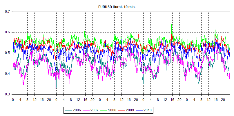
As you see, its behavior in 2006 and 2007 shows that during most of the trading week the Euro market was reversing. In 2008 and, to a lesser extent, in 2009 the Euro market was relatively trendy. This year it has been hovering around the 0.5 level, which is typical of a Wiener random walk.
However, this is just an illustration of what you get when you use the above formula.
At one time, I was greatly interested in the algorithm for calculating the Hurst index. Frankly speaking, I did not like several ways of calculating it found in the literature. This also applies to the method described by Peters in his Fractal Analysis of Financial Markets considered as basic. There Hearst is defined as the limiting tangent of the angle of slope of graph R to T in logarithmic coordinates. As a result, Hurst is obtained as one number characterizing the whole series. This is of course correct, but of little use. I was looking for an algorithm that would allow calculating Hurst locally, in real time. And now, looking at one year's worth of market statistics, I've come up with such an algorithm.
I don't claim originality or authorship. The fact that I have not seen it before only proves that I haven't watched enough.
I do not know if this algorithm of calculating the Hurst Index will be useful. Anyway, it allows to draw conclusions about the market stability (which is important for the specific strategy application) and its character (which is important for the strategy choice), having tracked its dynamics during a long interval. When we were determining the Hearst index for the whole series at once (actually obtaining only its average), we did not have such an opportunity.
- Free trading apps
- Over 8,000 signals for copying
- Economic news for exploring financial markets
You agree to website policy and terms of use
Volumes, as far as I know, are not often used by traders in their TS. Nevertheless, they do occur. This is why the question arose about its appropriateness and, if so, in what capacity they can be used. Especially since a lot has changed in the forex market in the last few years: 5-digit signs appeared, volumes increased significantly, crisis started, which also affected the nature of the market.
This is a preface to the research I have done and the results of which I am posting here. I warn you right away: there will be no grails, no TSs, no ready-made recipes. Only the results of the market research of the last few years, which give us a better understanding of what is going on and how we can use some of the parameters. There will be no mathematics either, everything is very simple and illustrative.