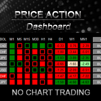
Price Action DashBoard
150 USD
Demo heruntergeladen:
1 315
Veröffentlicht:
23 Dezember 2015
Aktuelle Version:
2.95
Keinen passenden Roboter gefunden?
Geben Sie Ihren Eigenen in Auftrag
auf Freelance!
Gehen Sie zu Freelance
Geben Sie Ihren Eigenen in Auftrag
auf Freelance!
Wie man einen Roboter oder Indikator kaufen kann
Starte Deinen EA im
Virtual Hosting
Virtual Hosting
Teste einen Indikator/Roboter vor dem Kauf
Möchtest Du Geld im Market verdienen?
Wie man Produkte richtig präsentiert
Sie verpassen Handelsmöglichkeiten:
- Freie Handelsapplikationen
- Über 8.000 Signale zum Kopieren
- Wirtschaftsnachrichten für die Lage an den Finanzmärkte
Registrierung
Einloggen
Sie stimmen der Website-Richtlinie und den Nutzungsbedingungen zu.
Wenn Sie kein Benutzerkonto haben, registrieren Sie sich

exit order what time ?
At time in Close_All_At field. Broker time.
i'm newbie no experience with forex this tool can help me entry trade ?
it's look good from clip youtube
THIS IS A TEST...
i have a little money 40 GBP can start autotrade ?
i have a little money 40 GBP can start autotrade ?
Hi Thit
please send me a private message...
There are so many kinds of "Price Action", such as candle stick patterns, Head & Shoulder, Double Tops and bottoms, breakouts, etc. What exactly does your Price Action mean? A chart would be helpful. Thank you.
Ah..I read message #36 that you explained. So it is all based on the break of the previous candle.
Please view this video, and later send me private message for assistance on Skype.
Thanks :)
swm2:
Hello I have rented your dashboard to see if I can learn to use before i buy. At the moment if I click a currency pair for a chart it opens a new chart across the screen not like in the video do you have a set up guide for idiots please.
Could you answer his question to the public? I have the same question. I watched your video many times. You were able to open one and only one chart in the window on the right for each pair you clicked. But when I clicked on the symbol after symbol, it will open up a new chart each time across the screen. I ended up with many charts. How did you set it up?
Hi Julian please write me on private and i offer skype assistance for you :)
Now I understand. You have all the charts open but hidden behind the current chart. Once you click on any symbol, the chart will show on top. Clever trick.
Now I understand. You have all the charts open but hidden behind the current chart. Once you click on any symbol, the chart will show on top. Clever trick.
Chantal, what does it mean when the CLOSE button goes green? Is it over bought?
https://gyazo.com/4786295e8668c328f700a53efce82073
Chantal, what does it mean when the CLOSE button goes green? Is it over bought?
https://gyazo.com/4786295e8668c328f700a53efce82073
HI, the button becomes green when all rectangle (BO candles) are the same color, in this case green.
In this case the price is over the High candle of ALL TF.
Bye
Hi
Just Rent Price Action Dashboard. Please explain when the box is hollow and when the box is filled. I know that the red box is when the market is weak and green box is whenever market is strong, but I can't distinguish between filled box and hollow box. And another thing, when we have 28 symbols, the laptop screen cannot display all symbol in the screen, how can we scroll down the list, it seems that the up down arrow key and page up, page down key, even the mouse cannot scroll the list.
Ok, in the comment #36 I understand the filled box and the hollow box. Just for other ones new come here and do not understand, the hollow box is when the price break the Open Price of the previous candle, and the filled box is when the price break above/below the H/L of the previous candle.
But, how do we see all symbols in small screen such as lap top screen ? I can't scroll the list vertical whatsoever
But, how do we see all symbols in small screen such as lap top screen ? I can't scroll the list vertical whatsoever
Sorry but you cannot scroll on symbols.
But you could place another DASH on another chart and divided the symbols in 2 dash.
Tks
Sorry but you cannot scroll on symbols.
But you could place another DASH on another chart and divided the symbols in 2 dash.
Tks
Ah ok, thanks for your hint