Freelance's new design!
You can get used to the design.
What is more interesting is that the performers are now faceless, too. The client now has only one criterion for selecting a performer - the order of the list.
On the other hand, this is a good thing - now the client will be more motivated to consciously write to a possible performer in advance, discuss the task with him or her and make an explicit request.
It's an interesting trend - first everyone was de-anonymised, de-anonymised, and then suddenly, a sharp leap in the other direction - now not just anonymity, but anonymity with one-person impersonality.
Freelance is not finished yet.
We have started rolling out the changes one step at a time, as it is dangerous to wait long and do a big upgrade in a one-off fashion.
We will gradually hide the developers and the top developers, as in fact our freelance has turned into a free place to scoop orders and performers, working outside the service.
Inappropriate lettering at all
Place your first order
is taking up too much space. Can this be left off for Performers? Or turn it off in preferences? Make something up. You can't do that.
==============
Section
Find the right orders for you
also takes up too much space, very large line indents ((
==============
The font size is like on 90s websites (( horror).
You have to scroll the whole page to see new orders...
Inappropriate lettering at all
Place your first order
Takes up too much space. Is it possible not to show this for Contractors? Or turn it off in the settings? Well, think of something. You can't do that.
==============
Section
Find the right orders for you
also takes up too much space, very large line indents ((
==============
The font size is like on 90s websites (( horror).
You have to scroll the whole page to see new orders...
You probably meant to write: "Super huge indents"?
Actually it is, a lot of spaces
The style will definitely be brushed up.
The main work now is on redesigning the ideology and presentation of the data.
We'll comb the style for sure.
Now the main work is on the redesign of the ideology and the form of data submission.
I agree, first the logic, then the styles.
But I don't see any suggestions from the developers on what they want to see and what they don't want.
What is missing and what I would like:
1. Voice communication, and if possible, a demonstration screen developer and customer, as done in Skype, but that would not use third-party applications.
What is missing and what would be desirable:
1. Voice communication, and if possible a developer-customer screen, as in Skype, but without using a third-party application.
We have already implemented a new global geo-distributed messenger system to replace the current one. We will roll it out soon.
That's where it will all be: sharing files, screenshots, sound, etc.
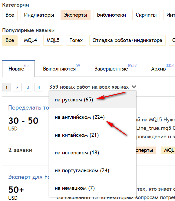
As in other sections of the site (where this either does not exist or is limited) a search/filtering/sorting by parameters such as number of requests, cost, etc. is needed.
The cost is 95% from 30+, so there's not much to sort through.
Number of bids ..., the chance of getting an order at any number remains 50/50
A filter is possible, but it's impractical in this case.
The cost is 95% from 30+, so there's not much to sort through.
Number of bids ..., the chance of getting an order at any number remains 50/50
A filter is possible, but not useful in this case.
Learn English! And what is surprising is the number of requests in Portuguese. From the former colonies?
- Free trading apps
- Over 8,000 signals for copying
- Economic news for exploring financial markets
You agree to website policy and terms of use