Indicators: Accumulation/Distribution
Accumulation Distribution uses volume to confirm price trends or warn of weak movements that could result in a price reversal.
- Accumulation: Volume is considered to be accumulated when the day's close is higher than the previous day's closing price. Thus the term "accumulation day"
- Distribution: Volume is distributed when the day's close is lower than the previous day's closing price. Many traders use the term "distribution day"
Therefore, when a day is an accumulation day, the day's volume is added to the previous day's Accumulation Distribution Line. Similarly, when a day is a distribution day, the day's volume is subtracted from the previous day's Accumulation Distribution Line.
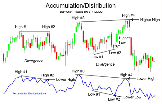
The main use of the Accumulation Distribution Line is to detect divergences between the price movement and volume movement. An example of the Accumulation Distribution Line is shown below in the chart of the Nasdaq 100 exchange traded fund QQQQ:
The basic interpretation of volume goes as follows:
- Increasing and decreasing prices are confirmed by increasing volume.
- Increasing and decreasing prices are not confirmed and warn of future trouble when volume is decreasing.
For more in-depth analysis of Volume.
The Nasdaq 100 made an equal high at High #2; however, the Accumulation Distribution Line failed to make an equal high, in fact it made a lower high. On average, less volume was transacted on the move higher at High #2 than occured on the first move higher at High #1; thus, this could be interpreted as there being less strength and conviction behind the rally in the Nasdaq the second move higher. This failure of the Accumulation Distribution Line signaled a strong bearish divergence.
High #3 to High #4Again, the Accumulation Distribution line made a lower high, even though the Nasdaq 100 this time made a higher high. This bearish divergence warned that the second move to make a higher high in price lacked conviction.
Low #1 to Low #2The bearish divergence from Low #1 to Low #2 confirmed the later bearish divergence of High #3 to High #4. On average, more volume was occuring on down days than up days, even while the Nasdaq 100 was making higher highs and higher lows, which usually is considered a sign of strength.
In summary, the Accumulation Distribution Line is a very effective tool to confirm price action and show warnings of potential price reversals. It is important to incorporate volume into price analysis, and the Accumulation Distribution Line is one of many indicators to do just this. Other indicators that include price and volume analysis and could be considered more accurate than the Accumulation Distribution Line include the Chaikin Oscillator, Money Flow Index, and Price Volume Trend indicator.
One Indicator Stock Traders Must Follow
Most stock investors spend a lot of time using technical or fundamental analysis to pick the best stock, ETF, or fund to buy. Less time is spent on doing equally rigorous analysis of the market’s trend, and too often their conclusions are based on a fundamental opinion of the economy. The majority of technical analysts, of course, will tell you that the fundamental data badly lags the price action.
In March 2009, it was almost impossible to have a positive fundamental view of the economy. As I will show you later, there were clear technical signs at the time that the stock market was indeed bottoming. In this article, I will focus on the one indicator that is often ignored by many, but that should be followed closely by all stock investors.
While there are always some stocks that will rise when the major averages are declining, going against the major trend is generally never a good idea. By determining the market’s internal strength or weakness, you will be able to make a more reasoned decision to buy or sell, and this should make your investing more successful.
The best way to measure the market’s health is through the Advance/Decline line, or A/D line. The most important A/D line is based on the NYSE Composite. It is calculated daily by determining the number of stocks that are up (advancing) and the number of stocks that are down (declining). The A/D line is a then-cumulative total of the number of advancing minus the number of declining stocks.
In many years of study, I have found that the A/D line is the most effective tool for identifying market bottoms. In this article, I will show you how I use support, resistance, trend line analysis, and moving averages to determine the market’s trend using the A/D line. Of course, these patterns are rarely exactly the same, but through these examples, you should be well-prepared for most future scenarios.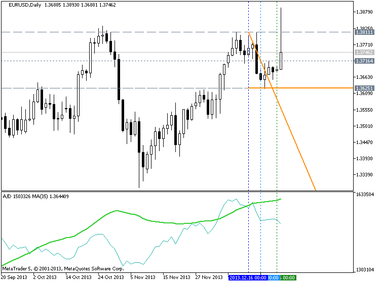
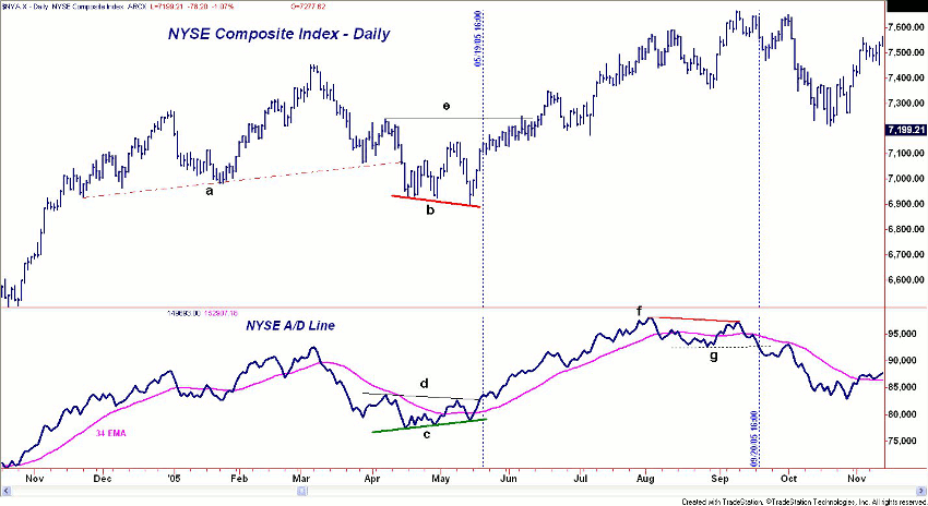
This chart, courtesy of Tradestation.com, covers the period from November 2004 through November 2005 and is a ideal example of how the A/D line can identify a market low. On the bottom of the chart in blue is the A/D line with a 34-period exponential moving average (EMA) of the A/D line in pink.
From the NYSE Composite’s March high of 7453, the market retreated sharply and violated four-month support, line a, in April. This created significant overhead resistance, as anyone who bought since November was now at a loss.
The NYSE made lower lows in April and May (line b), consistent with a weak market. The NYSE A/D line was giving a different picture, as it formed higher lows, line c. A bullish or positive divergence is not always seen at market lows, but when it is, that signal is highly reliable.
It is important to note that the A/D line was acting stronger than prices, and while the NYSE was at 7124 and still well below the April high at 7222 (line e), the A/D line was higher.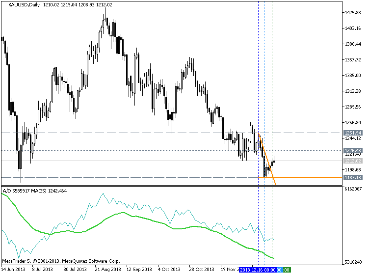
The NYSE Composite did not overcome its resistance until 17 trading days after the A/D line. Though this may seem rather surprising, this is a rather common occurrence with the A/D line.
Over the next three months, the A/D line was rising steadily, but on August 12, it failed to make a new high with prices (point 2). This was the first warning signal.
The NYSE Composite made further new highs on September 9 at 7665 (point 3), but the A/D line failed to make new highs, forming a negative divergence, line f. This divergence was completed on September 20 when support at line g was broken. This was 11 days before the important chart support at line h was broken.

- Tom Aspray
- www.forbes.com
- Free trading apps
- Over 8,000 signals for copying
- Economic news for exploring financial markets
You agree to website policy and terms of use
Accumulation/Distribution:
Accumulation/Distribution technical indicator is determined by the changes in price and volume. The volume acts as a weighting coefficient at the change of price - the higher the coefficient (the volume) is, the greater the contribution of the price change (for this period of time) will be in the value of the indicator.
In fact, this indicator is a variant of the more commonly used indicator On Balance Volume. They are both used to confirm price changes by means of measuring the respective volume of sales.
When the Accumulation/Distribution indicator grows, it means accumulation (buying) of a particular security, as the overwhelming share of the sales volume is related to an upward trend of prices. When the indicator drops, it means distribution (selling) of the security, as most of sales take place during the downward price movement.
Divergences between the Accumulation/Distribution indicator and the price of the security indicate the upcoming change of prices. As a rule, in case of such divergences, the price tendency moves in the direction in which the indicator moves. Thus, if the indicator is growing, and the price of the security is dropping, a turnaround of price should be expected.
Author: MetaQuotes Software Corp.