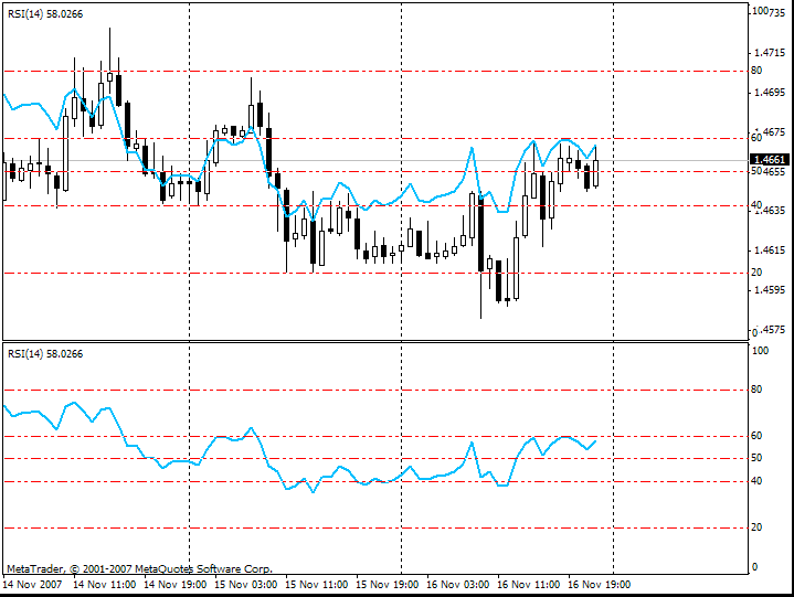
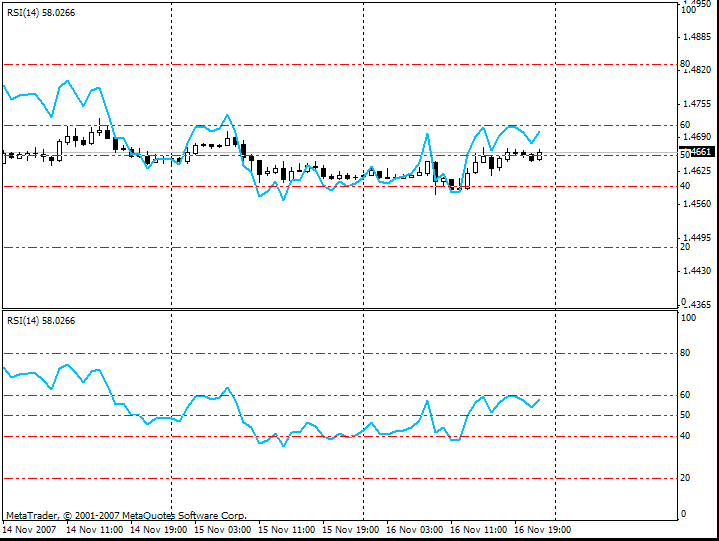
RSI value area
cool: rsi in chart window (overlay)
it's not hook up to the price, but still 
can we use same (opposite) method (trick) to plot Heiken Ashi (other histo) from chart to separate window?
templete:
//---------------------------------
comment=
symbol=EURUSD
period=1
leftpos=85597
digits=2
scale=8
graph=1
fore=0
grid=0
volume=0
scroll=1
shift=0
ohlc=0
askline=0
days=0
descriptions=0
shift_size=20
fixed_pos=0
window_left=154
window_top=154
window_right=967
window_bottom=731
window_type=3
background_color=16777215
foreground_color=0
barup_color=0
bardown_color=0
bullcandle_color=16777215
bearcandle_color=0
chartline_color=0
volumes_color=32768
grid_color=12632256
askline_color=17919
stops_color=17919
height=159
name=main
name=Relative Strength Index
period=14
apply=0
color=0
style=0
weight=1
min=0.000000
max=100.000000
levels_color=0
levels_style=1
levels_weight=1
level_0=20.0000
level_1=40.0000
level_2=80.0000
level_3=60.0000
period_flags=0
show_data=1
- Free trading apps
- Over 8,000 signals for copying
- Economic news for exploring financial markets
You agree to website policy and terms of use
Is this an illusion? Is this astandard rsi indicator made to look like its showing value areas to buy and sell? It's incredibly clever but I expect its adjusting to the last ideal area to put the value levels.
Take a look for yourself and let me know if its of any value in terms of calling out value areas for reversals.