Something Interesting in Financial Video December 2013
This is next lesson in free online futures trading course which covers transaction costs that traders pay when trading futures.
========
A futures contract is an obligation to buy or sell a commodity at or before a given date in the future, at a price agreed upon today. While the term “commodity” is usually used when referring to contracts like corn, or silver, it is also defined to include financial instruments and stock indexes. One of the benefits to the futures industry is that contracts are traded on an organized and regulated exchange to provide the facilities to buyers and sellers.
Exchange-traded futures provide several important economic benefits, but one of the most important is the ability to transfer or manage the price risk of commodities and financial instruments. A simple example would be a baker who is concerned with a price increase in wheat, could hedge his risk by buying a futures contract in wheat.
Not all futures contracts provide for physical delivery, some call for an eventual cash settlement. In most cases, the obligation to buy or sell is offset by liquidating the position. For example, if you buy 1 S&P500 e-mini contract, you would simply sell 1 S&P500 e-mini contract to offset the position. The profit or loss from the trade is the difference between the buy and sell price, less transaction costs. Gains and losses on futures contracts are calculated on a daily basis and reflected on the brokerage statement each night. This process is known as daily cash settlement.
US futures trading is regulated by the Commodity Futures Trading Commission (CFTC) and the National Futures Association (NFA). The CFTC is an independent federal agency based in Washington, DC that adopts and enforces regulations under the Commodity Exchange Act and monitors industry self-regulatory organizations. The NFA, whose principal office is in Chicago, is an industry-wide self-regulatory organization whose programs include registration of industry professionals, auditing of certain registrants, and arbitration.
========
Episode 64: Moving Average Envelopes: Simple But Effective Trend Indicators!
newdigital, 2013.11.29 06:48
Moving Average Envelopes (based on onlinetradingconcepts article)Moving Average Envelopes consist of a moving average plus and minus a certain user defined percentage deviation. Moving Average Envelopes serve as an indicator of overbought or oversold conditions, visual representations of price trend, and an indicator of price breakouts. The inputs of the Moving Average Envelopes indicator is shared below:
- Moving Average: A simple moving average of both the highs and the lows. (generally 20-period, but varies among technical analysts; also, a person could use only the close when calculating the moving average, rather than two)
- Upper Band: The moving average of the highs plus a user defined percentage increase (usually between 1 & 10%).
- Lower Band: The moving average of the lows minus a user defined percentage (again, usually between 1 & 10%).
A chart of the Nasdaq 100 ETF (QQQQ) shows a 20-day moving average with both a 1% and 2% percentage bands:
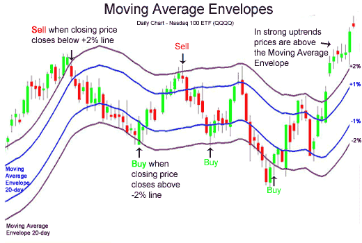
In the chart above of the QQQQ's, the price is not trending. During non-trending phases of markets, Moving Average Envelopes make great overbought and oversold indicators.
- Buy when the stock price penetrates the lower envelope and closes back inside the envelope.
- Sell when the stock price penetrates the upper envelope and then closes back down inside the envelope.
When stock prices are done resting and consolidating, they breakout, in one direction or the other.
- When prices break above the upper envelope, then buy.
- When prices break below the lower envelope, then sell.
An illustration of an upward price breakout is shown above on the chart of the QQQQ's. On the right side, the QQQQ's gapped up above the 2% price band.
Price Trend IndicatorA new trend in price is usually indicated by a price breakout as outlined above with a continued price close above the upper band, for an upward price trend. A continued price close below the lower band would indicate a new downward price trend.
In the chart of the QQQQ's, after the price breakeout, the closing price continued to close above the upper band; this is a good example of how a price trend begins. Soon after, the price will fall back into the Moving Average Envelopes, but the Moving Average Envelopes will be heading in a positive direction - easily identifying the trend as up.
Moving Average Envelopes is a helpful technical analysis tool for identifying trends and trend breakouts and identifying overbought and oversold conditions. Other similar indicators such as Bollinger Bands and Keltner Channels that adjust to volatility should be investigated as well.
17. How to trade the Stochastics indicator in Forex
In this Forex training video we discuss how to trade the Stochastics indicator. We discuss three main ways to trade it and it is up to you and your personality to decide which suits you the best.
Indicators: Stochastic Oscillator
newdigital, 2013.10.09 07:23
Pinpointing Forex Trend Trade Entries with Stochastics
- An uptrend is made up of higher highs and higher lows. Traders can use Stochastics to find excellent risk to reward entries at those low support points in the trend.
- A downtrend is made up of lower highs and lower lows. Forex traders can use Stochastics to find excellent risk to reward entries at these resistance high points
- Stochastics can be used to alert a forex trader to either tighten stops, reduce the position size, or take profit once in a trend trade
By far, traders who trade in the direction of the predominant daily trend have a higher percentage of success than those who trade the counter trend. One of the biggest attractions of the Forex market it is characterized by long trends that afford traders the potential to make hundreds of pips if they have timed their entries with precision and used protective stops to limit risk.
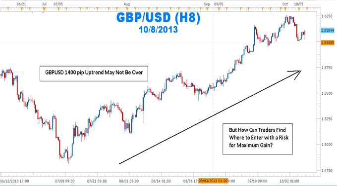
But How Can Traders Find Where to Enter with a Risk for Maximum Gain?
The mantra, “the trend is your friend until it ends,” can be found in many trading books, but it seems that many forex traders have not made the trend their friend and in some cases, the trend has become the enemy. Rather than being on the receiving end of those pips afforded to traders who have correctly entered the trend, many traders have been on the “giving” end of the trade losing pips while fighting the trend.
As people have turned to online dating services to meet their ideal match, forex traders can turn to stochastics as a way of making the trend the their friend again.
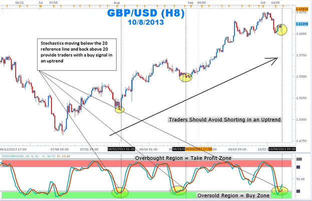
In an uptrend on a daily chart, stochastics %K and %D lines moving below the horizontal ‘20’ reference line and coming back above the 20 line indicates that the profit-taking correction is coming to an end. The stochastic crossing up also tells us that buyers are beginning to enter the market again. In addition, this shows that there is good support.
How to Trade the Trend Using Stochastics
Patience is the name of the game when attempting to trade with the trend. Getting into the trend too early can expose traders to large drawdowns. Getting in too late reduces the amount of profit before the swing is completed.
Use the stochastics indicator to find that “Goldilocks” entry of not too early and not too late. Once a strong uptrend is found, wait for stochastics with the settings of 15, 5, 5 to move into the oversold region below the 20 horizontal reference line. Next, wait for the %K and %D lines to move back above the 20 line. Enter long with a stop placed a few pips below the last low. Set a limit for at least twice the size of the stop.
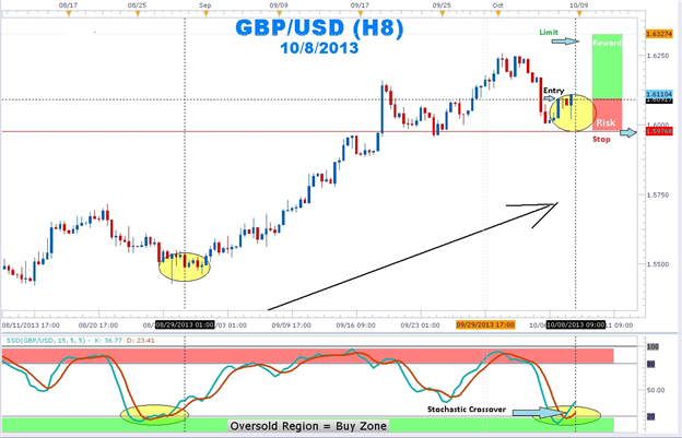
Once in an uptrend position, traders will attempt to squeeze as much profit as possible. Traders usually take profits on their open position or trail stops once stochastics moves into the overbought region. It is important to note that a forex currency pair can continue to make new highs even though stochastics is in the overbought region.
So next time you see a trend and you do not know how to make it your “friend”, let the stochastics indicator introduce you! Once these swings are highlighted by stochastics, stop placement becomes easier as well. stochastics crossovers in an uptrend can help you pinpoint your entries to join the major trend.
19. How to trade trend lines in Forex
In this Forex training video we discuss how to trade trend lines when the market is trending upwards and downwards. We provide detailed instructions on how to draw trend lines, set targets and stop losses whilst also focusing on how not to get caught out with fake trend lines.
newdigital, 2013.10.09 18:20
How to Exit While Trading with Trendlines
Talking Points:
- Traders should focus on their exit plan just as much as their trade entries.
- Trendline traders could set their stop losses beyond the nearest support or resistance level and set their limits within the nearest support or resistance level.
- Setting exit prices according to support and resistance levels could tip the odds in your favor.
Many traders have a strong set of rules that they follow to enter trades, but have difficulty in selecting their exits. This is troubling because how we exit a trade should be just as important, if not more important than how a trade is entered. After all, our exits ultimately determine if our trades are profitable for us or not. So we need to make sure our exit strategy is just as logical as our entry strategy.
When we place our trades based on trendlines, we are placing them based on support and resistance levels. We are thinking the price will bounce off a trendline like it did in the past. I propose we use the same logic when setting our stops and limits.
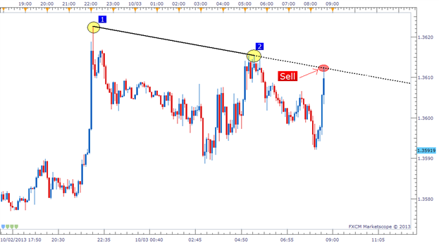
In the example above, it’s easy to see the sell entry that was given to us based on the bearish trendline. We entered right at the trendline looking for a bounce back down, but where do we want to exit? When do we call it quits if the trade goes against us? Where do we place our profit target? Let’s take a look.
Setting Stops Beyond Support/Resistance
We need to look at placing our stop somewhere above this trendline. If the resistance is broken through, we were wrong on the trade and should accept the loss quickly. It’s possible that price could return back to profitable territory after breaking this resistance, but we cannot rely on being lucky. We can only trade based on what we see.
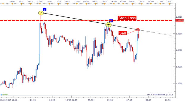
I like to set my stop 5-25 pips from the closest support/resistance level depending on the time frame I am trading. The smaller the time frame of the chart, the tighter I will place my stops. On this trade, I set my stop 5-6 pips away from my entry since that was beyond the resistance line as well as the previous swing high (Bounce #2).
Remember that when we set our Stop loss, this is also setting our monetary risk on the trade. So we also need to consider our trade side in respect to our Stop loss distance.
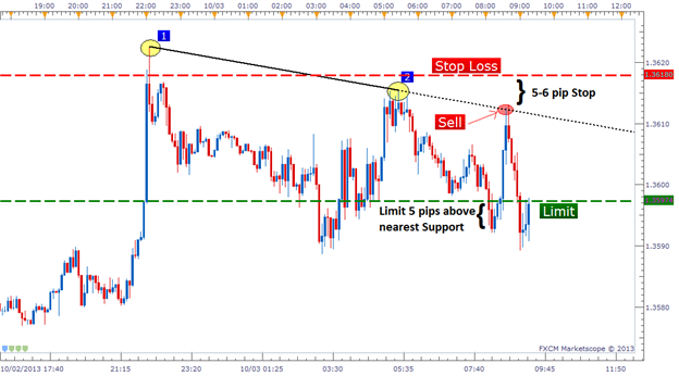
Setting Limits Within Support/Resistance
Now that our stop is set, we need to focus on our profit target. For our limit placement, we have two objectives:
- Our limit’s distance needs to be further than our stop’s distance.
- Our limit needs to be placed within the closest support/resistance (by at least 5 pips).
And the reason we want our limit to be placed within the closest support/resistance level (by at least 5 pips) is for the exact same rationale we used to open this trade to begin with. We know prices have a tendency to bounce off price levels they have bounced off of before, so we want to make sure that no support/resistance is in between our entry and our limit level. In the example below you can see I placed my limit 5 pips above the swing low (potential support). This gives price a clear path to a profitable trade.
Trendline Strategy Complete
This trendline strategy is one that can be used universally across all currency pairs and time frames so it is definitely a worthwhile style of trading to learn. The logic behind the entry and exit rules is also something that can be tailored to other types of strategies as well. Good trading!
Candlestick Charting - Vol 13 - Bearish Engulfing Pattern
Libraries: MQL5 Wizard - Candlestick Patterns Class
newdigital, 2013.09.11 16:21
Bearish Engulfing Pattern
The Bearish Engulfing Candlestick Pattern is a bearish reversal pattern, usually occuring at the top of an uptrend. The pattern consists of two Candlesticks:
- Smaller Bullish Candle (Day 1)
- Larger Bearish Candle (Day 2)
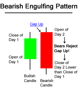
Generally, the bullish candle real body of Day 1 is contained within the real body of the bearish candle of Day 2.
The market gaps up (bullish sign) on Day 2; but, the bulls do not push very far higher before bears take over and push prices further down, not only filling in the gap down from the morning's open but also pushing prices below the previous day's open.
With the Bullish Engulfing Pattern, there is an incredible change of sentiment from the bullish gap up at the open, to the large bearish real body candle that closed at the lows of the day. Bears have successfully overtaken bulls for the day and possibly for the next few periods.
The chart below of Verizon (VZ) stock shows an example two Bearish Engulfing Patterns occuring at the end of uptrends:
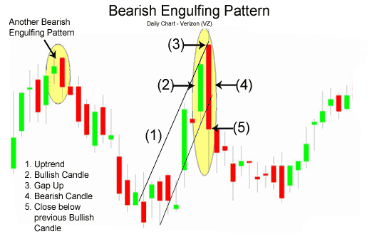
Three methodologies for selling using the Bearish Engulfing Pattern are listed below in order of most aggressive to most conservative:
- Sell at the close of Day 2. An even stronger indication to sell is given when there is a substantial increase in volume that accompanies the large move downward in price.
- Sell on the day after the Bearish Engulfing Pattern occurs; by waiting until the next day to sell, a trader is making sure that the bearish reversal pattern is for real and was not just a one day occurance. In the chart above of Verizon, a trader would probably entered on the day after the Bearish Engulfing Pattern because the selling continued.
- Usually trader's wait for other signals, such as a price break below the upward support line, before entering a sell order. However, in the case of Verizon above, the Bearish Engulfing Pattern occured at the same time as the trendline break below support.
An example of what usually occurs intra-day during a Bearish Engulfing Pattern is presented next.
Intra-day Bearish Engulfing PatternThe following 15-minute chart of Verizon (VZ) is of the 2-day period comprising the Bearish Engulfing Pattern example on the prior page:
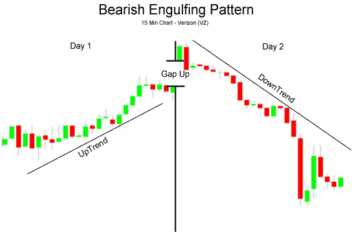
- Day 1: As is seen in the chart above, Day 1 was an up day, closing near the day's high (bullish sentiment).
- Day 2: The open was a gap up, a very bullish sign; nevertheless, the bulls ran out of buying pressure and prices fell the rest of the day, closing near the day's lows (bearish sentiment) and lower than Day 1's lows.
The next lesson in free futures trading course which covers what makes up the price of the futures contract.
Candlestick Charting - Vol 14 - Bullish Engulfing Pattern
Libraries: MQL5 Wizard - Candlestick Patterns Class
newdigital, 2013.09.11 16:10
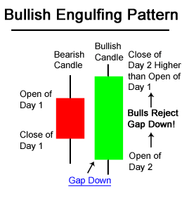
The Bullish Engulfing Candlestick Pattern is a bullish reversal pattern, usually occuring at the bottom of a downtrend. The pattern consists of two Candlesticks:
- Smaller Bearish Candle (Day 1)
- Larger Bullish Candle (Day 2)
The bearish candle real body of Day 1 is usually contained within the real body of the bullish candle of Day 2.
On Day 2, the market gaps down; however, the bears do not get very far before bulls take over and push prices higher, filling in the gap down from the morning's open and pushing prices past the previous day's open.
The power of the Bullish Engulfing Pattern comes from the incredible change of sentiment from a bearish gap down in the morning, to a large bullish real body candle that closes at the highs of the day. Bears have overstayed their welcome and bulls have taken control of the market.
The chart below of the S&P 500 Depository Receipts Exchange Traded Fund (SPY) shows an example of a Bullish Engulfing Pattern occuring at the end of a downtrend:
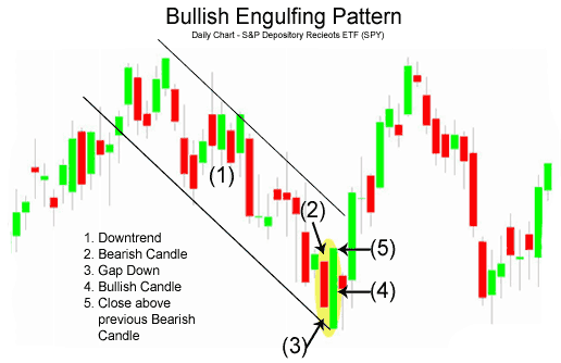
There are three main times to buy using the Bullish Engulfing Pattern; the buy signals that are presented below are ordered from the most aggressive to most conservative:
- Buy at the close of Day 2 when prices rallied upwards from the gap down in the morning. A strong indication that the rally on Day 2 was significant and truly a reversal of market sentiment, is if there was a substantial increase in volume that accompanied the large move upward in price.
- Buy on the day after the Bullish Engulfing Pattern occurs; by waiting until the next day to buy, a trader is making sure that the bullish reversal and enthusiasm of the prior day is continuing and was not just a one day occurance like a short covering rally. In the chart above of the SPY's, a trader would likely not enter the market long on the day after the Bullish Engulfing Pattern because the market gapped down significantly and even made new lows. A trader using methodology #2, would likely wait for a more concrete buy signals such as the one presented in method #3 next.
- After a trader sees the Bullish Engulfing Pattern, the trader would wait for another signal, mainly a price break above the downward resistance line, before entering a buy order.
An example of what usually occurs intra-day during a Bullish Engulfing Pattern is presented next.
Intra-day Bullish Engulfing PatternThe following 15-minute chart of the S&P 500 exchange traded fund (SPY) is of the 2-day period comprising the Bullish Engulfing Pattern example on the prior page:
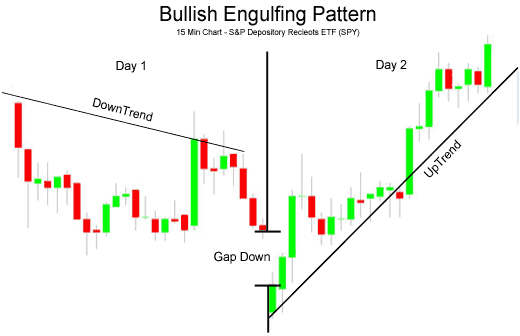
- Day 1: As is seen in the chart above, Day 1 was a down day, even closing the day at the low (bearish sentiment).
- Day 2: The open was a gap down, very bearish sign; but the bulls appeared to have had enough because the price of the SPY's went up the rest of the day, closing near the day's highs (bullish sentiment) and higher than Day 1's high.
Ichimoku: Strategies, Setups and What to Watch for
Many traders have had challenges trading the JPY pairs. However the Japanese traders have had large amounts of success in trading their native currency. This is not just due to familiarity, but the approach and indicators they use to measure key levels for these pairs - the Ichimoku Cloud.
This indicator is not only easy to learn, but highly accurate in giving JPY trading signals. When one learns how to use it correctly, one can build a very high accuracy and profit ratio trading the JPY pairs which can be some of the most volatile. Taking this class can give you a chance to master trading the yen and learn a unique approach to trading the Asian pairs as a whole.
newdigital, 2013.11.22 19:06
Breakout with Ichimoku (based on Take Advantage of False Breakouts at Great Prices with Ichimoku article)
Talking Points:
- What is a False Breakout?
- How Ichimoku Can Help You Recognize a False Breakout
- Trading Opportunity in EURUSD with Ichimoku on Recent Move
What is a False Breakout?
A false breakout takes place when price appears to be making a renewed move in the direction of the trend only to be retraced. A trend trader who is looking for prices to eventually move higher but wants confirmation of a price thrust in the direction of the trend is especially prey to false breakouts. This is because a break of resistance like a trendline that is pierced by price without follow through is ground zero to a false breakout.
How Ichimoku Helps You Recognize a False Breakout
Like many pains of trading such as stops getting hit at an unfortunate price, false breakouts cannot be avoided. However, they can be minimized as well as become a nice trading signal upon their failure. The reason I like looking to false breakouts as a trading opportunities is that they can often have a sharp reversal in the direction of the prior move with a good risk to reward ratio.
Ichimoku is a technical trading system that helps you catch moves in the direction of the trend on the time frame that you’re trading. Ichimoku is often seen as a difficult system to learn due to the 5 components that are displayed on the chart to explain a trading opportunity but each line serves a purpose and when you understand each purpose, you begin to get a feel for the value that Ichimoku can bring to your technical trading strategy.
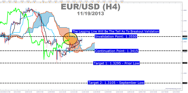
- Ichimoku Trade: Sell EURUSD If Price Breaks Below 1.3415 Showing a False Breakout Occurred
- Stop: 1.3550 (Technical Invalidation Point on the Chart)
- Limit: 1.3295 (Monthly Low)
If this is your first reading of the Ichimoku report, here is a recap of the traditional rules for a sell trade:
- Price is below the Kumo Cloud (That will be our entry trigger)
- The trigger line (black) is below the base line (light blue) or is crossing below
- Lagging line is below price action from 26 periods ago (bright green line)
- Kumo ahead of price is bearish and falling (red cloud = bearish Kumo)
If the breakout turns out to be legitimate and 1.3550 is taken out, then the next target would be in the neighborhood of 1.3630 /3650 range.
newdigital, 2013.11.25 12:23
Ichimoku Cloud (based on The Definitive Guide to Trading Trends with Ichimoku Cloud article)
Many traders are asked what indicator they would wish to never do without. The answer has never wavered as there is one indicator that clearly illustrates the current trend, helps you time entries, displays support and resistance, clarifies momentum, and shows you when a trend has likely reversed. That indicator is Ichimoku Kinko Hyo or more casually known as Ichimoku.
Ichimoku is a technical or chart indicator that is also a trend trading system in and of itself. The creator of the indicator, Goichi Hosada, introduced Ichimoku as a “one glance” indicator so that in a few seconds you are able to determine whether a tradable trend is present or if you should wait for a better set-up on a specific pair.
Before we break down the components of the indicator in a clear and relatable manner, there are a few helpful things to understand. Ichimoku can be used in both rising and falling markets and can be used in all time frames for any liquid trading instrument. The only time to not use Ichimoku is when no clear trend is present.
Always Start With the Cloud
The cloud is composed of two dynamic lines that are meant to serve multiple functions. However, the primary purpose of the cloud is to help you identify the trend of current price in relation to past price action. Given that protecting your capital is the main battle every trader must face, the cloud helps you to place stops and recognize when you should be bullish or bearish. Many traders will focus on candlesticks or price action analysis around the cloud to see if a decisive reversal or continuation pattern is taking shape.
In the simplest terms, traders who utilize Ichimoku should look for buying entries when price is above the cloud. When price is below the cloud, traders should be looking for temporary corrections higher to enter a sell order in the direction of the trend. The cloud is the cornerstone of all Ichimoku analysis and as such it is the most vital aspect to the indicator.
Time Entries with the Trigger & Base Line
Once you have built a bias of whether to look for buy or sell signals with the cloud, you can then turn to the two unique moving averages provided by Ichimoku. The fast moving average is a 9 period moving average and the slow moving average is a 26 period moving average by default. What is unique about these moving averages is that unlike their western counterparts, the calculation is built on mid-prices as opposed to closing prices. I often refer to the fast moving average as the trigger line and the slow moving average as the base line.
The Ichimoku components are introduced in a specific order because that is how you should analyze or trade the market. Once you’ve confirmed the trend by recognizing price as being below or above the cloud, you can move to the moving averages. If price is above the cloud and the trigger crosses above the base line you have the makings of a buy signal. If price is below the cloud and the trigger crosses below the base line you have the makings of a sell signal.
Confirm Entries with the Mysterious Lagging Line
In addition to the mystery of the cloud, the lagging line often confuses traders. This shouldn’t be the case as it’s a very simple line that is the close of the current candle pushed back 26 periods. When studying Ichimoku, I found that this line was considered by most traditional Japanese traders who utilize mainly Ichimoku as one of the most important components of the indicator.
Once price has broken above or below the cloud and the trigger line is crossing the base line with the trend, you can look to the lagging line as confirmation. The lagging line can best confirm the trade by breaking either above the cloud in a new uptrend or below the cloud in a developing downtrend. Looking above, you can see that the trend often gathers steam nicely after the lagging line breaks through the cloud. Another benefit of using the lagging line as a confirmation indicator is that the lagging line can build patience and discipline in your trading because you won’t be chasing the initial thrust but rather waiting for the correction to play out before entering in the direction of the overall trend.
Trading With Ichimoku Checklist
Now that you know the components of Ichimoku here is a checklist that you can print off or use to keep the main components of this dynamic trend following system:
Ichimoku Checklist:
1.Where is Price in Relation to the Cloud?
- Above the cloud -filtered for buy only signals
- In the Cloud - be cautious but ready to jump in on the prior trend or finesse a current position. what the candle stick formations heavily
- Below the cloud - filtered for short only trades
2. Is price consistently on one side of the cloud or is price whipping around on both sides consistently?
- Ichimoku is best used with clear trends and should be set aside during ranging markets.
3. Which level of the Ichimoku would like to use to place your stop?
- If you use Ichimoku to place stops as well, you can either use the cloud or the base line.
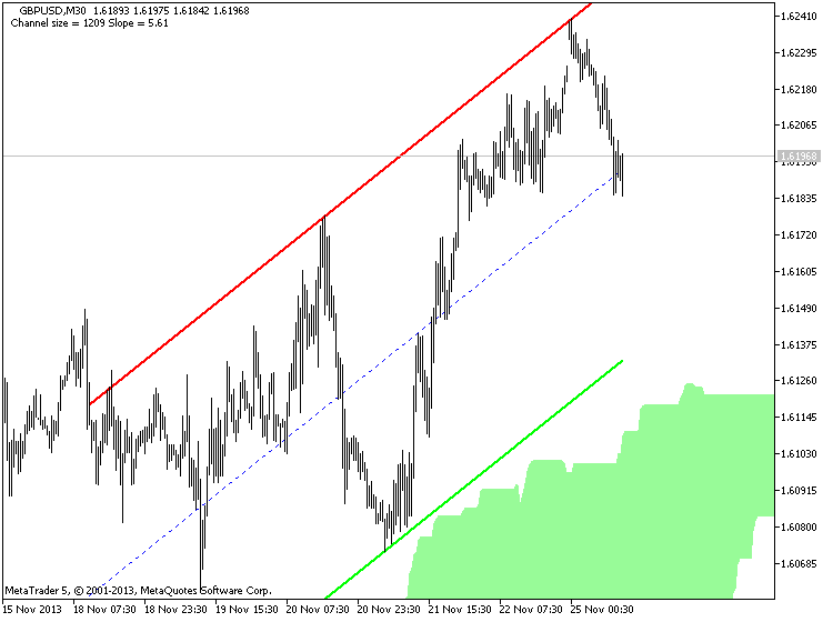
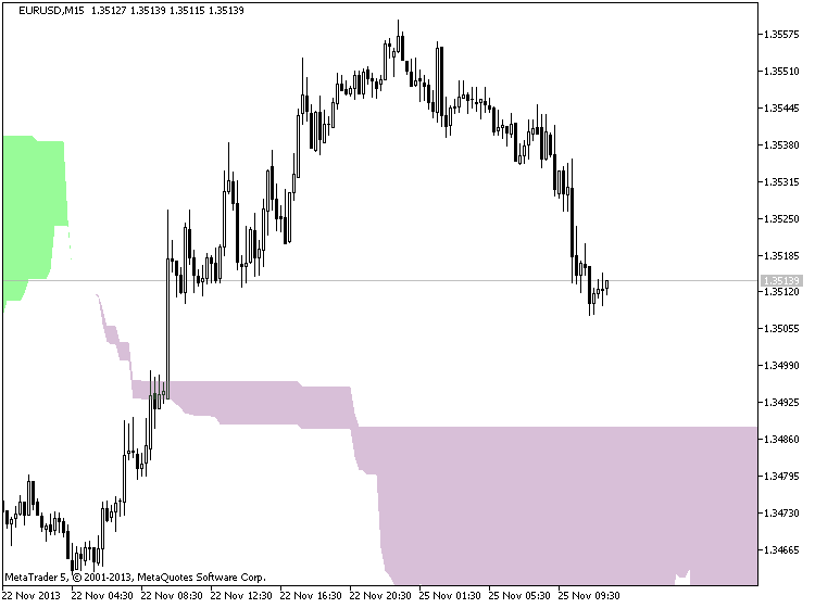
Moving Average Cloud Trading
Text made by the author :
Here I touch on support and resistance, moving averages, trend lines and fractals which is all involved in trading this moving average cloud system.
Before deciding whether or not to participate in the Forex market, you should carefully consider your investment objectives, level of experience and risk appetite. Most importantly, do not invest money you cannot afford to lose.
Any opinions, news, research, analyses, prices, or other information contained on this website are provided as general market commentary, and do not constitute investment advice. I am not liable for any loss or damage, including without limitation, any loss of profit, which may arise directly or indirectly from use of or reliance on such information.
Indicators: Custom Moving Average
newdigital, 2013.07.31 07:47
Moving Average Support and Resistance LevelsMoving Averages can be used as points of support and resistance.
When price reaches the moving average, the MA level can act as a point of support or resistance for the price.
Buy Signal
If price is on an up trend and starts to retrace, then most traders might wait to buy at a better price when the price hits a support level. Traders will sometimes use the MA to determine the support level.
A buy signal is generated when price hits the MA, turns and starts moving in the upward direction. The signal is confirmed when price closes above the MA. Because many traders use the moving averages to generate trading signals, price will normally react to these levels.
A stop loss should be set just below the MA. Ideally it should be set a few pips below the previous low.
Sell Signal
If price is on a down trend and starts to retrace, then most traders might wait to sell at a better price when the price hits a resistance level. Traders will sometimes use the MA to determine the resistance level.
A sell signal is generated when price hits the MA, turns and starts moving in the downward direction. The signal is confirmed when price closes below the MA. Because many traders use the moving averages to generate trading signals, price will normally react to these levels.
A stop loss should be set just above the MA. Ideally it should be set a few pips above the previous high.
Resistance turns support
When a resistance is broken it turns into support and vice versa.
This happens when the fundamentals of a currency change and consequently the direction of a currency pair. The direction change is reflected by the moving average, the direction is confirmed when the resistance turns into support or vice versa (when support turns into resistance)
Video 1 of 2 - In this Forex training video we discuss the characteristics of the double top and the surrounding market conditions you should consider. Before you learn how to trade the double top you must know how to identify the pattern. Watch the next video to learn how to trade the double top.
Libraries: MQL5 Wizard - Candlestick Patterns Class
newdigital, 2013.09.19 13:17
The Tweezer Top formation is a bearish reversal pattern seen at the top of uptrends and the Tweezer Bottom formation is a bullish reversal pattern seen at the bottom of downtrends.
Tweezer Top formation consists of two candlesticks:
- Bullish Candle (Day 1)
- Bearish Candle (Day 2)
Tweezer Bottom formation consists of two candlesticks:
- Bearish Candle (Day 1)
- Bullish Candle (Day 2)
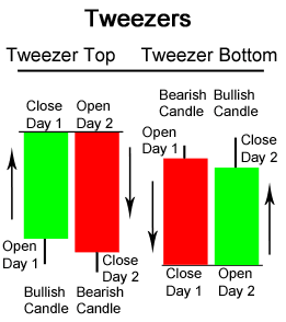
Sometimes Tweezer Tops or Bottoms have three candlesticks.
A bearish Tweezer Top occurs during an uptrend when bulls take prices higher, often closing the day off near the highs (a bullish sign). However, on the second day, how traders feel (i.e. their sentiment) reverses completely. The market opens and goes straight down, often eliminating the entire gains of Day 1.
The reverse, a bullish Tweezer Bottom occurs during a downtrend when bears continue to take prices lower, usually closing the day near the lows (a bearish sign). Nevertheless, Day 2 is completely opposite because prices open and go nowhere but upwards. This bullish advance on Day 2 sometimes eliminates all losses from the previous day.
Tweezer Bottom Candlestick Chart ExampleA Tweezer Bottom is shown below in the chart of Exxon-Mobil (XOM) stock:
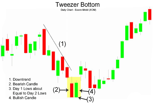
The bears pushed the price of Exxon-Mobil (XOM) downwards on Day 1; however, the market on Day 2 opened where prices closed on Day 1 and went straight up, reversing the losses of Day 2. A buy signal would generally be given on the day after the Tweezer Bottom, assuming the candlestick was bullish green.
Intra-day Tweezer Tops and BottomsThe bullish Tweezer Bottom formation shown on the last page of the daily chart of Exxon-Mobil is shown below with a 15-minute chart spanning the two days the Tweezer Bottom pattern was emerging:
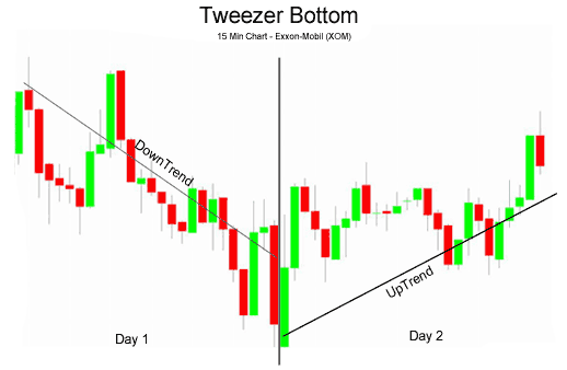
Notice how Exxon-Mobil (XOM) stock went downwards the whole day on Day 1. Then on Day 2, the bearish sentiment of Day 1 was completely reversed and XOM stock went up the whole day. This sudden and drastic change of opinion between Day 1 and Day 2 could be viewed as an overnight transfer of power from bears to bulls.
The 15-minute chart below of the E-mini Russell 2000 Futures contract shows how a three day Tweezer Top usually develops:
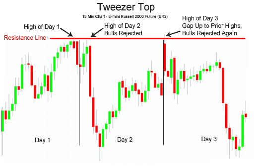
On Day 1, the bulls were in charge of the Russell 2000 E-mini. On Day 2, however, the bulls began the day trying to make a new high, but were rejected by the overhead resistance created by the prior day's highs. The market then sank quickly only to recover halfway by the end of the close on Day 2. Day 3 opened with a spectacular gap up, but the bulls were promptly rejected by the bears at the now established resistance line. The Russell 2000 E-mini then fell for the rest of the day. Many classic chartists will recognize this triple Tweezer Top as a Double Top formation (see: Double Top).
The Tweezer Top and Bottom reversal pattern is extremely helpful because it visually indicates a transfer of power and sentiment from the bulls and the bears. Of course other technical indicators should be consulted before making a buy or sell signal based on the Tweezer patterns.
- Free trading apps
- Over 8,000 signals for copying
- Economic news for exploring financial markets
You agree to website policy and terms of use
Trading and training video (from youtube for example) about forex and financial market in general.
Please upload forex video you consider as interesting one. No direct advertising and no offtopic please.
Any the comments without video will be deleted.