doktorfx: I wonder if someone out there could help to modify the indicator .. Yes I've tried
|
|
doktorfx: I wonder if someone out there could help to modify the indicator .. Yes I've tried |
|
Truth is I'm not a coder, I can tweak codes if I have a reference. I've tweaked a version of MACD to plot trendlines using a peak and trough technique I found online.
But this indicator is so different, I barely understand it......?
If I could afford it, I would pay but I can't; hence my request for assistance.
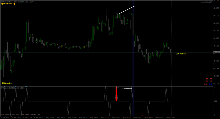
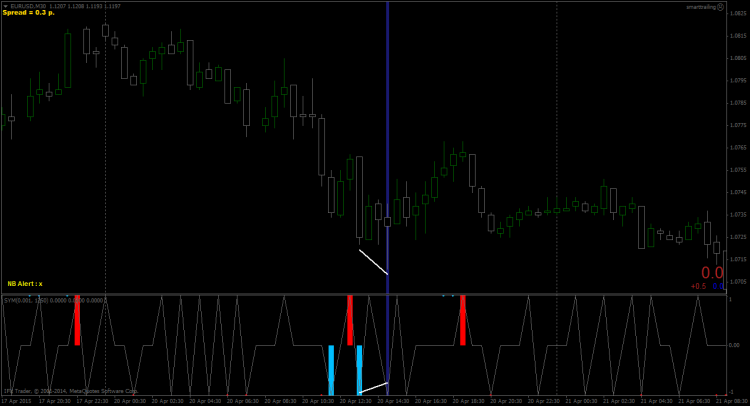
Yes I drew the trendlines in an attempt to convey a picture of where the trendlines should be plotted by the indicator.
From what I understand, I need a way (arrays...? ) to identify/ differentiate between the last Major peak/trough and the current minor peak/trough....?
If I had that, I could probably tweak my way through.
Like I said I'm not a coder so my explanation may not be very coherent..
I hope this is a better description of what I'm trying to achieve
The conditions for a bearish diversion are as follows:
2.A minor low is plotted.
3.A minor high is plotted as price makes a new high, higher than the last major high = This is a Diversion because a Major High (red spike) should be plotted not a minor high (gray spike).
The conditions for a bullish diversion are as follows:
1.A major low (skyblue spike) is plotted as price makes a new low.
2.A minor high is plotted.
3.A minor low is plotted as price makes a new low, lower than the last major low. = This is a Diversion because a Major low (red spike) should be plotted not a minor low (gray spike).
Let me know if this clarifies the concept.
Once again, the trendlines were drawn in by myself to indicate the respective divergence points.
- Free trading apps
- Over 8,000 signals for copying
- Economic news for exploring financial markets
You agree to website policy and terms of use


Dear 'Forumites',
I've been backtesting this indicator called Symphonie_Extreme_Cycle_Indikator2 or Cycle identifier. And I noticed a very unique form of diversion that happens very rarely.
I wonder if someone out there could help to modify the indicator so that it draws trendlines at these diversion points. Yes I've tried and failed woefully..... Not much of a coder am I.
Anyway I've enclosed two screenshots of what this unique diversion looks like and of course one version of the indicator.
THe indicator is supposed to identify Major Peaks and troughs with the red and skyblue colors.
In the first example, there appears a major low(skyblue) and then a minor low(gray down spike). But Price makes a lower low at the point of the supposed minor low.
In example 2, The red spike marks a Major High but price makes a new high after that and the indicator does not.
I hope someone understands my explanation.
THANKS