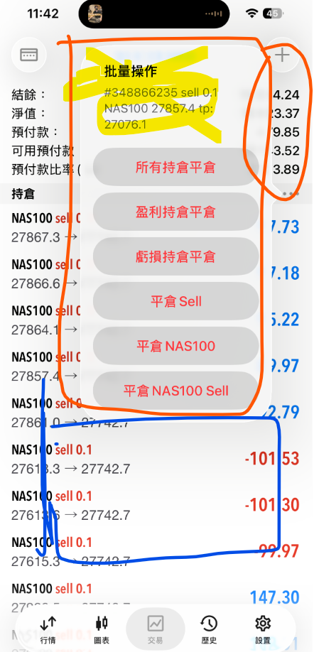

(MT5 mobile App) New interface of "Bulk order" button too large to block to view important data-- big influence to traders to view the money and design when to close ALL ORDERS in a second
Hi MT5 IT Team
Recent day, I notice there is stupid change or update in your MT5 mobile setting for bulk order.
Here attached the photo as your reference in my Apple mobile phone to use MT5 to close all order when the total amount of money is reached my target.
Do you know the screen of mobile is small? A clear and smart display in trading app (MT5) is very important ? Market moves fast, balance of $ in market each second is changing. Total amount of money is important to read when traders design which second/moment to close all Bulk orders !
MT5 mobile app - bulk order buttons
However, your company is not improving all serving level. You are stepping backward to make something incense for costumers to use. As the screen of NEW display in MT5 mobile , when customers need to read the amount of money ( located in the top part of the MT5 as photo) to press the button to close all orders when doing trades futures market, your NEW style of message box is blocked the important $ money part ! Do you know the market is running very fast, if you delay a second to close the orders, this could make a big LOSE of $ for costumers!
I think the previous setting of message box is better than the NEW ONE (AS photo). I remember the previous old style of BULK ORDER MESSAGE BOX was placed in the lower center part of the mobile display screen for BULK order to close some / all orders. BUT now the new style BULK order becomes longer, and moved to upper part to block the total money part which located in the top of the screen. Also those unnecessary information is added " #348866235 sell 0.1...." highlighted in yellow color. The space in mobile screen is limited , why adding unnecessary information to block the screen and make the message box very large ! ?
Please keep the message box as clear and smart as before , located it in the lower part of the mobile screen , and make it small , short (not LONG BOX) and clear to see. Kindly advice please DO NOT BLOCK to view the important market data < the upper part the table , list of total money and margin in account. Also all the Right hand side of money amount (red /blue colour of amount) for each individual order> in the mobile MT5 screen!
Remove those useless part( Highlighted in Yellow colour in the phone) .
Hope your improvement AS SOON AS POSSIBLE. I really unlike the new design of bulk order buttons in MT5 mobile app, I refer the old one much useful to read and use. Thank you!
Hi MT5 IT Team
Recent day, I notice there is stupid change or update in your MT5 mobile setting for bulk order.
Here attached the photo as your reference in my Apple mobile phone to use MT5 to close all order when the total amount of money is reached my target.
Do you know the screen of mobile is small? A clear and smart display in trading app (MT5) is very important ? Market moves fast, balance of $ in market each second is changing. Total amount of money is important to read when traders design which second/moment to close all Bulk orders !
MT5 mobile app - bulk order buttons
However, your company is not improving all serving level. You are stepping backward to make something incense for costumers to use. As the screen of NEW display in MT5 mobile , when customers need to read the amount of money ( located in the top part of the MT5 as photo) to press the button to close all orders when doing trades futures market, your NEW style of message box is blocked the important $ money part ! Do you know the market is running very fast, if you delay a second to close the orders, this could make a big LOSE of $ for costumers!
I think the previous setting of message box is better than the NEW ONE (AS photo). I remember the previous old style of BULK ORDER MESSAGE BOX was placed in the lower center part of the mobile display screen for BULK order to close some / all orders. BUT now the new style BULK order becomes longer, and moved to upper part to block the total money part which located in the top of the screen. Also those unnecessary information is added " #348866235 sell 0.1...." highlighted in yellow color. The space in mobile screen is limited , why adding unnecessary information to block the screen and make the message box very large ! ?
Please keep the message box as clear and smart as before , located it in the lower part of the mobile screen , and make it small , short (not LONG BOX) and clear to see. Kindly advice please DO NOT BLOCK to view the important market data < the upper part the table , list of total money and margin in account. Also all the Right hand side of money amount (red /blue colour of amount) for each individual order> in the mobile MT5 screen!
Remove those useless part( Highlighted in Yellow colour in the phone) .
Hope your improvement AS SOON AS POSSIBLE. I really unlike the new design of bulk order buttons in MT5 mobile app, I refer the old one much useful to read and use. Thank you!