Custom Graphical Controls. Part 2. Control Library
Dmitry Fedoseev | 14 December, 2011
Introduction
The article "Custom Graphical Controls. Part 1. Creating a Simple Control" set out the principles of creating graphical controls whereby the set of controls was created to handle the main problems arising in interaction between a program (Expert Advisor, script, indicator) and a user.
Some controls almost completely correspond to well-known standard controls, others were developed with due consideration of the Terminal features and capabilities. All the controls are designed as separate classes and added to IncGUI.mqh file used in the previous article (new file name is IncGUI_v2.mqh).
Apart from the new control classes being added, the file has further changes: CGraphicObjectShell class has been modified by adding methods for simultaneous setting of the coordinates and sizes SetXYDistance(), SetXYSize() and by correcting a typing error in the word Distance in some method names (it was spelled Distanse).
In the CInputBox class, a typing error in the name of the SetValueString() method has been corrected (it was spelled SetValueStrind), and SetReadOnly() and ReadOnly() methods have been added. SetReadOnly() method enables/disables keyboard input to the text box, while the ReadOnly() method makes it possible to find out whether the keyboard input is allowed or not.
The order of color swatches displayed using the Show() method has been modified in the CColorSchemes class; the color schemes now have somewhat more colors than expected, therefore the schemes are arranged vertically and the colors are arranged horizontally. Furthermore, some new color schemes have been added to the CColorSchemes class.
This article provides a library containing the following controls:
- CInputBox (Input Box),
- CSpinInputBox (Spin Button Input Box),
- CCheckBox (Checkbox),
- CRadioGroup (Radio Button Group),
- CVSсrollBar (Vertical Scrollbar),
- CHSсrollBar (Horizontal Scrollbar),
- CList (List),
- CListMS (Multiple-Selection List),
- CComBox (Drop-Down List),
- CHMenu (Horizontal Menu),
- CVMenu (Vertical Menu),
- CHProgress (Horizontal Progress Bar),
- CDialer (Dialer),
- CDialerInputBox (Dialer with Input Box),
- CTable (Table).
Let's have a look at every control with examples of use (except for the CInputBox as quite a detailed review of it was provided in the article "Custom Graphical Controls. Part 1. Creating a Simple Control").
1. CSpinInputBox Class
Spin Button Input Box (Fig. 1).
![]()
Fig. 1. CSpinInputBox Class (Spin Button Input Box)
By clicking the "+" button, the value in the text box is increased by a set value, similarly, by clicking the "-" button the same is decreased.
In addition to changing the values by the spin buttons, you can enable keyboard input to the text box (SetReadOnly() method). This control is based on the CInputBox working in the numeric mode and has similar methods for setting the value limits: SetMaxValue(), SetMinValue().
Unlike the CInputBox, when calling Init() method in CSpinInputBox class, instead of the Digits parameter the Change parameter is transmitted that represents the change in the value by the spin buttons. The value of the Change parameter defines the number of decimal places according to which the value in the text box is formatted. You can programmatically make the settings and get the value by using the SetValue() and Value() methods. The number of decimal places according to which the value is formatted can be received by using the Digits() method.
An example of using this control is given in the appended eIncGUI_v2_Test_CSpinInputBox.mq5 file.
2. CCheckBox Class
Checkbox or On-Off Switch (Fig. 2).
![]()
Fig. 2. CCheckBox Class (Checkbox or On-Off Switch)
It is a quite simple control that can take either of the two values: on or off. In the "off" state it represents a square. In the "on" state a tick appears in the square. You can programmatically modify the settings and get the value by using the SetValue() and Value() methods.
An example of using this control is given in the appended eIncGUI_v2_Test_CCheckBox.mq5 file.
3. CRadioGroup Class
Radio Button Group (Fig. 3).
![]()
Fig. 3. CRadioGroup Class (Radio Button Group)
The Radio Button Group is designed for selection of one of several options (for example, selection of order type). This control is used in the same manner as other controls - first, the Init() method is called with specification of the group name in the parameters, and then the buttons are created. Creation of the buttons is carried out using the AddButton() method.
The first parameter of the AddButton() method defines the caption located to the right of the button, followed by X and Y coordinates relative to the coordinates of the entire control.
Thus, the buttons in the group can be arranged in any order (not only horizontal or vertical) and the whole button group can be moved by changing the group coordinates without recalculating the individual button coordinates. The AddButton() method should be called as many times as many buttons in a group you want to create.
After creating the buttons, a selected button should be specified by the SetValue() method which only has one parameter indicating the index of the selected button; the buttons are numbered from zero onwards in the order they were created by the AddButton() method. In order to get the index of a selected button, the Value() method is used.
An example of using this control is given in the appended eIncGUI_v2_Test_CRadioGroup.mq5 file.
4. CVSсrollBar Class
Vertical Scrollbar (Fig. 4).
![]()
Fig. 4. CVSсrollBar Class (Vertical Scrollbar)
This is a well-known and commonly used control. The vertical scrollbar has its own properties: minimum value, maximum value (which define the valid range of the control values), minor change (value change when clicking the up or down scroll button), major change (value change when clicking the area between the scroll button and the scroll box).
In addition to value changes by a minor change when clicking the scroll buttons and a major change when clicking on the area between the scroll box and the scroll buttons, it is also possible to move the scroll box to a certain position. In order to move the scroll box to a certain position, one should click the scroll box so that it gets selected (the color will change) and then click on the required place - the scroll box will jump to the indicated place and get deselected.
If the scroll box has been selected by mistake, you should click on it again to deselect it. If you click on either of the scroll buttons while the scroll box is selected, the latter will jump respectively to the start or the end and the control will get either maximum or minimum value.
The control application starts with calling the Init() method upon specification of name, height and conditional size (from 1 to 4) in the parameters.
The value range is then defined by the SetMin(), SetMax() methods and a minor change value and major change value are set respectively by the SetSmallChange() and SetLargeChange() methods. The control value (scroll box position) is received using the Value() method.
The scroll box position can be programmatically modified utilizing the SetValue() method.
An example of using this control is given in the appended eIncGUI_v2_Test_CVSсrollBar.mq5 file.
5. CHSсrollBar Class
Horizontal Scrollbar (Fig. 5).
![]()
Fig. 5. CHSсrollBar Class (Horizontal Scrollbar)
This control is absolutely identical to the vertical scrollbar, except that when calling the Init() method the second parameter to be specified is the bar width instead of the bar height.
An example of using this control is given in the appended eIncGUI_v2_Test_CHSсrollBar.mq5 file.
6. CList Class
List (Fig. 6).
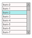
Fig. 6. CList Class (List)
This control represents a few text boxes displaying the list items. The number of visible boxes is defined upon the control initialization. If the number of the list items exceeds the number of visible boxes, the vertical scrollbar will appear.
One of the list items can be selected (color item in Fig. 6). As regards the item selection, the control can operate in two modes: either allowing or not allowing item deselection, whereby such modes are set by the SetAllowDeselect() method.
The control name, its width in pixels and height in the number of items are transmitted when calling the Init() method.
Following the Init() method, the AddItem() method is used to add a new item to the list. Then, if required, a selected item is set by the SetSelectedIndex() method. An item can always be programmatically deselected by transmitting a value of -1 to the SetSelectedIndex() method.
A selected item can be identified by the SelectedIndex() method; if the method returns -1, there is no selected item in the list. Besides, the text of a selected item can be received utilizing the SelectedText() method.
In order to receive the text of any list item, the Text() method is used with specification of the item index. Any item text can be modified using the SetText() method; DeleteItem() method deletes the item, Clear() method clears the entire list.
An example of using this control is given in the appended eIncGUI_v2_Test_CList.mq5 file.
7. CListMS Class
Multiple-Selection List (Fig. 7).
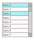
Fig. 7. CListMS Class (Multiple-Selection List)
This control is identical to the "List" control with one exception - a simultaneous existence of multiple selected items is allowed. Consequently, a somewhat different way of accessing selected items is used.
When dealing with the simple list, the SetSelected() method receives one parameter indicating the index of the selected item (upon selection of the new item, the previous item gets deselected); in the multiple-selection list, two parameters are transmitted to the SetSelected() method: index and item status (true/false - selected/not selected). In order to check whether the item is selected, the Selected() method is utilized that receives the transmitted index of the item under check.
FirstSelected() and NextSelected() methods are used for handling all selected items. The FirstSelected() method returns the index of the first selected list item; the NextSelected() method returns the index of the next selected item following the index of the item received at the last call of the FirstSelected() or NextSelected() methods.
The following structure can be used to iterate through all selected items:
// All selected items iteration

int Selected=lstm.FirstSelected();
    while(Selected!=-1){
        //=======================================
        // An action with the selected item
        // ======================================
       Selected=lstm.NextSelected();
   }
An example of using this control is given in the appended eIncGUI_v2_Test_CListMS.mq5 file.
8. CComBox Class
Drop-Down List (Fig. 8.1).
![]()
Fig. 8.1. CComBox Class (Drop-Down List)
This control represents a text box with a small button which needs to be clicked on for the list to drop down (Fig. 8.2). The "List" control is used to display the list. The text of the item selected in the list is displayed in the visible text box.
This control can be used in two modes: the first one only allows selection from the list, the second one allows for keyboard input (the mode is set by the SetReadOnly() method). Therefore, there are some differences between this control and the list.
If the value entered using the keyboard is on the list, the corresponding list item will be selected and the SelectedIndex() method will return the index of this item.
If the entered value cannot be found in the list, the SelectedIndex() method will return -1, therefore in order to receive the value of this control, the Value() method is used which returns the contents of the visible text box, thus to programmatically set the value one can use either the SetSelectedIndex() method (identical to clicking on the item) or the SetValue() method (identical to entering a value using the keyboard).

Fig. 8.2. Drop-Down List Expanded
An example of using this control is given in the appended eIncGUI_v2_Test_CComBox.mq5 file.
9. CHMenu Class
Horizontal Menu (Fig. 9.1).
![]()
Fig. 9.1. CHMenu (Horizontal Menu)
This control represents several text boxes being the menu items that are arranged in a horizontal row, and buttons on the sides. The side buttons featuring a vertical line are used to scroll through the menu to its beginning or end and the arrow buttons are used to scroll by a "screen" (by the number of visible items). The main purpose of the menu is execution of actions in the program.
When clicking the menu item, an event is generated whereby a command should be executed. In addition to direct execution of commands, the menu may be used to enable/disable any instruments.
For instance, the Expert Advisor has a few options to close a position: by using indicators 1, 2 and 3. A user can enable one or all options or any combination of two instruments to close the position using the indicator that first signals for the closing.
The following scheme is suggested: when clicking on the menu, a window appears for setting the instrument parameters and enabling the instrument, so the user sets the parameters, enables the instrument and clicks "Ok" - and the instrument starts working.
In order to clearly see what instruments are currently working, there is a method for marking the item (the check sign) - the SetChecked() method. If the menu contains the selected items, it changes the color to be clear that there are enabled instruments in the menu even if the enabled item is scrolled out of sight. One can identify any checked items programmatically by using the CheckedExist() method, and see if a certain menu item is checked by utilizing the Checked() method.
![]()
Fig. 9.2. Horizontal Menu with a Checked Item
The application of this control as well as of all other controls starts with the Init() method to which the control name, its width in pixels and number of visible items are transmitted. The AddItem() method following the Init() method is used to add items.
Since this control implies the display of other controls in response to its commands, it has methods for getting the coordinates of the clicked menu item, a method for getting a screen quarter where the item is located and a method for getting the item width in order to place the displayed control in a suitable screen quarter.
The LastClickedX() and LastClickedY() methods are used to get the coordinates, the LastClickedQuarter() method is utilized to get the quarter (value 1 - top left corner, 2 - top right corner, 3 - bottom left corner, 4 - bottom right corner), the LastClickedW() method gets the item width.
An example of using this control is given in the appended eIncGUI_v2_Test_CHMenu.mq5 file.
10. CVMenu Class
Vertical Menu (Fig. 10).
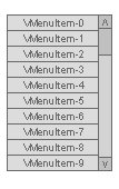
Fig. 10. CVMenu Class (Vertical Menu)
This control is fully identical to the horizontal menu in terms of its purpose, functionalities and use except that its items are arranged vertically and a vertical scrollbar is used to scroll through. There is however one difference - instead of the LastClickedW() method used in the horizontal menu to get the item width, the ItemHeight() method is used here to define the item height.
An example of using this control is given in the appended eIncGUI_v2_Test_CVMenu.mq5 file.
11. CHProgress Class
Horizontal Progress Bar (Fig. 11).
![]()
Fig. 11. CHProgress (Horizontal Progress Bar)
This control is designed to control the progress of a task in a percent format. For example, it is required to perform some complex time-consuming calculation for every bar on the chart for research. It will be interesting to know the extent to which the task has been performed, the time remaining until the end of the performance in order to plan your time ahead or at least to know that the program is still running and hasn't frozen up. The left part of the progress bar displays the performance percentage, the right part shows the estimated time to completion.
When calling the Init() method, two parameters are transmitted into it: name and width in pixels. Right before entering the controlled loop, the Begin() method needs to be called which receives the loop parameters: minimum value and maximum value. Inside the loop, the SetValue() method sets the value displayed by the progress bar. Upon exit from the loop the Reset() method resets the progress bar to its original form.
Every call of the SetValue() method invokes redrawing of the graphical objects so the use of the progress bar may become the main consumer of computer resources significantly increasing the loop running time to the point where the use of the progress bar gets inefficient. And for this case the control has the SetRefreshInterval() method to which the refresh interval value in seconds is transmitted.
When the refresh interval has been set, the SetValue() method at every call will first check the time of the last refresh of the control and only in case such time exceeds the set interval, the calculation will be made and the progress bar will be redrawn.
An example of using this control is given in the appended eIncGUI_v2_Test_CHProgress.mq5 file.
12. CDialer Class
Dialer (Fig. 12).
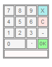
Fig. 12. CDialer Class (Dialer)
This control is intended for use within the CDialerInputBox class but can also be used independently.
For example, the control becomes visible by pressing any button; the user dials a value, presses "OK" and the program then uses the value received by the Value() method which is basically what is done in the Dialer With Input Box control, where the last entered value is always displayed in the text box next to which the button expanding the dialer is located.
One parameter - the name - is transmitted to the Init() method.
Buttons: "X" - closes the dialer without changing the value, "C" - resets the entered value, "OK" - uses the entered value, the use of the number buttons is obvious, decimal point - enters the decimal part of a number, "-" button - changes the sign of a number (positive / negative). The entered numbers are displayed in the text box at the bottom of the dialer.
An example of using this control is given in the appended eIncGUI_v2_Test_CDialer.mq5 file.
13. CDialerInputBox Class
Dialer with Input Box (Fig. 13).
![]()
Fig. 13. CDialerInputBox Class (Dialer with Input Box)
This control is based on the Input Box and Dialer controls and represents a text box with a button to expand the dialer located next to it. The control can operate in two modes: input through the dialer only and in addition to it the keyboard input.
SetReadOnly() method enables/disables keyboard input.
Four parameters are transmitted to the Init() method: the name, width in pixels, the number of decimal places according to which the value will be formatted for display and the caption displayed next to the control.
An example of using this control is given in the appended eIncGUI_v2_Test_CDialerInputBox.mq5 file.
14. CTable Class
Table (Fig. 14).
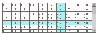
Fig. 14. CTable Class (Table)
The control name speaks for itself - it is designed to display data tables.
Three parameters are transmitted to the Init() method: the name, width and height in pixels. The actual table size is defined by the number of rows, columns and their sizes but it cannot exceed the size values specified at the Init() call. If the actual table size exceeds the size values specified at the Init() call, the scrollbars are displayed.
Use. Following the table initialization by the Init() method, the number of table columns is defined by the SetCollsCount() method and the number of rows is defined by the SetRowsCount() method. Instead of the SetRowsCount() method, the AddRow() method can be used; every time it is called one row is added to the table. After the table size (number of columns and rows) has been defined, the cells can be filled with values.
The SetCellText() method is used to fill in the cell values. In addition to the cell text, all other cell properties can also be modified: background color, text color, font size, font type (SetCellBGColor(), SetCellTxtColor(), SetCellFontSize(), SetCellFont() methods). The row height can be changed using the SetRowHeight() method, the column width can be modified by the SetCollWidth() method.
The SetCellsMerge() method is used to merge multiple cells into one and has four parameters: row index, column index, RowSpan and CollSpan parameters (similar to RowSpan and CollSpan attributes in HTML).
The RowSpan parameter defines the number of cells merged vertically, and the CollSpan parameter defines the number of cells merged horizontally. The merged cells can be restored by setting the RowSpan and CollSpan values equal to 1.
For viewing convenience, the table has a crosshair function. When clicking on a cell, the column and row of such cell are highlighted in a different color. By another click on the same row a standard table color (as well as the standard scrollbar color) is back. The crosshair function is enabled/disabled by the SetAllowSelection() method. The LastClickedRow() and LastClickedColl() methods help to identify the cell that was clicked on.
The HTML() method is used to get an HTML code of the table to be saved in html file for further viewing in the browser. However this method can also be utilized without having to display the control but to merely get an html code of the table.
An example of using this control is given in the appended eIncGUI_v2_Test_CTable.mq5 file.
Conclusion
The set of controls reviewed in this article will probably not give you solutions to all the problems arising in interaction between a program and a user but will nevertheless fully cover the most common of them:
- Enabling/disabling by using the checkbox;
- Selection of different options by using the radio buttons and the lists;
- A few options for a quick and easy input of values (keyboard input, spin button input, dialer input);
- Means of visual representation of data - again, the lists and the table.
In cases where these controls may be insufficient, some of them can be used as components for developing other controls that would be more adequate to the problem at hand. Anyway, I hope the provided controls will be of great use.
Appendix
List of Appended Files:
- IncGUI_v2.mqh is an include file with the CGraphicObjectShell, CWorkPiece, CColorSchemes, CInputBox classes and all control classes set out in this article. The file should be placed in MQL5/Include folder of the Terminal Data Folder.
- eIncGUI_v2_Test_CSpinInputBox.mq5 - an example of CSpinInputBox class use. This and all subsequent files (from 2 to 16) should be placed in MQL5/Experts folder.
- eIncGUI_v2_Test_CCheckBox.mq5 - an example of CCheckBox class use.
- eIncGUI_v2_Test_CRadioGroup.mq5 - an example of CRadioGroup class use.
- eIncGUI_v2_Test_CVSсrollBar.mq5 - an example of CVSсrollBar class use.
- eIncGUI_v2_Test_CHSсrollBar.mq5 - an example of CHSсrollBar class use.
- eIncGUI_v2_Test_CList.mq5 - an example of CList class use.
- eIncGUI_v2_Test_CListMS.mq5 - an example of CListMS class use.
- eIncGUI_v2_Test_CComBox.mq5 - an example of CComBox class use.
- eIncGUI_v2_Test_CHMenu.mq5 - an example of CHMenu class use.
- eIncGUI_v2_Test_CVMenu.mq5 - an example of CVMenu class use.
- eIncGUI_v2_Test_CHProgress.mq5 - an example of CHProgress class use.
- eIncGUI_v2_Test_CDialer.mq5 - an example of CDialer class use.
- eIncGUI_v2_Test_CDialerInputBox.mq5 - an example of CDialerInputBox class use.
- eIncGUI_v2_Test_CTable.mq5 - an example of using the CTable class element.
- eIncGUI_v2_Test_All features the creation of all the controls in one Expert Advisor.