Tips for an Effective Product Presentation on the Market
MetaQuotes | 8 August, 2014
MetaTrader Market is the largest store of applications for automated trading. It is the very place where developers of trading robots and technical indicators can receive a well deserved reward for their hard work. It is difficult to overestimate the role of a logo, description and screenshots in the success of publishing a product on the Market. If the application has a poor design, potential buyers will simply ignore it. A significant part of purchases takes place because the product logos on the Market showcase are eye catching. A logo has to be appealing for the potential buyer to want to download it. That is why the right design is crucial for success.
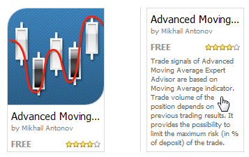
As the full size of the product logo can not exceed 200x200 pixels (actually the size for the exhibition on the main showcase is even smaller than that) it is very important to make the most out of a very limited space so potential buyers get the right first impression. For instance, let's take a look at the Expert Advisor Advanced Moving Average. Not only it has a beautifully designed logo but also a brief explanation of its main idea comes up when the cursor hover over it.
To find another example, we shall look for a program by the word "trend" and we will then see that the search result contains more than 50 applications. Let's choose one row on the showcase and will look at product icons and brief descriptions. For a convenient comparison icons show first and then under each picture we can see the description.
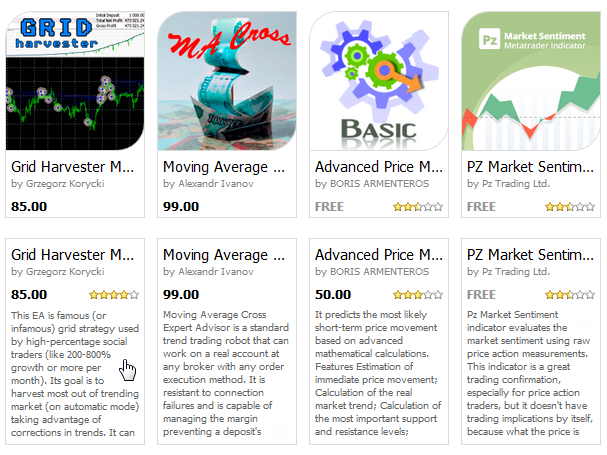
The logos of majority of the programs do not tell a lot to the customers and the descriptions do not cover the concept of the programs. It is obvious that a potential buyer will get very little from both the logo and the description.
It cannot be stressed enough that if you want traders to visit the page with your product, the first thing you need is the right logo for the Market showcase. Otherwise they will overlook it and will be interested with a better designed programs. On the Market showcase your product is presented by a small icon which is its business card and the first thing that customers see.
Now you know why the product logo can directly influence the number of downloads on the Market. Let's see how to create one that will really work for the program.
How to Create the Right Logo
As far as the graphics format is concerned, the best thing to do is to use PNG format because it allows to keep the quality high both at editing and transferring files. We strongly recommend you to refrain from using JPG.
A good logo should be simple and describe the basic idea of the product. Fine details are also inadvisable because they are usually difficult to make out. A picture overloaded with too many colors and graphic effects will not serve as a good logo either. Ideally, 3-4 colors and a couple of recognizable images are enough to design a logo. Trade terms, wildly used and familiar to every trader, could be used in the inscription. They will play a significant role in conveying the idea of the product. For example, Buy, Sell etc. Serif fonts are better be avoided. Keep it simple so everyone can read the logo.
For example, if the advertised trading robot is trading in the trend channel, then both images of the channel and the trend with marked Buy and Sell points could be used. Here are some examples of good logos:
![]()
These logos give a good idea of the purpose of the programs, are not overloaded with colours and details. Though some of them could do with a more detailed text as there is enough space for it. On the Spread Recorder logo an image of a spread between two prices would look good and it would certainly help to visualize the idea of "recording into a file".
Images of money, heaps of gold and glare are better be avoided. It does not only give zero information about the product but also does not go down well with the potential buyers who know well that "All that glitters is not gold". Examples of tasteless logos:
![]()
Using cartoon characters, cute animals or "cool pictures found in the internet" for a logo is also a bad idea. When people visit Market, they come for certain things that they need; and a gallery of fancy pictures is not what they are looking for. Examples of bad logos:
![]()
A logo can be a failure simply because it is difficult to understand. Either the picture is too small and blurred or it is something irrelevant to the whole thing.
![]()
Summing up, the right logo for your product:
- describes the main concept of the product;
- does not contain vague, tacky, hard to understand or indecent pictures;
- does not contain fine elements difficult to distinguish;
- has few coordinated colours;
- can contain brief text, easy to read and understand;
Commission your Logo to a Professional
A logo that would do the work is not that easy to design as it may seem, especially, if you are not a professional designer. The simplest thing to do in this case will be to commission a logo for your product to those who can do it professionally. In the section Freelance you can not only order programs for MetaTrader terminal but can also try to find a designer there.
In addition to that, you can find a designer on one of the multiple field - specific platforms. Here are some useful links:
You Can Add Up To 12 Screenshots to the Description, Use this Opportunity
It is advisable to use a standard color scheme "Black and White" (black on white background) when getting screenshots of the charts. This scheme matches the store showcase design best of all. It also means that you will avoid unwillingly displeasing customers with a weird color set.
Each product on MetaTrader Market has an allowance of 12 screenshots of 640x480 pixels in size. It is essential to show the full capacity of your product on the product page so a potential buyer can get a clear idea of it. If you publish a program for pattern recognition, show a few recognized patterns on the chart. Make large screenshots and provide sufficient explanatory comments.
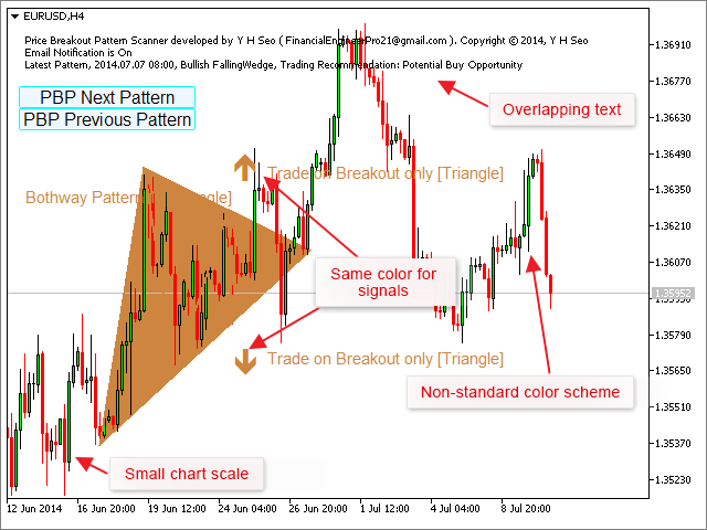
Fitting a lot of tiny details in one screenshot is not going to help either. Here is an example of what should be avoided:

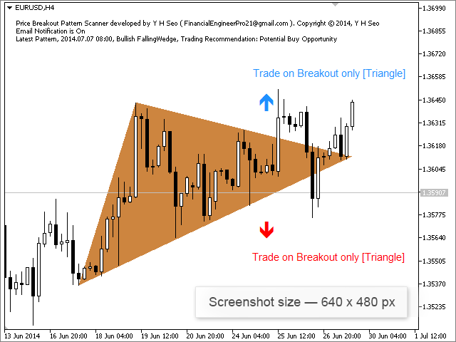
The product description would have gained if instead of one screenshot the developer had provided two or three ones with larger pictures of recognised patterns and a readable text. It concerns price charts too. Choose larger scales and let your potential customers see details. We do not recommend you to use unusual color schemes without any particular need. Please make sure that the text of the comment (message from the comment function) does not overlap a part of the chart. Using standard colors such as blue and red for highlighting signals to buy and sell is what we would recommend. Data on the screenshot below is not presented efficiently.
After it has been reworked, we can see an improved version.
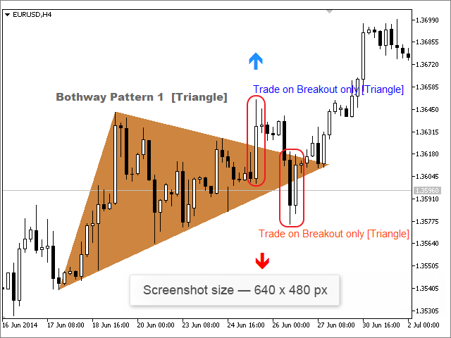
The designer opted for a larger scale of the chart and standard color scheme "Black and White". The name of the chart was removed, the font and color of the pattern name was changed and the points of the triangle breakout were contoured red. The arrows of the triangle breakout have traditional colors. Such a screenshot does not have excessive details and demonstrates the main idea only.
Please remember that looking through screenshots gallery is the first and the easiest thing to do for a potential customer when they are on a product page. They may never get to read the description if the illustrations do not inspire to do so.
Logo Size Requirement is 200x200 Pixels
A large logo for the Market section must be 200x200 pixels in size. A small logo presented in the Client Terminal must be 60x60 pixels. When uploading the large logo the system automatically uses it to create the small one. However, to avoid loosing bits of important information at automated conversion, it is advisable to have both logos created manually.
The recommended graphic file format is PNG. Formats GIF, JPG and JPEG are allowed but not desirable.
Screenshots Size Requirement is 640x480 Pixels
Each product description can contain up to 12 screenshots illustrating its features. The screenshots are crucial to be of an exact size of 640x480 pixels.
Similar to the logo requirement, the preferred graphic file format for illustrations is PNG. Formats GIF, JPG, JPEG are allowed but not desirable.
It is highly non advisable to downsize large pictures to the required format as most of the time it leads to the loss of quality and sharpness. Taking a screenshot of a chart (terminal, tester etc) with previously set chart size will have a better outcome. Working this way round there will be no need to compress a picture to the required 640x480 pixels.
How to Take Testing Screenshots
An Expert Advisor (trading robot) is the most popular product on the market. Majority of developers use screenshots from the tester to go with the product description. Take a number of screenshots that illustrate the whole testing process and show them in the right order.
- Tester settings for a single test.
- Expert parameters for a single test.
- Test report.
If you wish to demonstrate the Expert Advisor optimization procedure add also:
- Tester settings for the optimization of the Expert Advisor parameters.
- Expert Advisor parameters range and a change step for optimization.
- Optimization results.
A number of consecutive pictures provides a sufficient explanation even without reading through a description. Both the tester settings and Expert Advisor parameters could be shown on one screen shot. At the same time everything has to be done correctly. A vast majority of developers take screenshots without thinking about the quality too much. They take a screenshot and then compress it down to the required size using an editor. As the result the picture becomes the right size but loses sharpness.
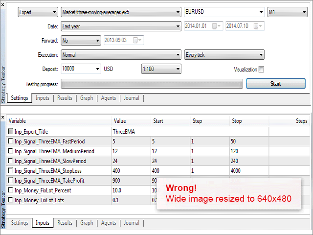
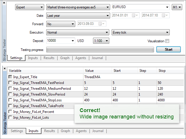
The picture lost quality but not quite through the fault of the developer. They have made the terminal as narrow as possible, however, the width of the screenshot exceeded 640 pixels and, respectively, the picture just got compressed to the right size. Actually, in this case editing the screenshot in a graphic editor instead of compressing the picture would have been a more efficient solution. It would have taken only making control buttons in the tester settings narrower and deleting the unnecessary "Steps" column from the Expert Advisor parameters. In the end we would have got a picture of a better quality.
Test results and the balance chart could also be combined.
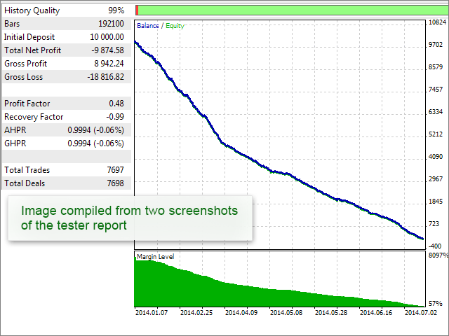
Trade reports and entry distribution by hours/days graphs could be shown together without quality loss.
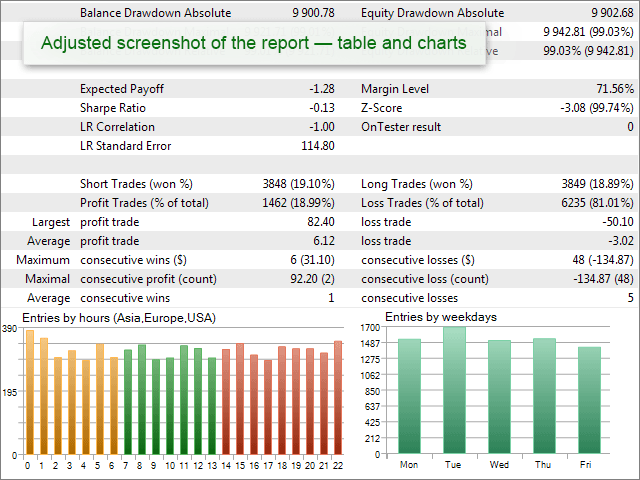
The rest of the graphs from the test report can be put together.
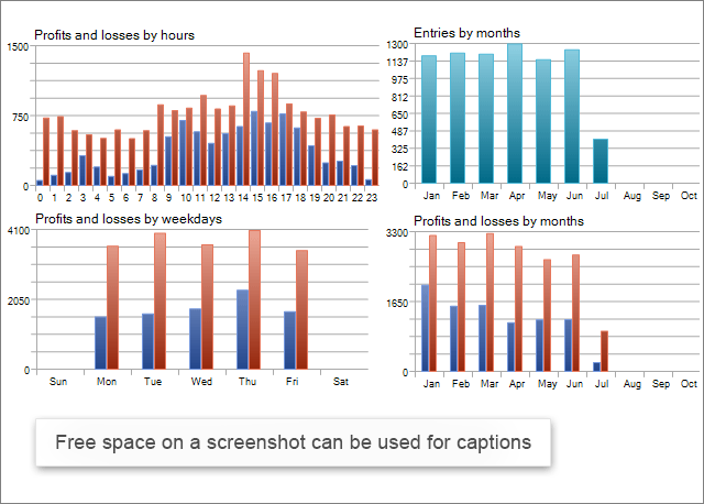
As you can see, there are means of showing the test results and keeping the data as initially designed without compressing screenshots.
Use Right Illustration on the Market
You can do your best to write and test a brilliant program for the Market but if it is not attracting customers and not getting purchased, all your efforts will be wasted. To appeal to a potential buyer so they download your application to the MetaTrader terminal, your product has to stand out of hundreds of others on the Market showcase. Therefore, the right logo is the key to success for your program.
The second important thing is well designed illustrations to the description page on the Market which should show the capacity of your product and its competitive advantage. Please remember that it is difficult to make good illustrations for a program with an awful graphic interface.
Here are a few more articles covering the role of the product design in sales that you may find useful:
- App Store Marketing Guidelines - a guide for developers of iOS applications.
- Graphic assets, screenshots, and video a guide for Android developers
- 10 Mistakes in Icon Design - the article was written back in 2008 but still stays topical
- 5 Simple Steps to the Perfect App Store Screenshots - is about how to take screen shots for games
Finally, the last but not the least. Learn by examples. Find well designed products on the Market and adopt best practice. Skillful presentation of your product on the Market will help you win customers and increase the number of downloads and sales!
We also recommend following articles dedicated to Market: