Advanced resampling and selection of CatBoost models by brute-force method
Maxim Dmitrievsky | 8 December, 2020
Introduction
In the previous article, I tried to provide a general idea about the main machine learning model creation steps and its further practical use. In this part, I want to switch from naive models to statistically significant ones. Since the creation of a machine learning-based trading system is not a trivial task, we will start with some data preparation improvements which will assist in achieving optimal results. Various resampling techniques can be used to improve the presentation of the source data (training examples). One of such techniques will be discussed in this article.
A simple random sampling of labels used in the previous article has some disadvantages:
- Classes can be imbalanced. Suppose that the market was mainly growing during the training period, while the general population (the entire history of quotes) implies both ups and downs. In this case, naive sampling will create more buy labels and less sell labels. Accordingly, labels of one class will prevail over another one, due to which the model will learn to predict buy deals more often than sell deals, which however can be invalid for new data.
- Autocorrelation of features and labels. If random sampling is used, the labels of the same class follow one another, while the features themselves (such as for example, increments) change insignificantly. This process can be shown using an example of a regression model training - in this case it will turn out that autocorrelation will be observed in the model residuals, which will lead to a possible model overestimation and overtraining. This situation is shown below:
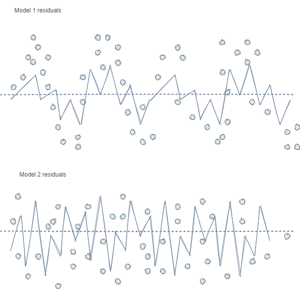
Model 1 has autocorrelation of residuals, which can be compared to model overfitting on certain market properties (for example, related to the volatility of training data), while other patterns are not taken into account. Model 2 has residuals with the same variance (on average), which indicates that the model covered more information or other dependencies were found (in addition to the correlation of neighboring samples).
The same effect is also observed for classification, though it is less intuitive because it has only a few classes, in contrast to a continuous variable used in regression models. However, the effect can still be measured, for example, by using Pearson residuals and similar metrics. These dependencies (as in Model 1) should be eliminated.
- Classes can overlap significantly. Imagine a hypothetical 2D feature space (multidimensional spaces is more complex), each point of which is assigned to class 0 or 1.
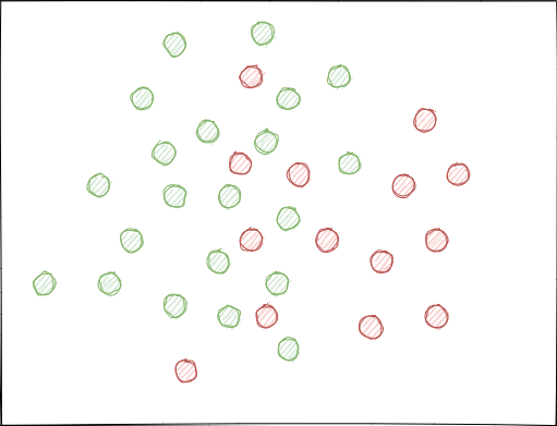
When using random sampling, sets of examples can intersect. This may lead to a decrease in the distance (say, Euclidean distance) between points of different classes and to an increase in the distance between points of the same class, which leads to the creation of an overly complex model at the training stage, having many boundaries separating the classes. Small deviations in features cause jumps in model predictions from class to class. This effect ruins the model stability on new data and must be eliminated.
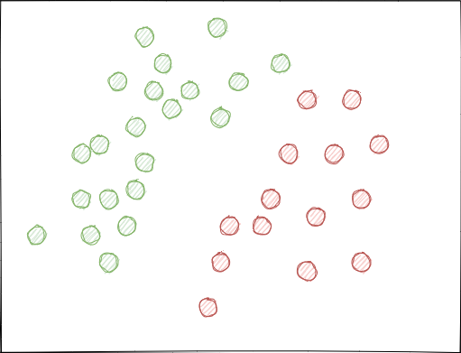
Ideally, class labels should not intersect in the feature space and should be separated either linearly (as is shown below) or by any other simple method. This solution would provide greater model stability on new data.
Analysis of the original GIGO dataset
Modified and improved functions from the previous part are used in this article. Load the data:
LOOK_BACK = 5
MA_PERIODS = [15, 55, 150, 250]

SYMBOL = 'EURUSD'
MARKUP = 0.00010
TIMEFRAME = mt5.TIMEFRAME_H1
START_DATE = datetime(2020, 1, 1)
TSTART_DATE = datetime(2015, 1, 1)
STOP_DATE = datetime(2021, 1, 1)

# make dataset
pr = get_prices(START_DATE, STOP_DATE)
pr = add_labels(pr, min=10, max=25, add_noize=0)
res = tester(pr, plot=True)
pca_plot(pr)
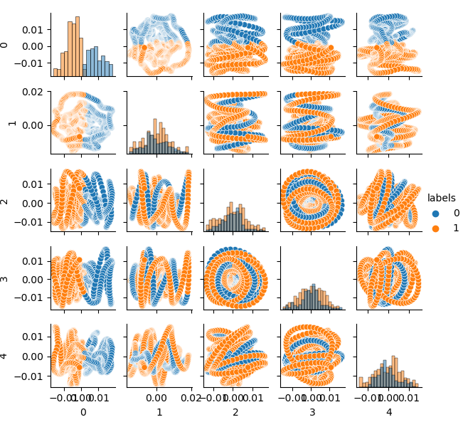
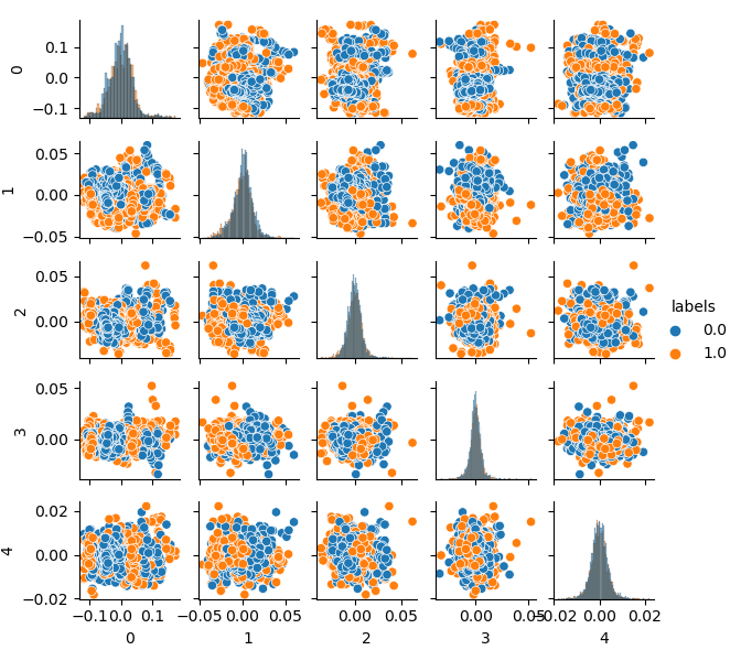
Since dimension of the original dataset is 20 features (loock_back * len(ma_periods)) or any other large one, it is not very convenient to display it on a plane. Let us use the PCA method and display only 5 main components, which will allow to compact the feature space with the least information loss:
If you are not familiar with PCA (Principal Component Analysis), please search in Google.
def pca_plot(data):
    from sklearn.decomposition import PCA
    pca = PCA(n_components = 5)
    components = pd.DataFrame(pca.fit_transform(data[data.columns[1:-1]]))
    components['labels'] = data['labels'].reset_index(drop = True)
    import seaborn as sns
    g = sns.PairGrid(components, hue="labels", height=1.2)
    g.map_diag(sns.histplot)
    g.map_offdiag(sns.scatterplot)
    g.add_legend()
    plt.show()
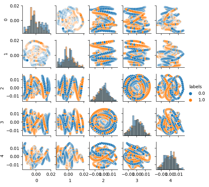
Now you can see the dependence of each component on the other: this is the 2D feature space, labeled into classes 0 and 1. Component pairs form loops, which are not similar to the usual point cloud. This is caused by the autocorrelation of points. The rings will disappear if you thin out the row. Another fact is that the classes overlap strongly. I order to classify the labels with the least error, the classifier will have to create a very complex model, with a lot of dividing boundaries. We can say that the original dataset is just garbage, and the rule states Garbage in — Garbage out (GIGO). To avoid the GIGO philosophy and to make the research more meaningful, I suggest improving the representation of original data for a machine learning model (for example, CatBoost)
Ideal feature space
In order to effectively divide the feature space into two classes, we can implement clustering for example, using the K-means method. This will give an idea of how the feature space could be ideally divided.
The source dataset is clustered into two clusters; five main components are displayed:
# perform K-means clustering over dataset
from sklearn.cluster import KMeans
pr = get_prices(look_back=LOOK_BACK)
X = pr[pr.columns[1:]]
kmeans = KMeans(n_clusters=2).fit(X)
y_kmeans = kmeans.predict(X)
pr['labels'] = y_kmeans
pca_plot(pr)
The feature space looks ideal, but class labels (0, 1) obviously do not correspond to profitable trading. This example only illustrates a more preferred feature space than the GIGO dataset. That is why we need to create a compromise between ideal and garbage data. This is what we are going to do next.
Generative model for resampling training examples
“What I cannot create, I do not understand.”
—Richard Feynman
In this section, we will consider a model that learns to "understand" data and to recreate new ones.
The k-means clustering method is relatively simple and easy to understand. However, it has a number of disadvantages and is not suitable for our case. In particular, it has poor performance in many real-world cases because it is not probabilistic. Imagine that this method places circles (or hyperspheres) around a given number of centroids with a radius which is determined by the outermost point of the cluster. This radius strictly limits the set of points for each cluster. Thus, all clusters can only be described by circles and hyperspheres, while real clusters do not always satisfy this criterion (as they can be oblong or in the form of ellipses). This will cause overlapping of different cluster values.
A more advanced algorithm is the Gaussian Mixture Model. This model searches for a mixture of multivariate Gaussian probability distributions that best models the dataset. Since the model is probabilistic, this outputs the probabilities of an example being categorized as a particular cluster. In addition, each cluster is associated not with a strictly defined sphere, but with a smooth Gaussian model, which can be represented not only as circles, but also as ellipses which are arbitrarily oriented in space.
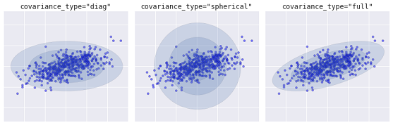
Different kinds of probabilistic models, depending on covaiance_type
Below is a comparison of clusters obtained by k-means and GMM (source):
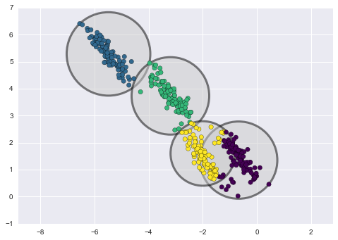
K-means clustering
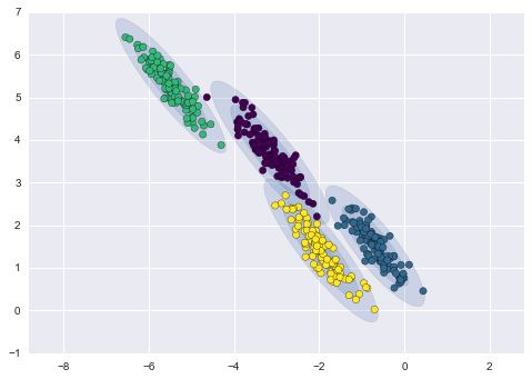
GMM clustering
In fact, the Gaussian Mixture Model (GMM) algorithm is not really a clusterizer, because its main task is to estimate the probability density. Clusters in this model are represented as data generated from probability distributions describing this data. Thus, after estimating the probability density of each cluster, new datasets can be generated from these distributions. These sets will be similar to the original data, but they have more or less variability and will have less outliers. Moreover, datasets in many cases will be less correlated. We can obtain random examples and then train the CatBoost classifier using these examples.
Pipeline for iterative resampling of the original dataset and CatBoost model training
Firstly, it is necessary to cluster the source data, including class labels:
# perform GMM clustering over dataset
from sklearn import mixture
pr_c = pr.copy()
X = pr_c[pr_c.columns[1:]]
gmm = mixture.GaussianMixture(n_components=75, covariance_type='full').fit(X)
The main parameter which can be selected is n_components. It was empirically set to 75 (clusters). Other parameters are not so important and are not considered here. After the model is trained, we can generate some artificial samples from the multivariate distribution of the GMM model and visualize several main components:
# plot resampled components
generated = gmm.sample(5000)
gen = pd.DataFrame(generated[0])
gen.rename(columns={ gen.columns[-1]: "labels" }, inplace = True)
gen.loc[gen['labels'] >= 0.5, 'labels'] = 1
gen.loc[gen['labels'] < 0.5, 'labels'] = 0
pca_plot(gen)
Please note that labels have also been clustered, and thus they no longer represent a binary series. The labels are again converted to values (0;1) in the above code. Now, the resulting feature space can be displayed, using the pca_plot() function:
If you compare this diagram with the earlier presented GIGO dataset diagram, you can see that it does not have data loops. Features and labels have become less correlated, which should have a positive effect on the learning result. At the same time, labels sometimes tend to form denser clusters and the model may turn out to be simpler, with fewer dividing boundaries. We have partly achieved the desired effect in eliminating problems with garbage data. Nevertheless, the data is essentially the same. We have simply resampled the original data.
Provided that GMM generates samples randomly, this leads to data pluralism. The best model can be selected using brute force. A special brute force function has been written for this purpose:
# brute force loop
def brute_force(samples = 5000):
    # sample new dataset
    generated = gmm.sample(samples)
    # make labels
    gen = pd.DataFrame(generated[0])
    gen.rename(columns={ gen.columns[-1]: "labels" }, inplace = True)
    gen.loc[gen['labels'] >= 0.5, 'labels'] = 1
    gen.loc[gen['labels'] < 0.5, 'labels'] = 0
    X = gen[gen.columns[:-1]]
    y = gen[gen.columns[-1]]
    # train\test split
    train_X, test_X, train_y, test_y = train_test_split(X, y, train_size = 0.5, test_size = 0.5, shuffle=True)
    #learn with train and validation subsets
    model = CatBoostClassifier(iterations=500,
                            depth=6,
                            learning_rate=0.1,
                            custom_loss=['Accuracy'],
                            eval_metric='Accuracy',
                            verbose=False,
                            use_best_model=True,
                            task_type='CPU')
    model.fit(train_X, train_y, eval_set = (test_X, test_y), early_stopping_rounds=25, plot=False)
    # test on new data
    pr_tst = get_prices(TSTART_DATE, START_DATE)
    X = pr_tst[pr_tst.columns[1:]]
    X.columns = [''] * len(X.columns)

    #test the learned model
    p = model.predict_proba(X)
    p2 = [x[0]<0.5 for x in p]
    pr2 = pr_tst.iloc[:len(p2)].copy()
    pr2['labels'] = p2
    R2 = tester(pr2, MARKUP, plot=False)

    return [R2, samples, model]
I have highlighted the main points in the code. First, it generated n random examples from the GMM distribution. Then the CatBoost model is trained using this data. The function returns the R^2 score calculated in the tester. Pay attention that the model is tested not only using the training period data, but it also uses earlier data. For example, the model was trained on data since early 2020, and it was tested using data since early 2015. You can change the date ranges as you like.
Let us write a loop that will call the specified function several times and will save each pass results to a list:
res = []
for i in range(50):
    res.append(brute_force(10000))
    print('Iteration: ', i, 'R^2: ', res[-1][0])


res.sort()
test_model(res[-1])
Then the list is sorted and the model at the end of the list has the best R^2 score. Let us display the best result:
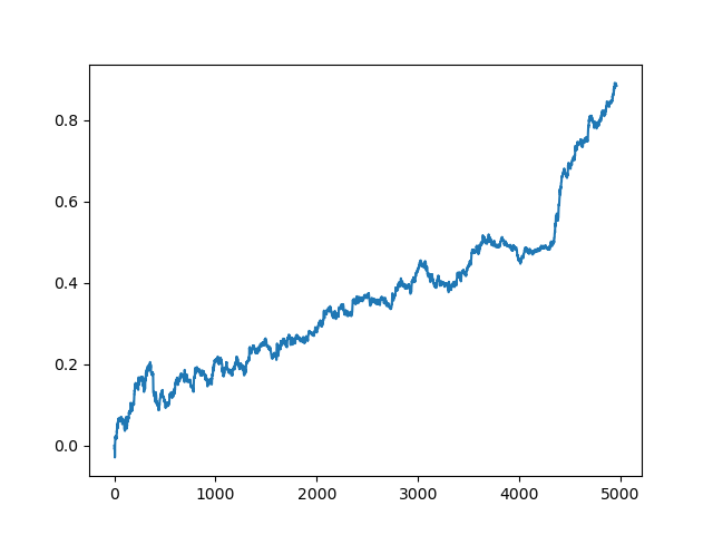
The last (right) part of the graph (about 1000 deals) is a training dataset, from the beginning of 2020, while the rest uses new data that was not used in model training. Since the models are sorted in ascending order, according to the R^2 metric, we can test previous models with a lower score:
test_model(res[-2]) 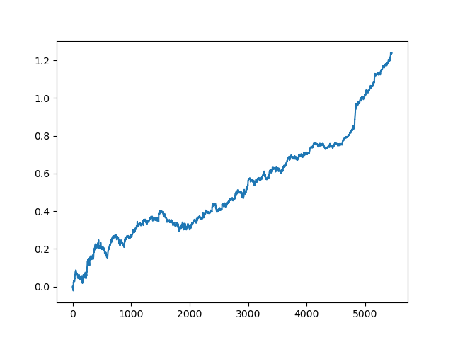
You can also look at the R^2 score itself:
>>> res[-2][0]
0.9576444017048906
As you can see, now the model is tested on a long five-year period, although it was trained on a one-year period. Then, the model can be exported to MQH format. The CatBoost model object is located in the nested list, with index 2 - the first dimension contains model numbers. Here we export the model with the index [-2] (the second from the end of the sorted list):
# export best model to mql
export_model_to_MQL_code(res[-2][2])
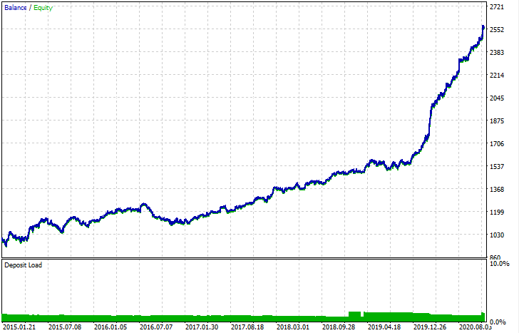
After export, the model can be tested in the standard MetaTrader 5 Strategy Tester. Since the spread in the custom tester was less than the real one, the curves are slightly different. Nevertheless, their general shape is the same.
How can the models be improved?
Model training implies many random components which are every time different. For example, random sampling of deals, GMM training (which also has an element of randomness), random sampling from the posterior GMM distribution and CatBoost training which also contains an element of randomness. Therefore, the entire program can be restarted several times to get the best result. If a stable model cannot be obtained, you should adjust the LOOK_BACK parameter and the number of moving averages and their periods. You can also change the number of samples received from GMM, as well as the training and testing intervals.
Change log and code refactoring
Some changes have been made to the Python code of the program. They require some clarification.
Now, a list of moving averages with different averaging periods can be set. A combination of several MAs usually has a positive effect on training results.
MA_PERIODS = [15, 55, 150, 250]
Added configurable start date for testing process, model evaluation and selection.
TSTART_DATE = datetime(2015, 1, 1)
The random sampling function has undergone a number of changes. Added the add_noize parameter, which allows you to add noise to the original dataset. This will make trading less ideal by adding drawdowns and mixing deals. Sometimes, a model can be improved on new data by introducing an error at the level of 0.1 - 02.
Now the spread is taken into account. The trades which do not cover the spread are marked with a label of 2.0, and are then deleted from the dataset due to being uninformative.
def add_labels(dataset, min, max, add_noize = 0.1):
    labels = []
    for i in range(dataset.shape[0]-max):
        rand = random.randint(min, max)
        curr_pr = dataset['close'][i]
        future_pr = dataset['close'][i + rand]

        if future_pr + MARKUP < curr_pr:
            labels.append(1.0)
        elif future_pr - MARKUP > curr_pr:
            labels.append(0.0)
        else:
            labels.append(2.0)
    dataset = dataset.iloc[:len(labels)].copy()
    dataset['labels'] = labels
    dataset = dataset.dropna()
    dataset = dataset.drop(dataset[dataset.labels == 2].index).reset_index(drop=True)

    if add_noize==0:
        return dataset

    # add noize to samples
    noize_b = dataset[dataset.labels == 0]['labels'].sample(frac = add_noize)
    noize_s = dataset[dataset.labels == 1]['labels'].sample(frac = add_noize)
    noize_b = noize_b+1
    noize_s = noize_s-1
    dataset.update(noize_b)
    dataset.update(noize_s)
    return dataset
The test function now returns the R^2 score:
def tester(dataset, markup = 0.0, plot = False):
    last_deal = int(2)
    last_price = 0.0
    report = [0.0]
    for i in range(dataset.shape[0]):
        pred = dataset['labels'][i]
        if last_deal == 2:
            last_price = dataset['close'][i]
            last_deal = 0 if pred <= 0.5 else 1
            continue
        if last_deal == 0 and pred > 0.5:
            last_deal = 1
            report.append(report[-1] - markup + (dataset['close'][i] - last_price))
            last_price = dataset['close'][i]
            continue
        if last_deal == 1 and pred < 0.5:
            last_deal = 0
            report.append(report[-1] - markup + (last_price - dataset['close'][i]))
            last_price = dataset['close'][i]

    y = np.array(report).reshape(-1,1)
    X = np.arange(len(report)).reshape(-1,1)
    lr = LinearRegression()
    lr.fit(X,y)

    l = lr.coef_
    if l >= 0:
        l = 1
    else:
        l = -1

    if(plot):
        plt.plot(report)
        plt.show()

    return lr.score(X,y) * l
Added a helper function for data visualization through the main component method. This may assist in better understanding your data.
def pca_plot(data):
    from sklearn.decomposition import PCA
    pca = PCA(n_components = 5)
    components = pd.DataFrame(pca.fit_transform(data[data.columns[1:-1]]))
    components['labels'] = data['labels'].reset_index(drop = True)
    import seaborn as sns
    g = sns.PairGrid(components, hue="labels", height=1.2)
    g.map_diag(sns.histplot)
    g.map_offdiag(sns.scatterplot)
    g.add_legend()
    plt.show()
The code parser has been extended. Now it takes into account all periods of moving averages, which are added to the MQL program, after which the fill_arrays function forms a feature vector.
def export_model_to_MQL_code(model):
    model.save_model('catmodel.h',
           format="cpp",
           export_parameters=None,
           pool=None)

    # add variables
    code = 'int ' + 'loock_back = ' + str(LOOK_BACK) + ';\n'
    code += 'int hnd[];\n'
    code += 'int OnInit() {\n'
    code +=     'ArrayResize(hnd,' + str(len(MA_PERIODS)) + ');\n'

    count = len(MA_PERIODS) - 1
    for i in MA_PERIODS:
        code +=     'hnd[' + str(count) + ']' + ' =' + ' iMA(NULL,PERIOD_CURRENT,' + str(i) + ',0,MODE_SMA,PRICE_CLOSE);\n'
        count -= 1

    code += 'return(INIT_SUCCEEDED);\n'
    code += '}\n\n'

    # get features
    code += 'void fill_arays(int look_back, double &features[]) {\n'
    code += '   double ma[], pr[], ret[];\n'
    code += '   ArrayResize(ret,' + str(LOOK_BACK) +');\n'
    code += '   CopyClose(NULL,PERIOD_CURRENT,1,look_back,pr);\n'
    code += '   for(int i=0;i<' + str(len(MA_PERIODS)) +';i++) {\n'
    code += '       CopyBuffer(hnd[' + 'i' + '], 0, 1, look_back, ma);\n'
    code += '       for(int f=0;f<' + str(LOOK_BACK) +';f++)\n'
    code += '           ret[f] = pr[f] - ma[f];\n'
    code += '       ArrayInsert(features, ret, ArraySize(features), 0, WHOLE_ARRAY); }\n'
    code += '   ArraySetAsSeries(features, true);\n'
    code += '}\n\n'
Conclusion
This article demonstrated an example of how to use a simple generative model - GMM (Gaussian Mixture Model) for resampling the original dataset. This model allows improving the performance of the CatBoost classifier on new data, by improving the characteristics of the feature space. For selecting the best model, we have implemented an iterative data resampling, with the possibility to select the desired result.
This was a kind of breakthrough from naive models to meaningful ones. By spending a minimum of effort for developing a logical component of a trading strategy, you can get interesting machine learning-based trading robots.