Analyzing charts using DeMark Sequential and Murray-Gann levels
Oleh Fedorov | 13 January, 2021
Introduction
Thomas DeMark is one of the well-known authors writing about trading. In his book "The New Science of Technical Analysis", DeMark describes several techniques of working with charts. One of them is called Sequential. It focuses on a trend in development — from its inception to the expected reversal. Some time ago, I developed an indicator and posted it on the Market — for MQL4 and MQL5.
The feedback from users boiled down to the following: "Hey! You've put great effort into this. But how can I use it for trading? Your indicator has too many icons and arrows, and I didn't understand a thing about the levels in the ninth picture... Please write the manual!"
So, here it is. ;-)
Do you know how typical book titles looked in the 17th century? Something like "A complete instruction on trading using DeMark Sequential written by Oleh Fedorov with his own hand based on the materials of his own research in order to make life of his fellow traders easier". ("Complete" is clearly an overstatement here. In fact, these are the techniques and conclusions that turned out useful for me. I hope, they might be useful for someone else as well).
The article provides several examples of hypothetical trades that could have happened if I had encountered the necessary conditions shown in the images below. ;-) The terminal time is GMT+3, quotes - MetaTrader 5, MetaQuotes-Demo.
Necessary indicators
The article applies two indicators: the aforementioned Sequential (for MQL4 and for MQL5) and the free indicator of controlled Murray-Gann levels. The indicator level is compatible with MQL5, just place it to the indicator folder and change the extension to *.mq5.
If you wish, you can do without levels. Simply configure the built-in Fibo levels tool. The interval between end points is divided into 8 parts (1/8 = 0.125), and 2 lines are added to its top and bottom: ±1/8 and ±2/8.
Or you can use any other level indicators — the principles described in the article work for them as well. The main thing is that these levels help you identify the price position more accurately than simply "up" or "down". In other words, they answer the questions "where exactly up" or "where exactly down".
In addition, I have prepared the library, which allows changing timeframes and drawing different sets of straight lines by pressing the keys. Click the above link to find the description and the ready-made solution. If you are not interested in programming graphics, you can skip the article, download the archive file and unpack it into the necessary folder. If the chart features an EA with its source code available to you, you can include the library into it as described in the first part of the article. If not, use the Shortcuts.mq5 file (or Shortcuts.mql4, depending on the terminal version).
Sequential
This approach to market analysis consists of several stages.
- At the first stage, an imbalance is identified — the price starts moving in some direction faster than before and the close bar of the last formed bar turns out to be higher or lower than the close price four bars before it (the Setup_Distance variable in the indicator). This is how the Setup preparation starts. Such candles are bright green and gold and are marked with a thumb up or down, respectively. Further on, I will call them "breakout" or "start" candles.
- The second stage is trend detection. For its full completion, the same "setup" rule should be fulfilled nine candles in a row (Setup_Limit parameter) or more: the close price of the last formed candle should be more extreme than the one closed four candles before. Such a candle is marked with a multi-rayed star at its top.
- At the third stage, we need to get confirmation that the fast movement segment is formed. In fact, there should be a slight correction. DeMark recommends waiting for the intersection, at which the minimum price (during the uptrend) of the current or previous bars is less than the maximum of one of the previous bars starting from the third one (Intersection_Min_Distance). This case is marked as a filled rectangle between the corresponding prices. In the indicator's voice messages and in the explanatory figure, this stage is called "Crossover".
- The fourth stage starts the countdown (Countdown). During this period, the close price of the last formed bar is compared with the minimum (during a downtrend) or maximum price (during an uptrend) for a bar located at the distance of two bars from the current one (Countdown_Distance). When the thirteenth bar (Countdown_Limit) fulfilling these conditions is formed (closing is more extreme than the second candlestick on the left), the signal arrow is displayed.
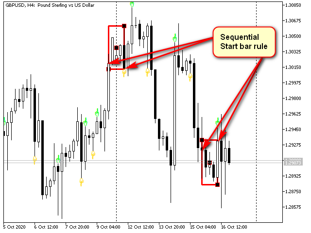
Fig. 1. Start bar rule
As we can see, there are lot of such bars. Technically, it is possible to leave only the ones defining the next stage but I decided not to do that, because in some strategies it is better to use them in this form. When they are not needed, they can simply be turned off by the Show_Setup_Start parameter.
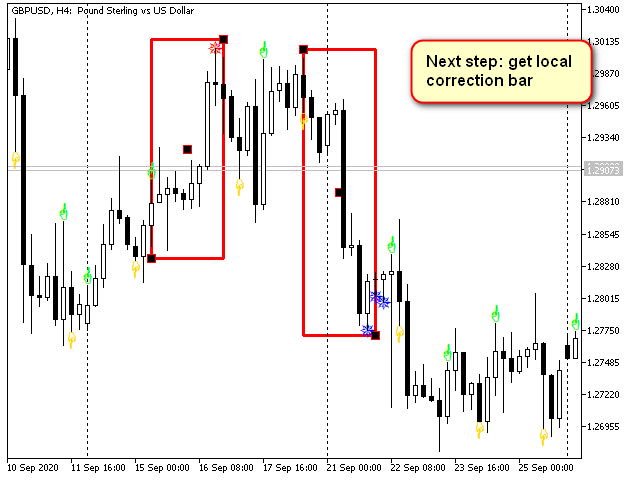
Fig. 2. Setup rule
Such a candle is often followed by a local correction or even a global reversal.
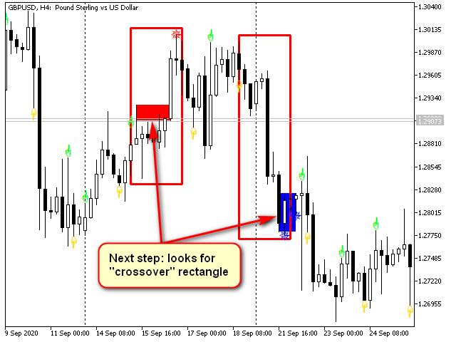
Fig. 3. Intersection. In figures and indicator voice messages, it is sometimes referred to as "Crossover"
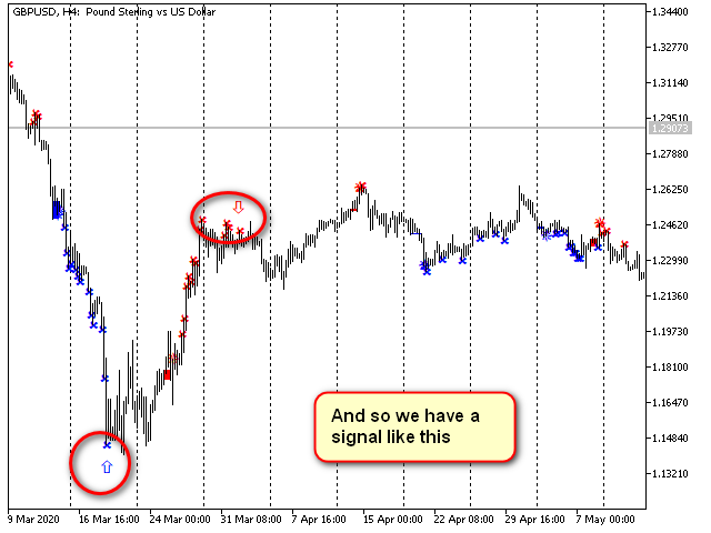
Fig. 4. Countdown and the signal arrow mark the end of the countdown stage
In addition to 13, the values of 9, 17, 20... also work well for Countdown_Limit. There is no point in using values less than 1.
Thomas DeMark's vision on trading
Demark offers the following rules for applying this method:
- Stop loss order — at a level higher for the main sell deal, or lower — for buying — at the extreme level of the most extreme candle for the entire period of the pattern formation. The stop size is equal to the candle true range or the difference between the closing price and the extreme of the same candle.
- The entry is performed in one of three ways:
- by the bar open price following the signal one;
- or by the bar open price following the "bounce" (the bar close price is more extreme than the close price 4 bars ago, as in the first stage);
- the last bar of the close price is more extreme than the extremum of the bar located at a distance of 2.
- The exit also has two options:
- if a new setup (consisting of 9 bars) is complete in the opposite direction, but the extremum of the signal set is not broken (Exit 1 in the figure);
- if the extremum of the signal set is broken and a new arrow is formed (trend reversal signal). It is marked as Exit 2 in the figure.

Fig. 5. Sample deal based on Sequential signal
Exit - according to the rule 1 (setup completion without crossing the extremum)

Fig. 6. Sample deal based on Sequential signal
Exit - according to the rule 2 (a new opposite signal appears after the setup extremum is crossed)
The profit/loss ratio in such trading is approximately 2/1. Most often, the signal arrives at a local extremum. Entries and exits are clear... All seems to be good. However, there are several subtleties I am not happy with.
Drawbacks of the original way of using Sequential
Let's continue analyzing the segment from the last screenshot. Suppose that we have selected the entry method 2 — breaking two candles. The buy deal was complete on 10.12.2019 at 12:00. According to the sell rules, the next deal occurs after the big engulfing candle on 11.12.2019 at 0:00 at the open price. However, it ends with a triggered stop level at 20:00 on the same day or 00:00 on the next one. There is nothing special about that. After all, this is why stop levels are set in the first place...
The price moves 355 points upwards from the entry point without us.
This is good since we have already cut the losses.
Then the price reverses and goes down in the direction initially showed by the signal...
Naturally, we do not perform any actions since there is no signal. Discipline comes first. The movement takes approximately 570 points but, as we know, the greed is bad for your deposit...
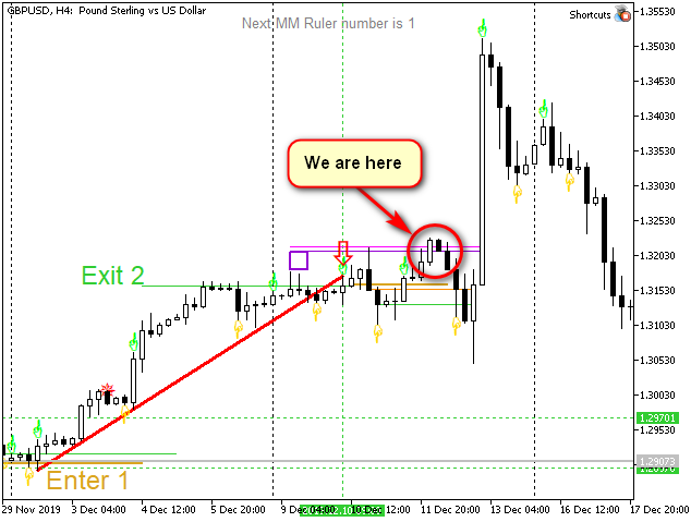
Fig. 7. Sample deal based on Sequential signal.
Stop Loss order has been triggered
So now we are simply waiting for a signal. How long? Well, until it comes...
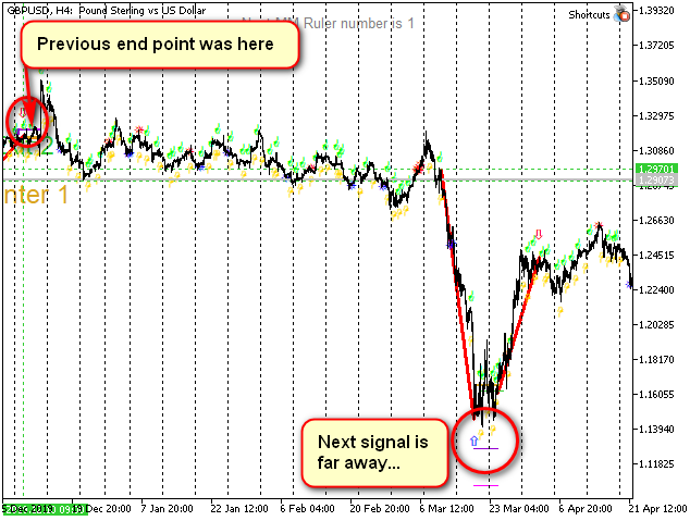
Fig. 8. The next signal is very far away.
Although the previous signal has been correct, we have not managed to capture the movement
due to the triggered stop loss
Considering the scale, it comes in 15 weeks. This is approximately 415 bars. 2000 points.
Ok, let's trade other pairs for now — not a big deal... Or switch to lower timeframes, they should have more signals...
We have finally arrived to the expected point 18:03:2020 16:00. The blue arrow appears and we manage to trade the upward movement till 25.03.2020 20:00 when we exit upon the "setup" completion since the setup extremum is far from broken.
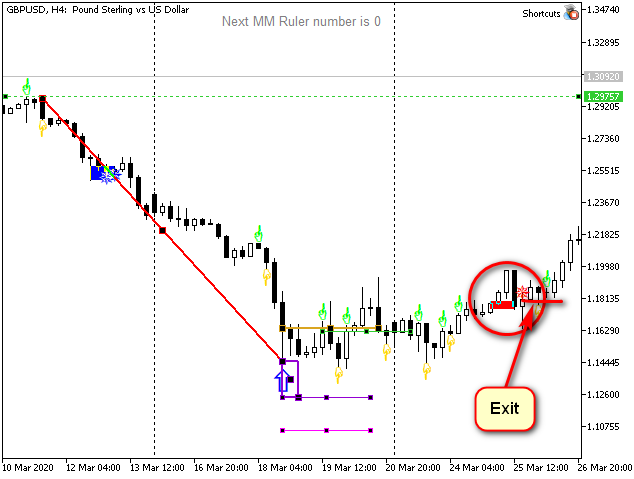
Fig. 9. Sample deal based on Sequential signal.
The deal is successful, but the profit is small
Time to wait for the next signal.
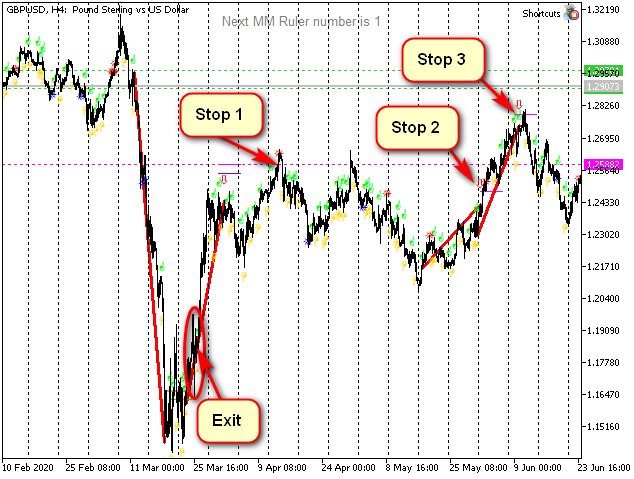
Fig. 10. The signal was correct but we got much less profit than we could.
The next three signals brought three losing deals (the entry points are shown by the ends of the red trend lines)
Next, we get three stops in a row as the uptrend starts but there are no up signals in sight. The uptrend continues but signals persistently show the downward movement (you can check this yourself in the terminal).
At this point, impatient traders who rely solely on indicators will most probably abandon Sequential and bear a grudge against those who sell or even mention it.
Some traders, however, will notice that Sequential, in fact, works well during a flat movement so it is still usable in some instances.
Finally, the most experienced traders will think: "This behavior can also be used during trends. If I measure it correctly..."
My vision on markets and charts
My path as a trader has led me to some pretty strong beliefs (and I know that I am not alone in these beliefs).
The first belief: the price always tends to travel the same distance (both in time and in price) that it has already traveled in that direction. However, it does not always achieve this goal. For the same reason, the levels dividing any range in half are also significant and can be trend reversal points.
The second belief: for those who trade big money, it is very important to have clear guidelines and investment horizons. In the simplest case, these may be tops and bottoms of more or less global extremums. Generally, big players prioritize a signal reliability over profit since they trade on a longer interval. Accordingly, it often happens that on long time intervals money is withdrawn a little earlier than the trend reversal actually occurs, although this reversal can usually be calculated very accurately.
The third belief: the most profitable trading starts at the equilibrium change point and ends at the next similar point to continue in the opposite direction. All indicators (including Sequential) are designed to search for such points.
The fourth belief: each flat is a part of a big trend and each trend is a part of big flat. You can trade both, the main thing is to choose the right scale.
These are the beliefs I am going to use when considering movements marked by Sequential. The conventional approach yields only a part of potential profit. I believe that the indicator has much more opportunities...
"Equilibrium"-based Sequential
First of all, Thomas Demark never recommended using only one indicator. Moreover, he developed dozens of indicators, including REI, DeMarker, etc. For me, this means that any of his indicators usually requires additional support.
Sequential is a fairly lengthy pattern. The minimum time for the formation of a complete pattern is 22 bars (9 from the "setup" and 13 from the countdown set). Accordingly, the movement it tries to describe is meant for the same number of bars — or a very fast price movement. This means we need some kind of benchmarks to help measure both duration and price.
I have selected Murray-Gann levels as reference points. The indicator I have developed (you can find it in the CodeBase) is very flexible: set the necessary starting points, measure time into the future, etc. These levels allow you to immediately see the interval the price is located in. The rules for working with levels are quite simple and do not require huge computing power. Everything becomes visible at once. ;-)
For me, equilibrium (or balance) is a concept that very much depends on the context. It occurs when some processes develop the same way.
For example, almost any candle is unbalanced since it usually has high/low points, as well as open and close price boundaries.
On the other hand, if three consecutive candles are white, then the market was in equilibrium at that time (this is a simple upward trend). If the next candlestick is black, the balance is disturbed.
If the market moves in a certain range, then it is also in equilibrium. A candle closing outside the range violates it.
The same goes for alternating highs and lows... During an uptrend, each subsequent high is higher than the previous one and each subsequent minimum is higher than the previous minimum. If both of these conditions are met, the market is in equilibrium, if at least one is violated, equilibrium is also violated.
In some cases, a candle with a long body, short shadows and a size comparable to ATR can be called balanced. If the candle size is significantly changed (more or less than ATR) or one wick is much longer than the candle body or another wick, the candle is unbalanced.

Fig. 11. Sample balanced and unbalanced structures on charts
I hope the idea is clear.
Generally, imbalance points (or areas):
(а) indicate a possible trend change and
(b) represent strong support/resistance zones for further movements.
Sequential provides four such areas. These areas correspond to the four stages of pattern formation:
- Breakout candle represents a trigger, the first sign of change.
- Completion of "setup" formation is often a pivot point, or at least a correction point.
- Rectangle obtained when searching for the final intersection. It usually indicates a powerful level the price reverts from even if the set is inactive already.
- Signal candle. As shown above, it does not guarantee a reversal, but it acts as a level and a good reference point for calculating further price movement.
Each of these areas can be used profitably.
Breakout candles
First of all, candles are powerful support-resistance zones. Second, measuring the distance from the nearest extremum to the candle extremum allows for reliable forecast of local reversal levels. Finally, we are able to measure the candle itself, which also provides significant levels or the distance between the candles... Generally, this is the most creative part of the work allowing us to describe the future price movement for many bars ahead...
The figure demonstrates all three possibilities.
Fig. 12. Different ways of measuring "breakout" candles.
1, 2 - base points for Murray levels,
3 - base points for verticals with levels 7/8 and 14/8,
4 - the top of the breakout candle is a support level
The red dotted line sets the Murray levels. I have placed these levels from the global extremum in this window (1) up to the nearest yellow breakout candle (2). The range is increased 4 times (the level of 2/8 is taken as the base one). The vertical dotted lines indicate the middle and end of the trend line, as well as the final level point.
Vertical solid lines (3) — sample candle length measurement. The length of these verticals is equal to the length of the candle increased four times. The horizontal lines represent 7/8 (solid ones — from 100%, while dotted ones — from the entire length) of the interval. Start points are marked with arrows. Note how the price interacts with the levels indicated by straight lines (red ellipses).
Finally, the bold orange horizontal line on the right (4) shows how the maximum level of the breakout candle becomes the support level for the subsequent movement.
All these patterns are absolutely typical. I have not chosen the chart deliberately. I have simply used the current GBP chart.
More figures are provided below...
Fig. 13. Another way to draw levels through breakout candles
Fig. 14. Attempt to measure the movement speed
It is clear that in all these cases it is possible to trade by turning off all other imbalance signals — by a rebound, by a level breakout or solely by time (although this is less convenient in most cases)...
Intersection rectangle
Extreme candles of rectangles (Intersection) can be used in exactly the same way. Although, I usually use only a grid of levels from the nearest extremum (not from the beginning of the sequence) for rectangles.
Fig. 15. Measuring the movement up to the intersection extremum (blue trend line)
The highest maximum of all the candles enclosed by the left rectangle is used as the second base point for the blue trend line. You can see how the previous and new construction are matched. This allows us to define where the price is to reverse from (most probably, this will happen from the coupled levels). The range of the blue set of levels is doubled, since the level +2/8 is broken in the original range (candle 08.12.2019). The broken level turned yellow after expanding the range.
Note that both rectangles are broken from top to bottom with a single long candle, but prices still return to their borders and bounce back marking resistance zones.
Signal candle. Searching for patterns
Fig. 10 displays the trend segment, within which signals consistently follow the trend but a stop level is constantly triggered after the entry. How often does this happen?
You do not need Excel to check this. Just look at the chart compressed to the minimum scale at any period.
For example, let's take something different from GBPUSD H4.
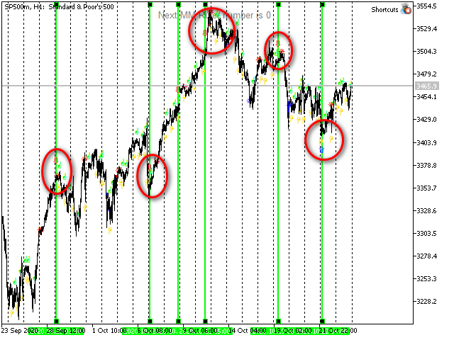
Fig. 16. SP500 H1
We still see that arrows sometimes accurately mark the tops of movements that are large for the current scale. But it would not be reasonable to follow these signals blindly since this is a very leading indicator. :-) Sometimes, you may even want to enter in reverse... Let those that are down show the upward movement and vice versa! Technically, this can be easily done... But I'd better not do that... Instead, I will simply assume that the trend is likely to continue right after the arrow signal for at least one candle.
Things are much better with arrow signals. But they provide no guarantees as well.
Can we disregard them completely?
Yes, we can. But personally, I think it is better to measure them... If we assume that the arrow is a trend continuation signal, then how far will it go?
Signal candle. Sample sequential analysis
Let's have a look at the same chart segment displayed in Fig. 7 (which I criticized so much) using the levels.
Suppose that a movement is formed from 02.12.2019 12:00 up to 10.12.2019 8:00. We have closed the position according to Sequential rules. So we need to figure out what to do next.
Let's divide the full range of the entire model using Murray-Gann levels.
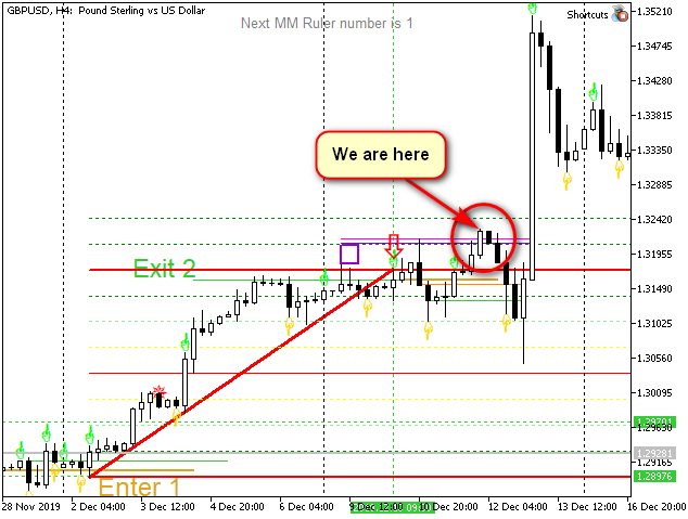
Fig. 17. Analyzing the movement using Sequential and Murray levels. Initial version of the levels
Now we have much more data.
It is immediately evident that the level 7/8 gave strong support to the price, while 6/8 turned out to be "a hard nut to crack". It was difficult for the price to break it upwards. So, it returned to the level on 06.12.2019 at 16:00 forming a "pin bar"... As you may remember, 6/8 is considered a stronger level than 5/8 or 7/8, since this is only the second division (a quarter, not an eighth part). Let's keep this in mind.
However, there are no reasons not to trust the signal so far.
Let's enter the market according to Sequential rules, for example,"the candle closes below the two previous Lows" (orange line). The stop level is triggered (shown in the figure).
We can see that the level 6/8 acts as the support level again. Besides, the +1/8 is tested twice. The second time (when the stop level is triggered), this level is broken by a single candle.
For me, all these signs together indicate that the range is tending to expand. We can either stretch the trend line or move it up. I usually prefer the former.
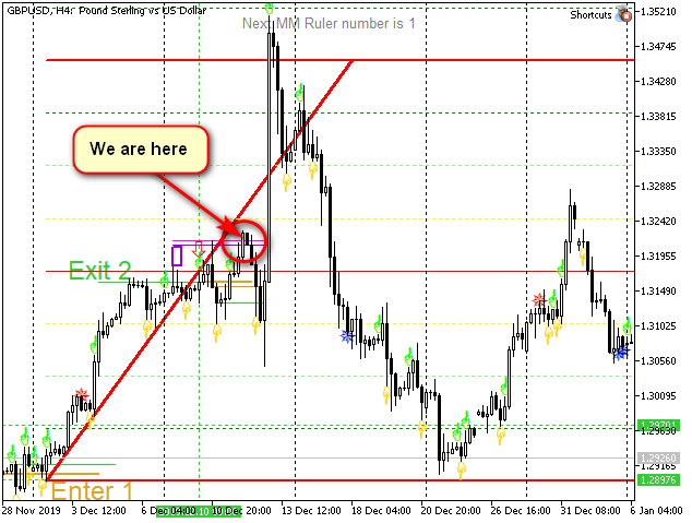
Fig. 18. Analyzing the movement using Sequential and Murray levels. Extended range
In this representation, it turns out that the price fluctuates around the middle and is located between 5/8 and 3/8, above the middle line (red thin line, 4/8), at the moment the stop level is triggered. At the same time, the price moves towards 4/8 quite briskly without stopping at 1/8 and 2/8 and breaking them with a single candle instead. The level 3/8 was the only one that caused some difficulties, though not global ones since there was no reversal from it... All this indicates that we may expect the movement at least up to 7/8 of the new range. If the price bounces off the level 3/8 (the lower yellow line), then it will most probably go as high as 100% (8/8, bold red line above).
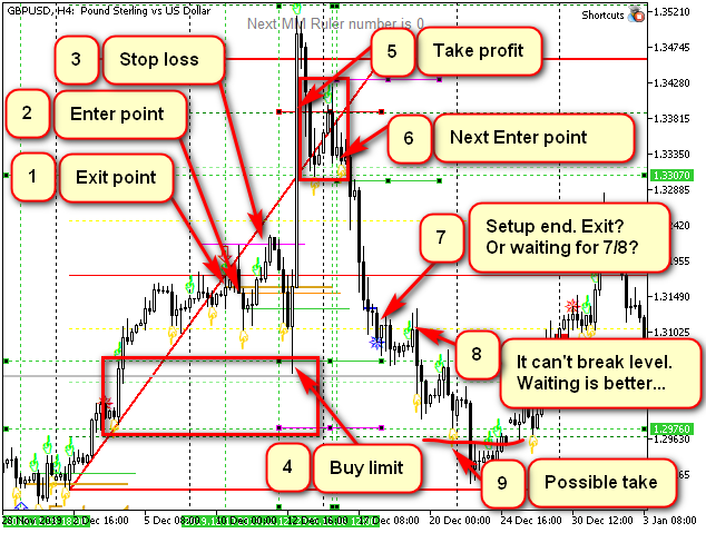
Fig. 19. Sample movement analysis (continued). Possible trading options
Upward movement analysis
The candle 04.12.2019 8:00 is unbalanced. First, it is larger than other candles in average. Second, it has broken through the "setup" extremum and third, it is itself a significant Sequential point (first stage candle). Besides, it has broken a strong level 2/8. At the same time, its maximum level has not been tested yet.
Since the price quite often returns to breakout levels, we may set a limit order at the maximum of this (breakout) candle + a couple of spreads to try to bounce back from that levels. The target is 7/8 of the extended range. For example, a stop level is located a couple of spreads below the same candle's minimum...
As you may remember, this assumptions are made at the point that is very close to the stop trigger point, say, around 8:00 on 12.12.2019.
So, at 8:00 on December 12 (the green vertical after the stop level has been triggered), I set a limit order at 1.307, a stop order at 1.297 and a take profit at 1.338 (I am often conservative). ;-) After the orders are triggered, the profit is about 310 points.
The second scenario: I set an alert at 3/8 (and redirect it to my phone). If (or when) it is triggered and the candle is complete, I analyze the levels. If the yellow one has resisted again while the red half one was again attacked, I enter the market with the stop level slightly below the yellow level. The take profit is the same — 1.338 (or is not set, while upon reaching 7/8, trailing is started, since it is clear that the candle is too fast). Without trailing, the profit is about 220 points, while with trailing, it is 300.
Analyzing the following downward movement
On December 16 at 8 am, I see that the price has reversed from +1/8 without reaching it, bounced from 6/8 and is trading at 7/8 area. The situation is non-trading, there are no signals, so I decide to wait till the next candle.
At 12 am, the groundwork for the downward movement has clearly been formed.
It is possible to set sell stop below the minimum point and wait the price movement towards the red line (4/8). The stop level is to be set above the H8 candle high.
Alternatively, we can wait for the Sequential "breakout candle" formation (the first stage downward candle). The indicator informs of that, for example, by a voice message or by sending a notification to the phone.
In this case, the price would be better than the one of a set order and the notification would arrive at 8 pm on Monday, therefore, it would be quite possible to enter the market by canceling the pending order.
Set the alert on the red line. After such sharp movements the price tends to be much lower than the middle (generally, 1/8 can be used as a reference). After the alert has been triggered, the stop level can be moved to breakeven if the strategy and the levels allow that...
Besides, after expanding the range, I have gained an additional time point: the second end of the red trend line. This is the point 18.12.2019 4:00. In critical cases, you may even set an alarm for this time, but, as a rule, a usual morning analysis is sufficient to define what it shows.
At 8 am, we can see that the price is slightly above 3/8, while Sequential "setup" is complete. At this level, such a top most often gives a minor correction, being rather a continuation signal. Most likely, I would expect further downward movement to 1/8 and to the tops of the green candles in the leftmost set, especially since the blue intersection rectangle is very narrow and is close to the top of the "Setup completion". Since the "setup" was complete, it has never been decisively broken, just like the level 3/8, which is now a resistance level.
Nevertheless, I will emphasize once again: generally, close attention should be paid to the area marked with a star, because at strong levels it is able to indicate a global reversal or, at least, a significant correction. For example, in the case displayed in Fig. 10, it would be possible to make at least four profitable trades based on a candle marked with the star since it indicates the end of the "setup" formation.
Conclusion
DeMark Sequential is an optional tool when analyzing charts using Murray levels. However, it allows for more accurate selection of level ranges, adds more analysis options, makes the analysis more straightforward and enables accurate search for entry and exit points both by time and objectives.
The article shows the analysis of only one timeframe. Nevertheless, the analysis is possible and yields good results. If you carry out a similar analysis starting with higher time intervals and clarifying it using the lower ones, you may be able to capture the tops of the sharp movements considered in the last example and even use the "always in the market" strategy in some cases.
I hope, the article was useful. Let the Profit be with you...