MQL as a Markup Tool for the Graphical Interface of MQL Programs (Part 3). Form Designer
Stanislav Korotky | 2 September, 2020
In the first two articles (1 and 2), we considered the general concept of building an interface markup system in MQL and the implementation of basic classes representing the hierarchical initialization of the interface elements, caching them, styling, setting up their properties, and processing the events. Dynamically creating the on-request elements allowed the on-the-fly modification of the simple dialog layout, while the availability of a single storage of elements already created has routinely enabled creating it in the MQL syntax proposed, to subsequently insert it "as is" into the MQL program where GUI is required. Thus, we have approached to creating a graphical editor of forms. We are going to closely attend to this task in this article.
Problem Statement
Editor must ensure arranging the elements in the window and adjusting their basic properties. Below is the general list of the properties supported, but not all the properties are available for all types of elements.
- Type,
- Name,
- Width,
- Height,
- Internal content alignment style,
- Text or header,
- Background color,
- Alignment in the parent container, and
- Offsets/fields of the container boundaries.
Many other properties are not included here, such as font name and size or the specific properties of various types of "controls" (particularly, the property of "sticking" buttons). This is done intentionally to simplify the project basically aimed at proof of concept (POC). If necessary, support for additional properties can be added into the editor later.
Positioning in absolute coordinates is available indirectly via offsets, but it is not a recommended option. Using the CBox containers suggests that positioning should be performed automatically by containers themselves in accordance with the alignment settings.
Editor is designed for the classes of Standard Library interface elements. To create similar tools for other libraries, you will have to write the specific implementations of all abstract entities from the markup system proposed. At the same time, you should be guided by the implementation of markup classes for the Standard Library.
It should be noted that the "library of standard components" definition is not factually correct, since in the context of our preceding articles, we had to considerably modify it and place to the parallel version branch in the ControlsPlus folder. Herein, we are going to continue using and modifying it.
Let us list the types of elements to be suppported by the editor.
- Containers CBox with horizontal (CBoxH) and vertical (CBoxV) orientation,
- CButton,
- CEdit input box,
- CLabel,
- SpinEditResizable,
- CDatePicker calendar,
- Drop-down list ComboBoxResizable,
- List ListViewResizable,
- CheckGroupResizable, and
- RadioGroupResizable.
All classes ensure adaptive resizing (some standard types could do that at the beginning, while we had to make considerable changes for the other ones).
The program will consist of two windows: Dialog "Inspector" where the user selects the required properties of controls to be created, and form "Designer" where these elements are created, forming the appearance of the graphical interface to be designed.
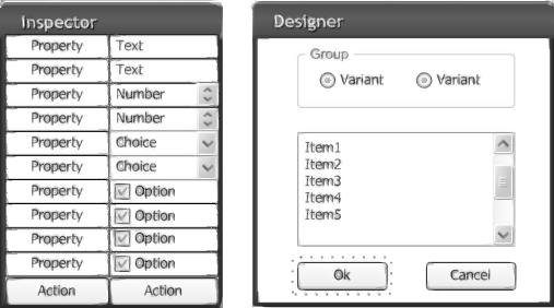
GUI MQL Designer Program Interface Sketch
In terms of MQL, the program will have 2 basic classes, InspectorDialog and DesignerForm, decribed in the header files of the respective names.
  #include "InspectorDialog.mqh"
  #include "DesignerForm.mqh"

  InspectorDialog inspector;
  DesignerForm designer;

  int OnInit()
  {
      if(!inspector.CreateLayout(0, "Inspector", 0, 20, 20, 200, 400)) return (INIT_FAILED);
      if(!inspector.Run()) return (INIT_FAILED);
      if(!designer.CreateLayout(0, "Designer", 0, 300, 50, 500, 300)) return (INIT_FAILED);
      if(!designer.Run()) return (INIT_FAILED);
      return (INIT_SUCCEEDED);
  }
Both windows are the descendants of AppDialogResizable (hereinafter, CAppDialog), formed by the MQL-markup technology. Therefore, we see calling CreateLayout, instead of Create.
Each window has its own cache of interface elements. However, in Inspector, it is filled with "controls" from the very beginning, which are described in quite a complex layout (that we will try to consider in general terms), while it is empty in Designer. It's easy to explain: Practically all business logic of the program is stored in Inspector, while Designer is a dummy, into which Inspector will implement new elements gradually, by the user's commands.
PropertySet
Each of the properties listed above is represented by the value of a specific type. For example, element name is a string, while width and height are integers. The full set of values fully describes the object that must appear in Designer. It is reasonable to store the set in one place, for which purpose a special class, PropertySet, was introduced. But what member variables must be in it?
At first glance, using the variables of simple embedded types seems to be an obvious solution. However, they lack an important feature that will be needed further. MQL does not support links to simple variables. At the same time, link is a very important thing in the algorithms of processing a user interface. It often means a complex response to changes in values. For example, an out-of-range value entered in one of the fields must block some depending "controls." It would be convenient if these "controls" could control their own states, guided by a single location storing the value to be checked. The easiest way to do that is to use the "giveaway" of links to the same variable. Therefore, instead of simple embedded types, we will use a template wrapper-class approximately appearing as follows, provisionally named Value.
  template<typename V>
  class Value
  {
    protected:
      V value;

    public:
      V operator~(void) const // getter
      {
        return value;
      }

      void operator=(V v)     // setter
      {
        value = v;
      }
  };
The word "approximately" is added for good reason. In fact, some more functionality will be added into the class, which will be considered below.
Availability of an object wrapper allows intercepting the assignment of new values in the overloaded operator '=', which is impossible when using simple types. And we will need it.
Considering this class, the set of the properties of the new interface object can be approximately described as follows.
  class PropertySet
  {
    public:
      Value<string> name;
      Value<int> type;
      Value<int> width;
      Value<int> height;
      Value<int> style; // VERTICAL_ALIGN / HORIZONTAL_ALIGN / ENUM_ALIGN_MODE
      Value<string> text;
      Value<color> clr;
      Value<int> align; // ENUM_WND_ALIGN_FLAGS + WND_ALIGN_CONTENT
      Value<ushort> margins[4];
  };
In the Inspector dialog, we will introduce a variable of this class as a centralized storage of the current settings that have entered from the Inspector controls.
Obviously, a suitable control is used in Inspector to define each property. For example, to select the type of the "control" to be created, a drop-down list, CComboBox, is used, while the CEdit entry box is used for the name. Property represents the single value of a type, such as line, number, or index in a list. Even compound properties, such as offsets defined separately for each of the 4 sides, should be considered independently (left, upper, etc.), since 4 entry fields will be reserved for entering them and, therefore, each value is connected to a control allocated for it.
Thus, let us formulate an obvious rule for the Inspector dialog — each control in it defines the property related to it and always having a specific value of a given type. This leads us to the following architectural solution.
Characteristic Properties of "Controls"
In our preceding articles, we introduced a special interface, Notifiable, that allowed defining the event processing for a specific control.
  template<typename C>
  class Notifiable: public C
  {
    public:
      virtual bool onEvent(const int event, void *parent) { return false; };
  };
Here, C is one of the "controls" classes, such as CEdit, CSpinEdit, etc. Processor onEvent is called by the layout cache automatically for the relevant elements and event types. Naturally, it only happens, provided that correct strings are added into the event map. For example, in the preceding part, processing the Inject button clicks was adjusted by this principle (it was described as the descendant of Notifiable<CButton>).
If a control is used to adjust the properties of a pre-defined type, it is tempting to create a more specialized interface, PlainTypeNotifiable.
  template<typename C, typename V>
  class PlainTypeNotifiable: public Notifiable<C>
  {
    public:
      virtual V value() = 0;
  };
Method value is intended for returning from a C element the V-type value that is the most characteristic of C. For example, for class CEdit, returning a string-type value looks naturally (in a certain hypothetic class ExtendedEdit).
  class ExtendedEdit: public PlainTypeNotifiable<CEdit, string>
  {
    public:
      virtual string value() override
      {
        return Text();
      }
  };
For each type of "controls", there is a single characteristic data type or a limited range thereof (for example, for integers, you can select the accuracy of short, int, or long). All "controls" have one or another "getter" method ready to provide the value in the overloadable "value" method.
Thus, we have come to the point of the architectural solution — harmonization of classes Value and PlainTypeNotifiable. It is implemented using the descendant class, PlainTypeNotifiable, that moves the "control" value from Inspector into the Value property linked to it.
  template<typename C, typename V>
  class NotifiableProperty: public PlainTypeNotifiable<C,V>
  {
    protected:
      Value<V> *property;

    public:
      void bind(Value<V> *prop)
      {
        property = prop;     // pointer assignment
        property = value();  // overloaded operator assignment for value of type V
      }

      virtual bool onEvent(const int event, void *parent) override
      {
        if(event == ON_CHANGE || event == ON_END_EDIT)
        {
          property = value();
          return true;
        }
        return false;
      };
  };
Due to inheriting from the template class PlainTypeNotifiable, the new class NotifiableProperty represents both the C "control" class and a provider of the V-type values.
Method bind allows retaining inside the "control" a link to Value and then changing the property value in place (by reference), automatically, as a response to the user's operations with the "control."
For example, for the string-type entry fields, the EditProperty was introduced, similar to the ExtendedEdit instance, but inherited from NotifiableProperty:
  class EditProperty: public NotifiableProperty<CEdit,string>
  {
    public:
      virtual string value() override
      {
        return Text(); // Text() is a standard method of CEdit
      }
  };
For a drop-down list, a similar class describes the property having an integer value.
  class ComboBoxProperty: public NotifiableProperty<ComboBoxResizable,int>
  {
    public:
      virtual int value() override
      {
        return (int)Value(); // Value() is a standard method of CComboBox
      }
  };
Classes of property "controls" are described in the program for all basic types of elements.
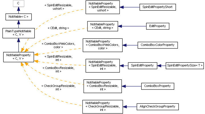
Diagram of "Notifiable Properties" Classes
Now it's time to get away with the epithet "approximately" and get to know full classes.
StdValue: Value, Monitoring, and Dependencies
A standard situation has already been mentioned above, whereit is necessary to monitor changing some "controls" to check the validity and changes in the states of other "controls." In other words, we need an observer capable of monitoring one "control" and inform other involved "controls" about changes in it.
For this purpose, interface StateMonitor (observer) was introduced.
  class StateMonitor
  {
    public:
      virtual void notify(void *sender) = 0;
  };
Method notify is intended for being called by the source of changes for this observer to be able to respond, if necessary. Source of changes can be identified by the "sender" parameter. Of course, the source of changes has to preliminarily know somehow that a specific observer is interested in being notified. For this purpose, the source must implement the interface Publisher.
  class Publisher
  {
    public:
      virtual void subscribe(StateMonitor *ptr) = 0;
      virtual void unsubscribe(StateMonitor *ptr) = 0;
  };
Using the "subscribe" method, observer can pass the link to itself to the Publisher. As easy to guess, the sources of changes for us will be properties and therefore, the hypothetical class Value is, in fact, inherited from Publisher and appears as follows.
  template<typename V>
  class ValuePublisher: public Publisher
  {
    protected:
      V value;
      StateMonitor *dependencies[];

    public:
      V operator~(void) const
      {
        return value;
      }

      void operator=(V v)
      {
        value = v;
        for(int i = 0; i < ArraySize(dependencies); i++)
        {
          dependencies[i].notify(&this);
        }
      }

      virtual void subscribe(StateMonitor *ptr) override
      {
        const int n = ArraySize(dependencies);
        ArrayResize(dependencies, n + 1);
        dependencies[n] = ptr;
      }
      ...
  };
Any registered observer gets to the "dependencies" and, if the value changes, will be notified by calling its "notify" method.
Since properties are uniquely associated to the "controls," using which they are introduced, we are going to provide for saving a link to the "control" in the final class of properties for the Standard Library, i.e., StdValue (it uses the basic type of all CWind "controls").
  template<typename V>
  class StdValue: public ValuePublisher<V>
  {
    protected:
      CWnd *provider;

    public:
      void bind(CWnd *ptr)
      {
        provider = ptr;
      }

      CWnd *backlink() const
      {
        return provider;
      }
  };
This link will be useful later.
These are the StdValue instances that fill PropertySet.
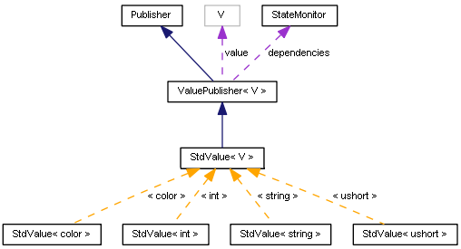
StdValue Communication Diagram
In the class NotifiableProperty mentioned above, StdValue is also used in reality, and in method "bind" we bind the property value to the "control" (this).
  template<typename C, typename V>
  class NotifiableProperty: public PlainTypeNotifiable<C,V>
  {
    protected:
      StdValue<V> *property;
    public:
      void bind(StdValue<V> *prop)
      {
        property = prop;
        property.bind(&this);        // +
        property = value();
      }
      ...
  };
Automatic Management of the "Controls" States — EnableStateMonitor
The most relevant way to respond to changes in some settings is blocking/deblocking other dependent "controls." State of each of such adaptive "controls" may depend on several settings (not necessary on only one). To monitor them, a special abstract class, EnableStateMonitorBase, was developed.
  template<typename C>
  class EnableStateMonitorBase: public StateMonitor
  {
    protected:
      Publisher *sources[];
      C *control;

    public:
      EnableStateMonitorBase(): control(NULL) {}

      virtual void attach(C *c)
      {
        control = c;
        for(int i = 0; i < ArraySize(sources); i++)
        {
          if(control)
          {
            sources[i].subscribe(&this);
          }
          else
          {
            sources[i].unsubscribe(&this);
          }
        }
      }

      virtual bool isEnabled(void) = 0;
  };
"Control", the state of which is monitored by a given observer, is placed in the "control" field. Array "sources" contains the sources of changes, which affect the state. The array will have to be filled in the descendant classes. When we connect the observer to a specific "control" by calling "attach," the observer subscribes for all sources of changes. Then it will start being notified about changes in the sources via calling its "notify" method.
Whether a "control" should be blocked or deblocked, the isEnabled method will decide, but it is declared abstract here and will be implemented in descendant classes.
For the Standard Library classes, a mechanism is known that enables/disables "controls" using both Enable and Disable. Let us use them to implement the specific class, EnableStateMonitor.
  class EnableStateMonitor: public EnableStateMonitorBase<CWnd>
  {
    public:
      EnableStateMonitor() {}

      void notify(void *sender) override
      {
        if(control)
        {
          if(isEnabled())
          {
            control.Enable();
          }
          else
          {
            control.Disable();
          }
        }
      }
  };
In practice, this class will frequently be used in the program, but we are going to consider only one example. To create new objects or use the modified properties in Designer, there is the Apply button in the Inspector dialog box (class ApplyButton derived from Notifiable<CButton> is defined for it).
  class ApplyButton: public Notifiable<CButton>
  {
    public:
      virtual bool onEvent(const int event, void *parent) override
      {
        if(event == ON_CLICK)
        {
          ...
        }
      };
  };
If the object name is not defined or its type is not selected, the button must be blocked. Therefore, we implement ApplyButtonStateMonitor with two sources of changes ("publishers"): Name and type.
  class ApplyButtonStateMonitor: public EnableStateMonitor
  {
    // what's required to detect Apply button state
    const int NAME;
    const int TYPE;

    public:
      ApplyButtonStateMonitor(StdValue<string> *n, StdValue<int> *t): NAME(0), TYPE(1)
      {
        ArrayResize(sources, 2);
        sources[NAME] = n;
        sources[TYPE] = t;
      }

      virtual bool isEnabled(void) override
      {
        StdValue<string> *name = sources[NAME];
        StdValue<int> *type = sources[TYPE];
        return StringLen(~name) > 0 && ~type != -1 && ~name != "Client";
      }
  };
The class constructor takes two parameters pointing at the relevant properties. They are saved in the "sourcees" array. Method isEnabled is used to check whether the name is filled out and whether the type is selected (whether it is not -1). If the conditions are met, the button may be pushed. Additionally, the name is checked for a special string, Client, that is reserved for the client area in the dialogs of the Standard Library and, therefore, cannot appear in the name of user elements.
In the inspector dialog class, there is a variable of the ApplyButtonStateMonitor type, which is initialized in the constructor by links to the StdValue objects that store the name and type.
  class InspectorDialog: public AppDialogResizable
  {
    private:
      PropertySet props;
      ApplyButtonStateMonitor *applyMonitor;
    public:
      InspectorDialog::InspectorDialog(void)
      {
        ...
        applyMonitor = new ApplyButtonStateMonitor(&props.name, &props.type);
      }
In the dialog layout, the properties of the name and type are bonded to the relevant "controls," while the observer is bonded to the Apply button.
          ...
          _layout<EditProperty> edit("NameEdit", BUTTON_WIDTH, BUTTON_HEIGHT, "");
          edit.attach(&props.name);
          ...
          _layout<ComboBoxProperty> combo("TypeCombo", BUTTON_WIDTH, BUTTON_HEIGHT);
          combo.attach(&props.type);
          ...
          _layout<ApplyButton> button1("Apply", BUTTON_WIDTH, BUTTON_HEIGHT);
          button1["enable"] <= false;
          applyMonitor.attach(button1.get());
We have already known the "attach" method in the applyMonitor object, while "attach" in the _layout objects is something new. Class _layout was covered in depth in our second article, and the "attach" method is the only change, as compared to that version. This intermediate method just calls "bind" for the control generated by the _layout object inside the inspector dialog.
  template<typename T>
  class _layout: public StdLayoutBase
  {
      ...
      template<typename V>
      void attach(StdValue<V> *v)
      {
        ((T *)object).bind(v);
      }
      ...
  };
It should be reminded that all property "controls", including EditProperty and ComboBoxProperty, as in this example, are the descendants of class NotifiableProperty, in which there is the "bind" method to bound the "controls" to the StdValue variables that store the relevant properties. Thus, "controls" in the inspector window turn out to be bound with the relevant properties, while the latter ones, in turn, are monitored by observer ApplyButtonStateMonitor. As soon as the user changes the value of either of the two fields, it is displayed in PropertySet (remember the onEvent processor for events ON_CHANGE and ON_END_EDIT in NotifiableProperty) and notifies the registered observers, including ApplyButtonStateMonitor. This results in automatically changing the button state for the current one.
We will need several monitors in the inspector dialog, which monitor the state of "controls" in a similar manner. We will describe the specific rules of blocking in a section of the user manual.
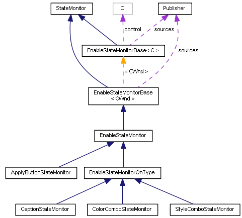
StateMonitor Classes
Well, let us denote the final relevance of all properties of the object to be created and "controls" in the inspector dialog.
- name — EditProperty, string;
- type — ComboBoxProperty, integer, type number from the list of supported elements;
- width — SpinEditPropertySize, integer, pixels;
- height — SpinEditPropertySize, integer, pixels;
- style — ComboBoxProperty, integer that is equal to the value of one of the enumerations (depending on the element type): VERTICAL_ALIGN (CBoxV), HORIZONTAL_ALIGN (CBoxH), and ENUM_ALIGN_MODE (CEdit);
- text — EditProperty, string;
- background color — ComboBoxColorProperty, color value from the list;
- boundary alignment — AlignCheckGroupProperty, bit masks, group of independent flags (ENUM_WND_ALIGN_FLAGS + WND_ALIGN_CONTENT); and
- indents — four SpinEditPropertyShort, integers;
Name of the classes of some "Property" elements points to their specialization, that is, expanded functionality, as compared to the basic implementation offered by "simple" SpinEditProperty, ComboBoxProperty, CheckGroupProperty, etc. What they are used for, will become clear from the user manual.
To present these "controls" accurately and clearly, the dialog markup certainly includes additional containers and data labels. Full code can be found in the attachment hereto.
Handling the Events
Handling the events for all "controls" is defined in the event map:
  EVENT_MAP_BEGIN(InspectorDialog)
    ON_EVENT_LAYOUT_CTRL_DLG(ON_END_EDIT, cache, EditProperty)
    ON_EVENT_LAYOUT_CTRL_DLG(ON_CHANGE, cache, SpinEditProperty)
    ON_EVENT_LAYOUT_CTRL_DLG(ON_CLICK, cache, SpinEditProperty)
    ON_EVENT_LAYOUT_CTRL_DLG(ON_CHANGE, cache, SpinEditPropertyShort)
    ON_EVENT_LAYOUT_CTRL_DLG(ON_CHANGE, cache, ComboBoxProperty)
    ON_EVENT_LAYOUT_CTRL_DLG(ON_CHANGE, cache, ComboBoxColorProperty)
    ON_EVENT_LAYOUT_CTRL_DLG(ON_CHANGE, cache, AlignCheckGroupProperty)
    ON_EVENT_LAYOUT_CTRL_DLG(ON_CLICK, cache, ApplyButton)
    ...
    ON_EVENT_LAYOUT_ARRAY(ON_CLICK, cache) // default (stub)
  EVENT_MAP_END(AppDialogResizable)
To enhance the efficiency of handling the events in cache, some special steps have been made. Macros ON_EVENT_LAYOUT_CTRL_ANY and ON_EVENT_LAYOUT_CTRL_DLG introduced in our second article work based on searching for "controls" in the cache array by a unique number received from the system in parameter lparam. At the same time, the basic cache implementation performs linear search through the array.
To accelerate the process, method buildIndex was added into class MyStdLayoutCache (a descendant of StdLayoutCache), an instance of which is stored and used in Inspector. Convenient indexation capability implemented in it is based on the special feature of the Standard Library to assign unique numbers to all elements. In method CAppDialog::Run, a random number, i.e., m_instance_id already known to us, starting from which all chart objects created by the window are numbered. In this manner, we can get to know the range of values obtained. Deducting m_instance_id, each value of lparam, which comes with an event, turns into the direct number of the object. However, the program creates much more objects in the chart, than those stored in cache, because many "controls" (and the window itself for that matter, as an aggregation of the frame, header, minimization button, etc.) consist of multiple low-level objects. Therefore, index in cache never coincides with the object identifier minus m_instance_id. Therefore, we had to allocate a special index array (its size being equal to the number of objects in the window) and somehow write the sequential numbers of those "real" controls available in cache. As a result, access is provided practically instantly, on the principle of indirect addressing.
The array should only be filled after the basic CAppDialog::Run implementation has assigned unique numbers, but before the processor OnInit finishes operating. For this purpose, the best solution is to make method Run virtual (it is not such in the Standard Library) and override it in InspectorDialog, for instance, as follows.
  bool InspectorDialog::Run(void)
  {
    bool result = AppDialogResizable::Run();
    if(result)
    {
      cache.buildIndex();
    }
    return result;
  }
Method buildIndex itself is quite simple.
  class MyStdLayoutCache: public StdLayoutCache
  {
    protected:
      InspectorDialog *parent;
      // fast access
      int index[];
      int start;

    public:
      MyStdLayoutCache(InspectorDialog *owner): parent(owner) {}

      void buildIndex()
      {
        start = parent.GetInstanceId();
        int stop = 0;
        for(int i = 0; i < cacheSize(); i++)
        {
          int id = (int)get(i).Id();
          if(id > stop) stop = id;
        }

        ArrayResize(index, stop - start + 1);
        ArrayInitialize(index, -1);
        for(int i = 0; i < cacheSize(); i++)
        {
          CWnd *wnd = get(i);
          index[(int)(wnd.Id() - start)] = i;
        }
      ...
  };
Now we can write a quick implementation of the method to search "controls" by number.
      virtual CWnd *get(const long m) override
      {
        if(m < 0 && ArraySize(index) > 0)
        {
          int offset = (int)(-m - start);
          if(offset >= 0 && offset < ArraySize(index))
          {
            return StdLayoutCache::get(index[offset]);
          }
        }

        return StdLayoutCache::get(m);
      }
But enough on the internal structure of Inspector.
This is how its window looks in the running program.
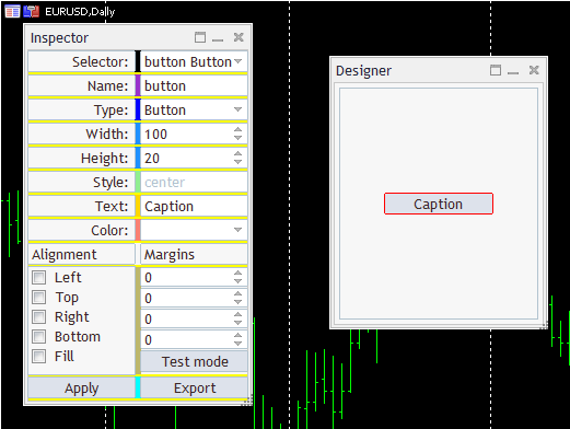
Dialog Inspector and Form Designer
Along with properties, we can see some unknown elements here. They all will be decribed later. Now let's take a look at button Apply. After the user sets the values for properties, the requested object can be generated in the Designer form by pressing this button. Having a class deriving from Notifiable, the button can process the presses in its own method onEvent.
  class ApplyButton: public Notifiable<CButton>
  {
    public:
      virtual bool onEvent(const int event, void *parent) override
      {
        if(event == ON_CLICK)
        {
          Properties p = inspector.getProperties().flatten();
          designer.inject(p);
          ChartRedraw();
          return true;
        }
        return false;
      };
  };
It should be reminded that variables inspector and designer are global objects with the Inspector dialog and the Designer form, respectively. In its program interface, Inspector has method getProperties to provide the current set of properties, PropertySet, described above:
    PropertySet *getProperties(void) const
    {
      return (PropertySet *)&props;
    }
PropertySet can pack itself in a flat (normal) structure, Properties, to pass to the Designer method, inject. Here we are seguing to the Designer window.
Designer
Additional checks aside, the essence of method "inject" is similar to what we saw in the end of our second article: Form places the target container into the layout stack (it was set statically in the second article, i.e., it was always the same) and generates an element with the passed properties in it. In the new form, all elements can be selected by mouse-clicking, thereby changing the insert context. Moreover, such click initiates transferring the properties of the selected element into Inspector. Thus, there appears a capability of editing the properties of objects already created and updating them using the same Apply button. Designer detects whether the user wants to introduce a new element or edit an existing one, by comparing the name and type of the element. If such a combination already exists in the Designer cache, then this means editing.
This is, in general, how adding a new element looks.
    void inject(Properties &props)
    {
      CWnd *ptr = cache.get(props.name);
      if(ptr != NULL)
      {
        ...
      }
      else
      {
        CBox *box = dynamic_cast<CBox *>(cache.getSelected());

        if(box == NULL) box = cache.findParent(cache.getSelected());

        if(box)
        {
          CWnd *added;
          StdLayoutBase::setCache(cache);
          {
            _layout<CBox> injectionPanel(box, box.Name());

            {
              AutoPtr<StdLayoutBase> base(getPtr(props));
              added = (~base).get();
              added.Id(rand() + ((long)rand() << 32));
            }
          }
          box.Pack();
          cache.select(added);
        }
      }
Variable "cache" is described in DesignerForm and contains an object of class DefaultStdLayoutCache deriving from StdLayoutCache (presented in our preceding articles). StdLayoutCache allows finding the object by name, using method "get." If it does not exist, this means there is a new object and Designer tries to detect the current container selected by the user. For this purpose, method getSelected is implemented in the new class, DefaultStdLayoutCache. How exactly selection is performed, we will see a bit later. It is important to note here that a place to implement the new element can only be a container (in our case, CBox containers are used). If not a container was selected at a moment, the algorithm calls findParent to detect the parent container and use it as a target. When the place of insertion is defined, a conventional markup scheme with nested blocks starts working. In the external block, object _layout with the target container is created and then an object is generated inside, in string:
AutoPtr<StdLayoutBase> base(getPtr(props));
All properties are passed to the helper method getPtr. It can create the objects of all types supported, but for the sake of simplicity, we are only going to show how it looks for some of them.
    StdLayoutBase *getPtr(const Properties &props)
    {
      switch(props.type)
      {
        case _BoxH:
          {
            _layout<CBoxH> *temp = applyProperties(new _layout<CBoxH>(props.name, props.width, props.height), props);
            temp <= (HORIZONTAL_ALIGN)props.style;
            return temp;
          }
        case _Button:
          return applyProperties(new _layout<CButton>(props.name, props.width, props.height), props);
        case _Edit:
          {
            _layout<CEdit> *temp = applyProperties(new _layout<CEdit>(props.name, props.width, props.height), props);
            temp <= (ENUM_ALIGN_MODE)LayoutConverters::style2textAlign(props.style);
            return temp;
          }
        case _SpinEdit:
          {
            _layout<SpinEditResizable> *temp = applyProperties(new _layout<SpinEditResizable>(props.name, props.width, props.height), props);
            temp["min"] <= 0;
            temp["max"] <= DUMMY_ITEM_NUMBER;
            temp["value"] <= 1 <= 0;
            return temp;
          }
        ...
      }
    }
Objects _layout templated by the predefined type of the GUI element are created using constructors known to us by the static descriptions of MQL markups. Objects _layout enable using overloaded operators <= to define properties, in particular, this is how style HORIZONTAL_ALIGN is filled for CBoxH, ENUM_ALIGN_MODE for a text field, or spinner ranges. Settings of some other general properties, such as indents, text, and color, are delegated to the helper method applyProperties (you can find more details about it in source codes).
    template<typename T>
    T *applyProperties(T *ptr, const Properties &props)
    {
      static const string sides[4] = {"left", "top", "right", "bottom"};
      for(int i = 0; i < 4; i++)
      {
        ptr[sides[i]] <= (int)props.margins[i];
      }

      if(StringLen(props.text))
      {
        ptr <= props.text;
      }
      else
      {
        ptr <= props.name;
      }
      ...
      return ptr;
    }
If the object is found in cache by name, the following takes place (in a simplified form):
    void inject(Properties &props)
    {
      CWnd *ptr = cache.get(props.name);
      if(ptr != NULL)
      {
        CWnd *sel = cache.getSelected();
        if(ptr == sel)
        {
          update(ptr, props);
          Rebound(Rect());
        }
      }
      ...
    }
Helper method "update" transfers the properties from the structure "props" into the ptr object found.
    void update(CWnd *ptr, const Properties &props)
    {
      ptr.Width(props.width);
      ptr.Height(props.height);
      ptr.Alignment(convert(props.align));
      ptr.Margins(props.margins[0], props.margins[1], props.margins[2], props.margins[3]);
      CWndObj *obj = dynamic_cast<CWndObj *>(ptr);
      if(obj)
      {
        obj.Text(props.text);
      }

      CBoxH *boxh = dynamic_cast<CBoxH *>(ptr);
      if(boxh)
      {
        boxh.HorizontalAlign((HORIZONTAL_ALIGN)props.style);
        boxh.Pack();
        return;
      }
      CBoxV *boxv = dynamic_cast<CBoxV *>(ptr);
      if(boxv)
      {
        boxv.VerticalAlign((VERTICAL_ALIGN)props.style);
        boxv.Pack();
        return;
      }
      CEdit *edit = dynamic_cast<CEdit *>(ptr);
      if(edit)
      {
        edit.TextAlign(LayoutConverters::style2textAlign(props.style));
        return;
      }
    }
Now let us return to the problem of selecting the GUI elements in the form. It is solved by the cache object, due to handling the events initiated by the user. Processor onEvent is reserved in class StdLayoutCache to connect to the chart events on the map using macro ON_EVENT_LAYOUT_ARRAY:
  EVENT_MAP_BEGIN(DesignerForm)
    ON_EVENT_LAYOUT_ARRAY(ON_CLICK, cache)
    ...
  EVENT_MAP_END(AppDialogResizable)
This sends mouse clicks for all cache elements to processor onEvent that we define in our derived class, DefaultStdLayoutCache. Pointer "selected" of the universal window type, CWnd, is created In the class; it must be filled by processor onEvent.
  class DefaultStdLayoutCache: public StdLayoutCache
  {
    protected:
      CWnd *selected;

    public:
      CWnd *getSelected(void) const
      {
        return selected;
      }

      ...
      virtual bool onEvent(const int event, CWnd *control) override
      {
        if(control != NULL)
        {
          highlight(selected, CONTROLS_BUTTON_COLOR_BORDER);

          CWnd *element = control;
          if(!find(element)) // this is an auxiliary object, not a compound control
          {
            element = findParent(element); // get actual GUI element
          }
          ...

          selected = element;
          const bool b = highlight(selected, clrRed);
          Print(control.Name(), " -> ", element._rtti, " / ", element.Name(), " / ", element.Id());
          EventChartCustom(CONTROLS_SELF_MESSAGE, ON_LAYOUT_SELECTION, 0, 0.0, NULL);
          return true;
        }
        return false;
      }
  };
An element is visually selected in the form using a red frame in the trivial "highlight" method (calling ColorBorder). Processor unselects the preceding selected element first (sets the frame color, CONTROLS_BUTTON_COLOR_BORDER), then finds a cache element corresponding with the chart object that has been clicked on, and saves the pointer to it in the "selected" variable. Finally, the new selected object is marked by a red frame, and event ON_LAYOUT_SELECTION is sent to the chart. It informs Inspector that a new element has been selected in the form and, therefore, it should show its properties in the Inspector dialog.
In Inspector, this event is intercepted in processor OnRemoteSelection that requests from Designer a link to the select object and reads all attributes from it via the standard API of the library.
  EVENT_MAP_BEGIN(InspectorDialog)
    ...
    ON_NO_ID_EVENT(ON_LAYOUT_SELECTION, OnRemoteSelection)
  EVENT_MAP_END(AppDialogResizable)
Below is the beginning of method OnRemoteSelection.
  bool InspectorDialog::OnRemoteSelection()
  {
    DefaultStdLayoutCache *remote = designer.getCache();
    CWnd *ptr = remote.getSelected();

    if(ptr)
    {
      string purename = StringSubstr(ptr.Name(), 5); // cut instance id prefix
      CWndObj *x = dynamic_cast<CWndObj *>(props.name.backlink());
      if(x) x.Text(purename);
      props.name = purename;

      int t = -1;
      ComboBoxResizable *types = dynamic_cast<ComboBoxResizable *>(props.type.backlink());
      if(types)
      {
        t = GetTypeByRTTI(ptr._rtti);
        types.Select(t);
        props.type = t;
      }

      // width and height
      SpinEditResizable *w = dynamic_cast<SpinEditResizable *>(props.width.backlink());
      w.Value(ptr.Width());
      props.width = ptr.Width();

      SpinEditResizable *h = dynamic_cast<SpinEditResizable *>(props.height.backlink());
      h.Value(ptr.Height());
      props.height = ptr.Height();
      ...
    }
  }
Having received from the Designer cache the ptr link to the selected object, the algorithm finds out its name, clears it from the window identifier (this field, m_instance_id, in class CAppDialog is a prefix in all names to prevent from conflicts among objects from different windows, of which we have 2), and writes it into the "control" related to the name. You should note that it is here where we use a backlink to the "control" (backlink()) from property StdValue<string> name. Moreover, since we modify the field from inside, the event related to its change is not generated (as is sometimes the case, where the change is initiated by the user); therefore, it additionally needs writing the new value into the relevent property of PropertySet (props.name).
Technically, from the perspective of OOP, it would be more correct to override for each type of the property "control" its virtual method of changing and to automatically update the StdValue instance linked to it. Here is, for example, how it could be done for CEdit.
  class EditProperty: public NotifiableProperty<CEdit,string>
  {
    public:
      ...
      virtual bool OnSetText(void) override
      {
        if(CEdit::OnSetText())
        {
          if(CheckPointer(property) != POINTER_INVALID) property = m_text;
          return true;
        }
        return false;
      }
  };
Then changing the field contents using method Text() would lead to the subsequent call of OnSetText and automatically updating the property. However, it is not so convenient to do so for compound controls, such as CCheckGroup; therefore, we preferred a more practical implementation.
Similarly, using backlinks to "controls," we update the contents in the fields of height, width, type, and other properties of the object selected in Designer.
To identify the supported types, we have an enumeration, the element of which can be detected, based on special variable, _rtti, that we added in our preceding articles at the lowest level, into class CWnd, and fill it with the name of a specific class in all the derived classes.
Quick Start Guide
Inspector dialog contains the entry field of various types with the properties of the current object (selected in Designer) or the object to be created.
Mandatory fields are name (string) and type (to be selected in the drop-down list).
Width and height fields allow defining the object size in pixels. However, these settings are not considered, if a specific stretching mode is specified below: For instance, binding to the left and right borders means the width fitted to container. Clicking with the mouse in the height or width field with the Shift key down can reset the property to the default value (width 100 and height 20).
All "controls" of the SpinEdit type (not only in size properties) were improved in such a manner that moving the mouse inside the "control" to the left or right with the mouse key down (drag, but not drop) quickly changes the values of "spinner" proportionally to the distance covered in pixels. This was done to facilitate editing, which is not very convenient to do by pressing small pumping buttons. Changes are available to any programs that will use "controls" from the ControlsPlus folder.
Drop-down list with the content alignment style (Style) is only available to the elements of CBoxV, CBoxH, and CEdit (it is blocked for all other types). For CBox containers, all alignment modes ("center", "justify", "left/top", "right/bottom", and "stack") are enabled. For CEdit, only those work, which correspond with ENUM_ALIGN_MODE ("center", "left", and "right").
Field "Text" allows defining the header of CButton, CLabel, or the contents of CEdit. For other types, the field is disabled.
Drop-down list "Color" is designed to select the background color from the list of Web colors. It is only available to CBoxH, CBoxV, CButton, and CEdit. Other types of "controls," being compound ones, require more a sophisticated technique of updating the color in all its components, so we decided not to support coloring them yet. To select colors, class CListView was modified. A special "color" mode was added to it, in which mode the values of the list items are interpreted as color codes, and the background of each item is drawn in the relevant color. This mode is enabled by method SetColorMode and used in the new class, ComboBoxWebColors (a specialization of ComboBoxResizable from the Layouts folder).
Standard colors of the Library GUI cannot be selected at the moment, because there is a problem with defining the default colors. It is important to us to know the default color for each type of "controls" in order not to show it as selected in the list, if the user has not selected any specific color. The simplest approach is to create an empty "control" of a specific type and read in it the property of ColorBackground, but it only works in a highly limited number of "controls." The matter is that color, as a rule, is not assigned in the class constructor, but in method Create that begets much unnecessary initialization, including creation of real objects in the chart. Of course, we do not need any unnecessary objects. Moreover, the background color of many compound objects results from the substrate background, not from the basic "control." Due to complicacy in taking these nuances into consideration, we decided to consider unselected all the default colors in any classes of the Standard Library "controls." This means that they cannot be included into the list, since, otherwise, the user can select such a color, but will not see any confirmation of his/her selection in Inspector. Lists of web colors and standard GUI colors are presented in file LayoutColors.mqh.
To reset the color to the default value (different for each "control" type), the first "empty" item should be selected in the list, relevant to clrNONE.
Flags in the group of independent switchers, Alignment, correspond with the alignment modes by sides from enumeration ENUM_WND_ALIGN_FLAGS, plus a special mode, WND_ALIGN_CONTENT, is added to them, which is described in the second article and only works for containers. If you hold the Shift key down when pressing a switcher, the program will synchronously switch all 4 flags of ENUM_WND_ALIGN_FLAGS. If the option is enabled, then other ones will also be enabled, and vice versa, if the option is disabled, other ones will be reset. This allows switching the entire group with one click, except for WND_ALIGN_CONTENT.
"Spinners" Margins define the indents of the element as related to the sides of the container rectangle, in which this element is located. Order of fields: Left, upper, right, and lower. All fields can be quickly reset to zero by clicking in any field with the Shift key down. All fields can easily be set as equal by clicking on the field with the required value with the Ctrl key down — this results in the value being copied into 3 other fields.
We already know the Apply button — it applies the changes made, which results in either creating a new "control" in Designer or modifying the existing one.
The new object is inserted into the selected container object or container containing the selected "control" (if the "control" is selected).
To select an element in Designer, you should click on it with the mouse. The selected element is highlighted with a red frame. The only exception is CLabel — this feature is not supported in it.
The new element is automatically selected immediately upon insertion.
Only container CBoxV or CBoxH can be inserted into an empty dialog, while it is not necessary to preliminarily select the client area. This first and largest container is stretched over the entire window by default.
Repeated click on an element already selected calls the request for deletion. Deletion only happens upon being confirmed by the user.
Two-position button TestMode switches between two operation modes of Designer. By default, it is unpressed, the test mode is disabled, and Designer interface editing operates — the user can select elements by clicking with the mouse and delete them. When it is pressed, the test mode is enabled. At the same time, the dialog works approximately like it will in the real program, while the layout editing and selecting the elements are disabled.
Button Export allows saving the current configuration of the Designer interface as an MQL-layout. File name starts with prefix layout and contains the current time mask and extension txt. If you hold the Shift key down when pressing Export, the configuration of the form will be saved in a binary form, not as a text, into the file of its own format, with extension mql. It is convenient, for you can interrupt the layout designing process and then restore it after a while. To upload the binary layout mql-file, the same Export button is used, provided that the form and cache of the elements are empty, which is performed immediately upon starting the program. The current version always tries to import the file layout.mql. If you wish, you can implement the file selection in the inputs or in MQL.
In the upper part of the Inspector dialog, there is a drop-down with all the elements created in Designer. Selecting an element in the list leads to automatically selecting and highlighting it in Designer. Vice versa, selecting an element in the form makes it current in the list.
Now, in editing, the errors of 2 categories may occur: Those that can be fixed by analyzing the MQL layout and more serious ones. The former ones include such combinations of settings, where "controls" or containers go beyond the borders of the window or of the parent container. In this case, they usually stop being selected with the mouse, and you can only enable them using the selector in Inspector. Which exactly properties are false, you can find out by analyzing the textual MQL markup — it is sufficient to press Export to get its current state. Upon having analyzed the markup, you should correct the properties in Inspector and, doing so, restore the correct view of the form.
This version of the program is designed to verify the concept, and in the source code, there are no checks for all the combinations of parameters, which may occur when recalculating the sizes of adaptive containers.
The second category of errors particularly includes the situation where an element has been inserted into a wrong container by mistake. In this case, you can only delete the element and add it again, but into another location.
It is recommended to regularly save the form in binary format (press the Export button, holding the Shift key down), so that, in case of unsolvable problems, you could continue working, starting with the last good configuration.
Let us consider some examples of working with the program.
Examples
First, let us try to reproduce the Inspector structure in Designer. In the animated image below, you can see the process beginning with adding four upper strings and fields to set the name, type, and width. Different types of "controls," alignments, color schemes are used. Labels containing the field names are formed using the entry fields of CEdit, because CLabel has a very limited functionality (particularly, text alignment and background color are not supported). However, the "read only" attribute setting is unavailable in Inspector. Therefore, the only way to denote a label as non-editable is to assign gray background to it (this is a purely visual effect). In MQL code, such CEdit objects must surely be additionally adjusted accordingly, i.e., switched to the "read only" mode. This is exactly what we've done in Inspector itself.
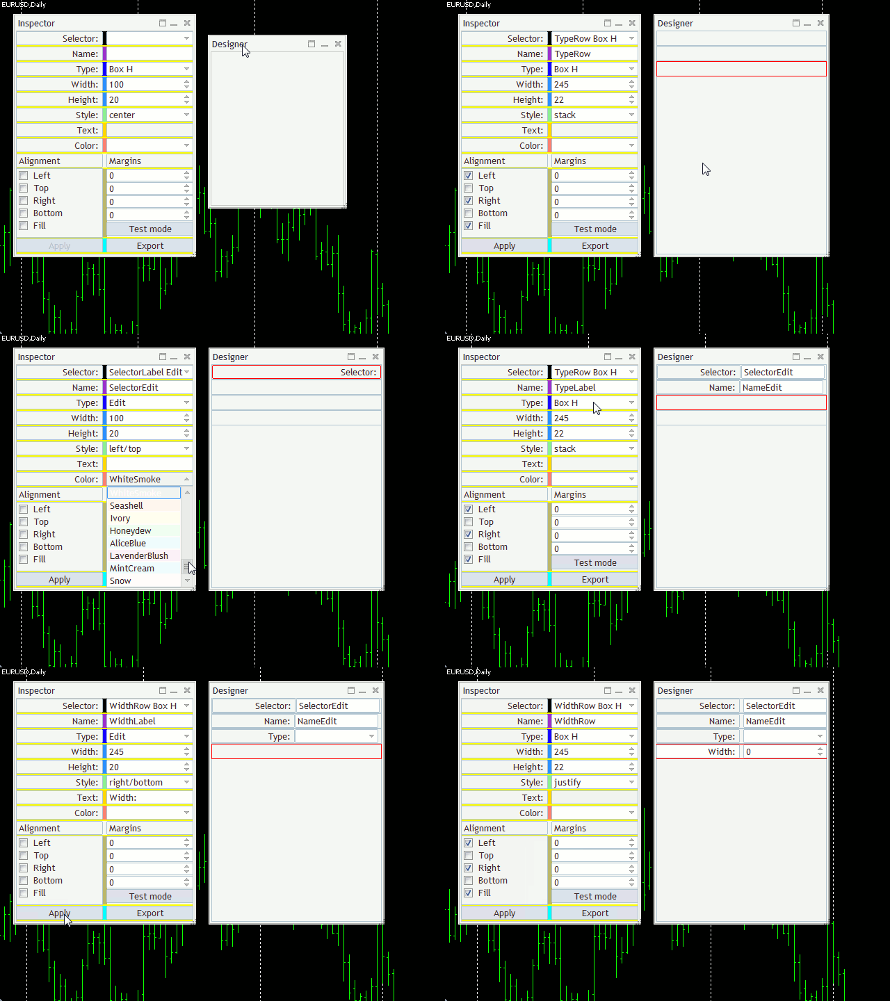
Editing the Form
Editing the form clearly demonstrates the adaptive nature of the markup technology and, as an external representation, is uniquely bound by MQL-markup. You can press the Export button any time and see the resulting MQL code.
In the final version, we can get a dialog that is preactically completely corresponds with the Inspector window (except for some details).
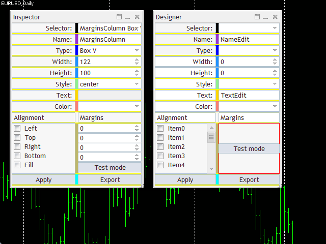
Inspector Dialog Markup Restored in Designer
However, it should be noted that, inside Inspector, many classes of "controls" are non-standard, since they are inherited from a certain x-Property and represent an additional algorithmic harness. In our example, however, only standard classes of "controls" (ControlsPlus) are used. In other words, the resulting layout always contains the external representation of the program and the standard behavior of "controls" only. Tracking the states of elements and coding the responses to their changes, including potential customization of classes, is the prerogative of the programmer. The system created allows changing the artifacts in the MQL markup as in normal MQL. That is, you can replace, for example, ComboBox with ComboBoxWebColors. But, in any case, all classes mentioned in the layout must be included into the project using the directives of #include.
The above dialog (Inspector duplicate) was saved using the Export command into the text and binary files — both are attached hereto under the names of layout-inspector.txt and layout-inspector.mql, respectively.
Having analyzed the text file, you can make sense of the Inspector markup without binding to algorithms or data.
Basically, upon having exported the markup to the file, its contents can be inserted into any project, which includes the header files of the layout system and all the GUI classes used. As a result, we obtain a working interface. Particularly, a project with the empty DummyForm dialog is attached hereto. If you wish, you can find the CreateLayout in it and insert into it the MQL-markup to be preliminarily prepared in Designer.
This can easily be done for layout-inspector.txt, too. We will copy the entire contents of this file into clipboard and insert into file DummyForm.mqh inside method CreateLayout, where there is comment // insert exported MQL-layout here.
Please note that the dialog size is mentioned in the text representation of the layout (in this case, 200*350), for which it has been created. Therefore, the following strings should be inserted into the source code CreateLayout after the string of creating the object with form _layout<DummyForm> dialog(this...) and before the copied layout:
  Width(200);
  Height(350);
  CSize sz = {200, 350};
  SetSizeLimit(sz);
This will provide sufficient space for all "controls" and won't allow making the dialog smaller.
We don't generate the relevant fragment automatically when exporting, because the layout may represent just a part of the dialog or, eventually, serve for other classes of windows and containers, where there will not be these methods.
If we compile and run the example now, we will get a very similar copy of Inspector. But there still are differences.
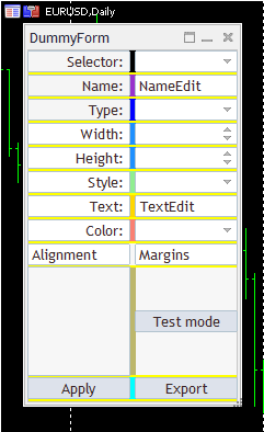
Restored Inspector Interface
First, all drop-down lists are empty and, therefore, they do not work. No "spinners" are adjusted, so they don't work either. Group of alignment flags is visually empty, because we have not generated any checkbox in the layout, but the relevant "control" exists, and it even has 5 hidden checkboxes that are generated by the library of standard components, based on the initial size of the "control" (you can see all these objects in the list of chart objects, command Object List).
Second, the group of "spinners" with the indent values is really absent: We did not transfer it into the form, because it is created by one layout object as an array in Inspector. Our editor cannot do anything like that. We could create 4 independent elements, but then we would have to adjust them in the code similarly to each other.
Any "control" being pressed, the form prints its name, class, and identifier to the log.
We can also upload binary file layout-inspector.mql (having preliminarily renamed it to layout.mql) back to Inspector and continue editing it. For this purpose, it is sufficient to rung the main project and press Export as early as the form is still empty.
Please note that Designer generates, for illustrative purposes, some amount of data for all "controls" with lists or groups, and also sets the range for spinners. Therefore, we can play with elements when switching to TestMode. This size of pseudodata is defined in the Designer form by macro DUMMY_ITEM_NUMBER and is 11 by default.
Now let's see how the trading panel could appear in Designer.
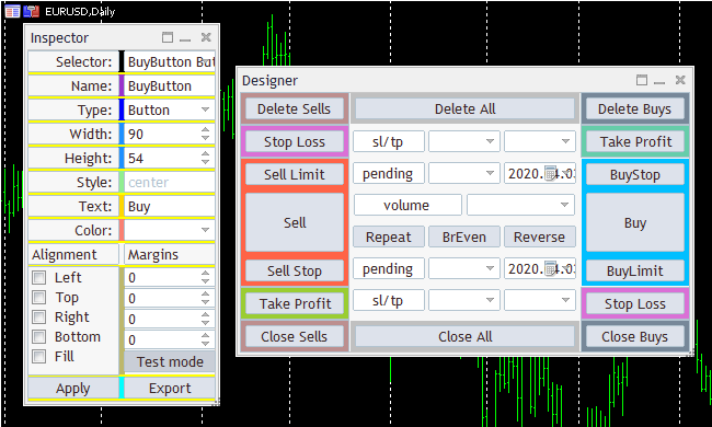
Trade Panel Layout: Color-Cube-Trade-Panel
It makes no pretense to superfunctionality, but the matter is that it can easily be changed redically in accordance with the specific trader's preferences. This form, like the previous one, uses colored containers to easier see their arrangement.
We should make a reservation again that we only mean appearance here. At the Designer output, we get the MQL code only responsible for generating the window and the initial state of "controls." As usual, all computational algorithms, responses to the user's actions, protection against wrongly entered data, and sending trade orders must be programmed manually.
In this layout, some types of "controls" should be replaced with something more suitable. Thus, expiry dates of pending orders are denoted in it with Calendar that does not support entering the time. All drop-down lists must be filled with the relevant options. For instance, stop levels can be entered in different units, such as price, distance in pips, risk/losses as the deposit percentage, or with absolute value, while the volume can be set as fixed, in money terms or as the free margin percentage, and trailing is one of several algorithms.
This markup is attached hereto as two layout-color-cube-trade-panel files: Textual and binary. The former one can be inserted into the empty form, such as DummyForm, and complete with data and with handling of events. The latter one can be loaded into Designer and edit. But keep in mind that the graphical editor is not mandatory. Markup can also be corrected in its textual representation. The only advantage of the editor is that we can play with settings and see the changes on-the-fly. However, it only supports the most basic features.
Conclusions
In this paper, we have considered a simple editor to interactively develop the graphical interface of programs based on the MQL-markup technology. The implementation presented includes basic features only, which are still sufficient for demonstrating the workability of the concept and the further extension to other types of "controls," more complete support for various properties, other libraries of GUI components, and editing mechanisms. Particularly, the editor is still lacking the function of cancelling operations, inserting elements into a any position in the container (i.e., not only adding them to the end of the list of already existing "controls"), group operations, copying into and pasting from clipboard, and much more. However, open source codes allow you to complement and adapt the technology to fit your needs.