Graphical Interfaces V: The Combobox Control (Chapter 3)
Anatoli Kazharski | 25 May, 2016
Contents
- Introduction
- The Combobox Control
- Writing a Class for Creating the Combobox Control
- Methods for Control Event Handling
- Connecting the Control Class with the Library Engine
- Testing the Combobox Control in the Graphical Interface of the Custom Application
- Conclusion
Introduction
The first article Graphical Interfaces I: Preparation of the Library Structure (Chapter 1) explains in detail what this library is for. You will find a list of articles with links at the end of each chapter. There, you can also download a complete version of the library at the current stage of development. The files must be placed in the same directories as they are located in the archive.
In the first two chapters of the fifth part of the series, we developed classes for creating a scrollbar and a view list. There we demonstrated how to attach a scrollbar to the element if the data does not fit the designated area. In this chapter, we will speak about creating a class for the combobox control. This is also a compound control containing, among others, elements considered in the previous chapters of the fifth part.
The Combobox Control
A combobox is a compound control, the main parts of which are (1) a button and (2) a list view. A list view in this case is a drop-down element and is called by pressing the button. After selecting a list view item, its text is displayed in the button and the list view is hidden. When a program contains many multi-option parameters, using a combobox will allow to create a compact graphical interface.
Below are the primitive objects for composing the combobox control.
- The element background
- Label (element description)
- Button
- Indication of a drop-down list view
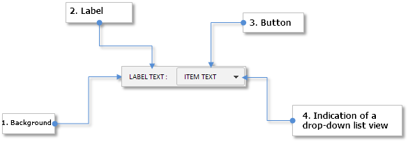
Fig. 1. Compound parts of the combobox control
In the next part of the article, we are going to write a class for creating this control.
Writing a Class for Creating the Combobox Control
We are going to consider all stages of the development of the combobox control so that in the future this article could be used as an example for writing similar classes. At first, create an mqh file (ComboBox.mqh) and include in it all necessary files with the classes that will be required for creating a combobox. In our case, these will be three files with classes:
- CElement — base class for creating the control.
- CWindow — class of the form to which this control will be attached.
- CListView — class of the list view, visibility of which will be managed by the combobox.
//+------------------------------------------------------------------+
//|                                                     ComboBox.mqh |
//|                        Copyright 2015, MetaQuotes Software Corp. |
//|                                              http://www.mql5.com |
//+------------------------------------------------------------------+
#include "Element.mqh"
#include "Window.mqh"
#include "ListView.mqh"
Then, create the CComboBox class and methods standard for each element of the library in the ComboBox.mqh file:
//+------------------------------------------------------------------+
//| Class for creating a combobox                                    |
//+------------------------------------------------------------------+
class CComboBox : public CElement
  {
private:
   //--- Pointer to the form to which this element is attached
   CWindow          *m_wnd;
   //---
public:
                     CComboBox(void);
                    ~CComboBox(void);
   //--- Stores the form pointer
   void              WindowPointer(CWindow &object)                   { m_wnd=::GetPointer(object);                      }
   //---
public:
   //--- Chart event handler
   virtual void      OnEvent(const int id,const long &lparam,const double &dparam,const string &sparam);
   //--- Timer
   virtual void      OnEventTimer(void);
   //--- Moving the element
   virtual void      Moving(const int x,const int y);
   //--- (1) Show, (2) hide, (3) reset, (4) delete
   virtual void      Show(void);
   virtual void      Hide(void);
   virtual void      Reset(void);
   virtual void      Delete(void);
   //--- (1) Set, (2) reset priorities of pressing the left mouse button
   virtual void      SetZorders(void);
   virtual void      ResetZorders(void);
   //--- Reset the color
   virtual void      ResetColors(void);
  };
//+------------------------------------------------------------------+
//| Constructor                                                      |
//+------------------------------------------------------------------+
CComboBox::CComboBox(void)
  {
//--- Store the name of the element class in the base class
   CElement::ClassName(CLASS_NAME);
  }
//+------------------------------------------------------------------+
//| Destructor                                                       |
//+------------------------------------------------------------------+
CComboBox::~CComboBox(void)
  {
  }
The user should have an opportunity to choose his own color scheme of the graphical interface. For that, he should have an access to the settings of the properties of the objects for composing the control. Below are the properties to set up before the control is created:
- Color of the control background
- Displayed description of the combobox (text label)
- Margins for the text label along the X and Y axes
- Colors of the text label in different states
- Text of the button (text of the selected list view item)
- Button size
- Colors of the button in different states
- Colors of the button frame in different states
- Colors of the button text in different states
- Icons for the arrow - the indication of a drop-down list views for the active and blocked modes
- Margins for the arrow icons along the X and Y axes
The code below contains the fields and methods for installing the properties listed above:
class CComboBox : public CElement
  {
private:
   //--- Combobox properties:
   //    Color of the general background
   color             m_area_color;
   //--- Text and margins of the text label
   string            m_label_text;
   int               m_label_x_gap;
   int               m_label_y_gap;
   //--- Colors of the text label in different states
   color             m_label_color;
   color             m_label_color_off;
   color             m_label_color_hover;
   color             m_label_color_array[];
   //--- (1) Button text and (2) its size
   string            m_button_text;
   int               m_button_x_size;
   int               m_button_y_size;
   //--- Colors of the button in different states
   color             m_button_color;
   color             m_button_color_off;
   color             m_button_color_hover;
   color             m_button_color_pressed;
   color             m_button_color_array[];
   //--- Colors of the button frame in different states
   color             m_button_border_color;
   color             m_button_border_color_off;
   //--- Color of the button text in different states
   color             m_button_text_color;
   color             m_button_text_color_off;
   //--- Label margins
   int               m_drop_arrow_x_gap;
   int               m_drop_arrow_y_gap;
   //--- Labels of the buttons with a drop-down menu in the active and blocked states
   string            m_drop_arrow_file_on;
   string            m_drop_arrow_file_off;
   //--- Priorities of the left mouse button click
   int               m_area_zorder;
   int               m_button_zorder;
   int               m_zorder;
   //---
public:
   //--- (1) Background color, (2) sets and (3) returns the value of the text label
   void              AreaColor(const color clr)                       { m_area_color=clr;                                }
   void              LabelText(const string label_text)               { m_label_text=label_text;                         }
   string            LabelText(void)                            const { return(m_label_text);                            }
   //--- Margins of the text label
   void              LabelXGap(const int x_gap)                       { m_label_x_gap=x_gap;                             }
   void              LabelYGap(const int y_gap)                       { m_label_y_gap=y_gap;                             }
   //--- (1) Returns the button text, (2) setting the button size
   string            ButtonText(void)                           const { return(m_button_text);                           }
   void              ButtonXSize(const int x_size)                    { m_button_x_size=x_size;                          }
   void              ButtonYSize(const int y_size)                    { m_button_y_size=y_size;                          }
   //--- (1) Background color, (2) colors of the text label
   void              LabelColor(const color clr)                      { m_label_color=clr;                               }
   void              LabelColorOff(const color clr)                   { m_label_color_off=clr;                           }
   void              LabelColorHover(const color clr)                 { m_label_color_hover=clr;                         }
   //--- Button colors
   void              ButtonBackColor(const color clr)                 { m_button_color=clr;                              }
   void              ButtonBackColorOff(const color clr)              { m_button_color_off=clr;                          }
   void              ButtonBackColorHover(const color clr)            { m_button_color_hover=clr;                        }
   void              ButtonBackColorPressed(const color clr)          { m_button_color_pressed=clr;                      }
   //--- Colors of the button frame
   void              ButtonBorderColor(const color clr)               { m_button_border_color=clr;                       }
   void              ButtonBorderColorOff(const color clr)            { m_button_border_color_off=clr;                   }
   //--- Colors of the button text
   void              ButtonTextColor(const color clr)                 { m_button_text_color=clr;                         }
   void              ButtonTextColorOff(const color clr)              { m_button_text_color_off=clr;                     }
   //--- Setting icons for the button with a drop-down menu in the active and blocked states
   void              DropArrowFileOn(const string file_path)          { m_drop_arrow_file_on=file_path;                  }
   void              DropArrowFileOff(const string file_path)         { m_drop_arrow_file_off=file_path;                 }
   //--- Label margins
   void              DropArrowXGap(const int x_gap)                   { m_drop_arrow_x_gap=x_gap;                        }
   void              DropArrowYGap(const int y_gap)                   { m_drop_arrow_y_gap=y_gap;                        }
  };
The initialization of all the properties listed above by default values is in the class constructor:
//+------------------------------------------------------------------+
//| Constructor                                                      |
//+------------------------------------------------------------------+
CComboBox::CComboBox(void) : m_area_color(C'15,15,15'),
                             m_label_text("combobox: "),
                             m_label_x_gap(0),
                             m_label_y_gap(2),
                             m_label_color(clrWhite),
                             m_label_color_off(clrGray),
                             m_label_color_hover(C'85,170,255'),
                             m_button_text(""),
                             m_button_y_size(18),
                             m_button_text_color(clrBlack),
                             m_button_text_color_off(clrDarkGray),
                             m_button_color(clrGainsboro),
                             m_button_color_off(clrLightGray),
                             m_button_color_hover(C'193,218,255'),
                             m_button_color_pressed(C'153,178,215'),
                             m_button_border_color(clrWhite),
                             m_button_border_color_off(clrWhite),
                             m_drop_arrow_x_gap(16),
                             m_drop_arrow_y_gap(1),
                             m_drop_arrow_file_on(""),
                             m_drop_arrow_file_off("")
  {
//--- Set priorities of the left mouse button click
   m_zorder        =0;
   m_area_zorder   =1;
   m_button_zorder =2;
  }
A combobox will be created with five private methods, which will be called in the main public method CComboBox::CreateComboBox(). To gain access to the setting of the list view and the scrollbar properties, create methods for getting pointers to these elements:
class CComboBox : public CElement
  {
private:
   //--- Objects for creating a combobox
   CRectLabel        m_area;
   CLabel            m_label;
   CEdit             m_button;
   CBmpLabel         m_drop_arrow;
   CListView         m_listview;
   //---
public:
   //--- Methods for creating a combobox
   bool              CreateComboBox(const long chart_id,const int subwin,const int x,const int y);
   //---
private:
   bool              CreateArea(void);
   bool              CreateLabel(void);
   bool              CreateButton(void);
   bool              CreateDropArrow(void);
   bool              CreateList(void);
   //---
public:
   //--- Returns pointers to (1) the list view and (2) the scrollbar
   CListView        *GetListViewPointer(void)                         { return(::GetPointer(m_listview));                }
   CScrollV         *GetScrollVPointer(void)                          { return(m_listview.GetScrollVPointer());          }
  };
Out of the methods presented in the code above, we are going to consider only the CComboBox::CreateList() method for creating a list view in detail. Other methods do not contain anything that has not been studied in the previous articles of this series. Before that, however, we must introduce some changes to the CListView class of the list view.
A drop-down list view is always a compound part of another element. This means that its event handler may require tracking the focus over the element it is attached to. In our case it is a combobox. Add a field and a method to the CListView class for storing the pointer to the combobox to which the list view will be attached.
class CListView : public CElement
  {
private:
   //--- Pointer to the element managing the list view visibility
   CElement         *m_combobox;
   //---
public:
   //--- Stores the combobox pointer
   void              ComboBoxPointer(CElement &object)                   { m_combobox=::GetPointer(object); }
  };
If the list view is a drop-down, add a check for the pointer to the main (public) method for creating a list view. If during the creation of the list view it turns out that there is no pointer, then the creation of the graphical interface will be terminated and a relevant message will be printed in the journal.
Below is a shortened version of the CListView::CreateListView() method:
//+------------------------------------------------------------------+
//| Creates a list view                                              |
//+------------------------------------------------------------------+
bool CListView::CreateListView(const long chart_id,const int window,const int x,const int y)
  {
//--- Leave, if there is no form pointer

//--- If the list view is a drop-down, a pointer to the combobox to which it will be attached is required
   if(CElement::IsDropdown())
     {
      //--- Leave, if there is no pointer to the combobox
      if(::CheckPointer(m_combobox)==POINTER_INVALID)
        {
         ::Print(__FUNCTION__," > Before creating a drop-down list view, the class must be passed "
                 "a pointer to the combobox: CListView::ComboBoxPointer(CElement &object)");
         return(false);
        }
     }
//--- Initializing variables
//--- Margins from the edge
//--- Creating a button
//--- Hide the element if the window is a dialog one or is minimized
//---
   return(true);
  }
Now, we are going to return to the development of the combobox class (CComboBox). The property indicating that the list view will be a drop-down will have to be set at the very early stage, that is in the class constructor:
CComboBox::CComboBox(void)
  {
//--- Drop-down list view mode
   m_listview.IsDropdown(true);
  }
When creating a list view, the pointers to the form and the combobox to which the list view will be attached must be stored at the beginning of the method. Please note that the list view and the combobox must have common identifier as in this case they make up one control. After the list view was created, it must be hidden.
//+------------------------------------------------------------------+
//| Creates a list view                                              |
//+------------------------------------------------------------------+
bool CComboBox::CreateList(void)
  {
//--- Store pointers to the form and the combobox
   m_listview.WindowPointer(m_wnd);
   m_listview.ComboBoxPointer(this);
//--- Coordinates
   int x=CElement::X2()-m_button_x_size;
   int y=CElement::Y()+m_button_y_size;
//--- Set properties
   m_listview.Id(CElement::Id());
   m_listview.XSize(m_button_x_size);
//--- Create the control
   if(!m_listview.CreateListView(m_chart_id,m_subwin,x,y))
      return(false);
//--- Hide the list view
   m_listview.Hide();
   return(true);
  }
To set the number of list view items and fill the list view with values, add the relevant methods to the CComboBox class:
class CListView : public CElement
  {
public:
   //--- Setting (1) the size of the list view (number of items) and (2) its visible part
   void              ItemsTotal(const int items_total)                { m_listview.ListSize(items_total);                }
   void              VisibleItemsTotal(const int visible_items_total) { m_listview.VisibleListSize(visible_items_total); }

   //--- Stores the passed value in the list view by specified index
   void              ValueToList(const int item_index,const string item_text);
  };
//+------------------------------------------------------------------+
//| Stores passed value in the list view by specified index          |
//+------------------------------------------------------------------+
void CComboBox::ValueToList(const int item_index,const string item_text)
  {
   m_listview.ValueToList(item_index,item_text);
  }
To select (highlight) a list view item, create the CComboBox::SelectedItemByIndex() method. The index of the item that has to be highlighted is the only argument that has to be passed to this method. Then, highlighting of the item is carried out in the eponymous method of the list view (CListView), where the index is adjusted if the range is exceeded. After that, the item text is stored and set in the combobox button.
class CListView : public CElement
  {
public:
   //--- Highlighting the item by specified index
   void              SelectedItemByIndex(const int index);
  };
//+------------------------------------------------------------------+
//| Highlighting the item by specified index                         |
//+------------------------------------------------------------------+
void CComboBox::SelectedItemByIndex(const int index)
  {
//--- Highlight the item in the list view
   m_listview.SelectedItemByIndex(index);
//--- Store and set the text in the button
   m_button_text=m_listview.SelectedItemText();
   m_button.Description(m_listview.SelectedItemText());
  }
We will also need a method for blocking and unblocking the element and also one for getting its current state. Depending on the new state of the element, colors corresponding to this state are set for its objects. Examples will be shown further in the article.
class CListView : public CElement
  {
public:
   //--- Getting and setting the element state
   bool              ComboBoxState(void)                        const { return(m_combobox_state);                        }
   void              ComboBoxState(const bool state);
  };
//+------------------------------------------------------------------+
//| Changing the combobox state                                      |
//+------------------------------------------------------------------+
void CComboBox::ComboBoxState(const bool state)
  {
   m_combobox_state=state;
//--- Set colors corresponding to the current state to the object
   m_label.Color((state)? m_label_color : m_label_color_off);
   m_button.Color((state)? m_button_text_color : m_button_text_color_off);
   m_button.BackColor((state)? m_button_color : m_button_color_off);
   m_button.BorderColor((state)? m_button_border_color : m_button_border_color_off);
   m_drop_arrow.State(state);
  }
When the mouse cursor is hovering over the element objects, changing their color using the CComboBox::ChangeObjectsColor() method will take place only when that element is available:
class CListView : public CElement
  {
public:
   //--- Changing the object color when the cursor is hovering over it
   void              ChangeObjectsColor(void);
  };
//+------------------------------------------------------------------+
//| Changing the object color when the cursor is hovering over it    |
//+------------------------------------------------------------------+
void CComboBox::ChangeObjectsColor(void)
  {
//--- Leave, if the element is blocked
   if(!m_combobox_state)
      return;
//--- Change the object color
   CElement::ChangeObjectColor(m_label.Name(),CElement::MouseFocus(),OBJPROP_COLOR,m_label_color,m_label_color_hover,m_label_color_array);
   CElement::ChangeObjectColor(m_button.Name(),CElement::MouseFocus(),OBJPROP_BGCOLOR,m_button_color,m_button_color_hover,m_button_color_array);
  }
The CComboBox::ChangeObjectsColor() method must be called in the timer of the control CComboBox::OnEventTimer(). Skipping ahead, it should be mentioned that a combobox can be a compound part of a more complex element that is also a drop down. In one of the future articles, we will speak about a drop-down calendar - an example of such an element. A compound part of it is a combobox. Conditions for changing the color in the timer for such an element will be formed as shown in the code below:
- If this is a drop-down element and the list view is hidden.
- If the first condition is not met, check the availability of the form and the element itself.
//+------------------------------------------------------------------+
//| Timer                                                            |
//+------------------------------------------------------------------+
void CComboBox::OnEventTimer(void)
  {
//--- If this is a drop-down element and the list view is hidden
   if(CElement::IsDropdown() && !m_listview.IsVisible())
      ChangeObjectsColor();
   else
     {
      //--- If the form and the element are not blocked
      if(!m_wnd.IsLocked() && m_combobox_state)
         ChangeObjectsColor();
     }
  }
Let us create the CComboBox::ChangeComboboxListState() method for managing the visibility of the list view of the combobox. This method will change the current state of the combobox for the opposite one. At the beginning of the method, there will be a check for the the element availability. If the combobox is blocked, the program will leave the method. Then the code will be split into two branches:
- If the list view is already visible, it will be hidden here and corresponding colors will be set for the button of the combobox. After that, if this is not a drop-down element, the form must be unblocked and the identifier of the active element must be reset.
- If the list is hidden, it has to be made visible and the colors corresponding to this state must be set for the button of the combobox. At the end of the branch, the form must be blocked and the identifier of the activating element must be stored.
class CListView : public CElement
  {
public:
   //--- Changes the current state of the combobox for the opposite
   void              ChangeComboBoxListState(void);
  };
//+------------------------------------------------------------------+
//| Changes the current state of the combobox for the opposite       |
//+------------------------------------------------------------------+
void CComboBox::ChangeComboBoxListState(void)
  {
//--- Leave, if the element is blocked
   if(!m_combobox_state)
      return;
//--- If the list view is visible
   if(m_listview.IsVisible())
     {
      //--- Hide the list view
      m_listview.Hide();
      //--- Set colors
      m_label.Color(m_label_color_hover);
      m_button.BackColor(m_button_color_hover);
      //--- If this is not a drop-down element
      if(!CElement::IsDropdown())
        {
         //--- Unblock the form
         m_wnd.IsLocked(false);
         m_wnd.IdActivatedElement(WRONG_VALUE);
        }
     }
//--- If the list view is hidden
   else
     {
      //--- Show the list view
      m_listview.Show();
      //--- Set colors
      m_label.Color(m_label_color_hover);
      m_button.BackColor(m_button_color_pressed);
      //--- Block the form
      m_wnd.IsLocked(true);
      m_wnd.IdActivatedElement(CElement::Id());
     }
  }
Methods for Control Event Handling
We can move on to setting the CComboBox::OnEvent() control event handler. For that, we will need two auxiliary private methods:
- CComboBox::OnClickButton() – the combobox button press event will be tracked in this method.
- CComboBox::CheckPressedOverButton() – the state of the left mouse button over the combobox button will be tracked here.
class CListView : public CElement
  {
private:
   //--- Handling of pressing the button
   bool              OnClickButton(const string clicked_object);
   //--- Checking the pressed left mouse button over the combobox button
   void              CheckPressedOverButton(void);
  };
Code of the CComboBox::OnClickButton() method is very simple. It will contain only a check of the object name on which the pressing took place and a call of the CComboBox::ChangeComboBoxListState() method discussed previously, which will manage the visibility of the combobox list view as shown in the code below.
//+------------------------------------------------------------------+
//| Pressing on the combobox button                                  |
//+------------------------------------------------------------------+
bool CComboBox::OnClickButton(const string clicked_object)
  {
//--- Leave, if the object name is different
   if(clicked_object!=m_button.Name())
      return(false);
//--- Change the list view state
   ChangeComboboxListState();
   return(true);
  }
Code of the CComboBox::CheckPressedOverButton() method is presented below. A check for the form availability and the identifier of the activating element is carried out at the beginning of the method. The program will leave the method if the form is blocked and identifiers do not match.
Then, if there is no focus over the element, we check the presence of the focus over the list view and the state of the scrollbar. If the focus turns out to be not over the list view or the scrollbar is in the mode of the slider movement, then the program will leave the method. As you know, the slider of the scrollbar if it is in the movement mode, can be moved even if the cursor leaves the slider area. If none of these conditions is met, then:
(1) the list view is hidden,
(2) colors of the element objects are restored,
and at the end of this block of code, if identifiers do not match and the element is not a drop-down, (3) the form must be unblocked. Let me remind you that a form can be unblocked only by the element that blocked it.
In case when there is a focus over the element, at first a check for the visibility of the list view is carried out. If the list is visible, then there is no point in continuing and the program leaves the method. If the list is hidden, then corresponding colors are set depending on the focus over the combobox button.
//+------------------------------------------------------------------+
//| Check of the pressed left mouse button over the button           |
//+------------------------------------------------------------------+
void CComboBox::CheckPressedOverButton(void)
  {
//--- Leave, if the form is blocked and identifiers do not match
   if(m_wnd.IsLocked() && m_wnd.IdActivatedElement()!=CElement::Id())
      return;
//--- If there is no focus
   if(!CElement::MouseFocus())
     {
      //--- Leave, if the focus is not over the list view or the scrollbar is enabled
      if(m_listview.MouseFocus() || m_listview.ScrollState())
         return;
      //--- Hide the list view
      m_listview.Hide();
      //--- Restore colors
      ResetColors();
      //--- If identifiers match and the element is not a drop-down
      if(m_wnd.IdActivatedElement()==CElement::Id() && !CElement::IsDropdown())
         //--- Unblock the form
         m_wnd.IsLocked(false);
     }
//--- If there is focus
   else
     {
      //--- Leave, if the list view is visible
      if(m_listview.IsVisible())
         return;
      //--- Set the color considering the focus
      if(m_button.MouseFocus())
         m_button.BackColor(m_button_color_pressed);
      else
         m_button.BackColor(m_button_color_hover);
     }
  }
Call of the CComboBox::OnClickButton() method must be passed in the block of handling the graphical object press event which can be identified by the CHARTEVENT_OBJECT_CLICK identifier:
//+------------------------------------------------------------------+
//| Event handler                                                    |
//+------------------------------------------------------------------+
void CComboBox::OnEvent(const int id,const long &lparam,const double &dparam,const string &sparam)
  {
//--- Handling the left mouse button press on the object even
   if(id==CHARTEVENT_OBJECT_CLICK)
     {
      //--- Pressing on the combobox button
      if(OnClickButton(sparam))
         return;
     }
  }
Before calling the CComboBox::CheckPressedOverButton() method, the following checks must be passed in the block of handling the mouse cursor move event CHARTEVENT_MOUSE_MOVE:
- the element visibility;
- the element availability;
- left mouse button state.
//+------------------------------------------------------------------+
//| Event handler                                                    |
//+------------------------------------------------------------------+
void CComboBox::OnEvent(const int id,const long &lparam,const double &dparam,const string &sparam)
  {
//--- Handling of the cursor movement event
   if(id==CHARTEVENT_MOUSE_MOVE)
     {
      //--- Leave, if the element is hidden
      if(!CElement::IsVisible())
         return;
      //--- Coordinates
      int  x=(int)lparam;
      int  y=(int)dparam;
      //--- Checking the focus over the elements
      CElement::MouseFocus(x>CElement::X() && x<CElement::X2() &&
                           y>CElement::Y() && y<CElement::Y2());
      m_button.MouseFocus(x>m_button.X() && x<m_button.X2() &&
                          y>m_button.Y() && y<m_button.Y2());
      //--- Leave, if the element is blocked
      if(!m_combobox_state)
         return;
      //--- Leave, if the left mouse button is released
      if(sparam=="0")
         return;
      //--- Check of the left mouse button pressed over a split button
      CheckPressedOverButton();
      return;
     }
  }
At the moment of pressing on one of the list view items, the ON_CLICK_LIST_ITEM custom event is generated as shown in the code below. This message must be received in the combobox event handler. If the element identifiers match, that is the message came from the list view attached to this combobox, then store the text of the highlighted item of the list view and hide the list view using the CComboBox::ChangeComboBoxListState() method.
To ensure the connection with the application under development, this message with the ON_CLICK_LIST_ITEM identifier can be received in the CProgram custom class. A message can be also sent from the combobox with its unique (1) event identifier, (2) element identifier (3) and combobox description. To broaden the capacity of the control event identification, we are going to cater for such an option too. Add a unique identifier for the combobox control to the Defines.mqh file.
//+------------------------------------------------------------------+
//|                                                      Defines.mqh |
//|                        Copyright 2015, MetaQuotes Software Corp. |
//|                                              http://www.mql5.com |
//+------------------------------------------------------------------+
#define ON_CLICK_COMBOBOX_ITEM    (17) // Selecting an item in the combobox list view
In this case, add a line highlighted in the code below in blue to the control event handler:
//+------------------------------------------------------------------+
//| Event handler                                                    |
//+------------------------------------------------------------------+
void CComboBox::OnEvent(const int id,const long &lparam,const double &dparam,const string &sparam)
  {
//--- Handling the list view item press event
   if(id==CHARTEVENT_CUSTOM+ON_CLICK_LIST_ITEM)
     {
      //--- If identifiers match
      if(lparam==CElement::Id())
        {
         //--- Store and set the text in the button
         m_button_text=m_listview.SelectedItemText();
         m_button.Description(m_listview.SelectedItemText());
         //--- Change the list view state
         ChangeComboBoxListState();
         //--- Send a message about it
         ::EventChartCustom(m_chart_id,ON_CLICK_COMBOBOX_ITEM,CElement::Id(),0,m_label_text);
        }
      //---
      return;
     }
  }
We can also set hiding the list view when the chart properties are changed. For that, an event with the CHARTEVENT_CHART_CHANGE identifier must be handled as shown in the code below:
//+------------------------------------------------------------------+
//| Event handler                                                    |
//+------------------------------------------------------------------+
void CComboBox::OnEvent(const int id,const long &lparam,const double &dparam,const string &sparam)
  {
//--- Handling the chart properties change event
   if(id==CHARTEVENT_CHART_CHANGE)
     {
      //--- Leave, if the element is blocked
      if(!m_combobox_state)
         return;
      //--- Hide the list view
      m_listview.Hide();
      //--- Restore colors
      ResetColors();
      //--- Unblock the form
      m_wnd.IsLocked(false);
      m_wnd.IdActivatedElement(WRONG_VALUE);
      return;
     }
  }
The class for creating the combobox control is ready for testing but before that it must be connected with the library engine for correct work.
Connecting the Control Class with the Library Engine
Connecting an control with the library engine takes only a few simple actions:
1.Include the file with the control class in the WndContainer.mqh root file of the library.
//+------------------------------------------------------------------+
//|                                                 WndContainer.mqh |
//|                        Copyright 2015, MetaQuotes Software Corp. |
//|                                              http://www.mql5.com |
//+------------------------------------------------------------------+
#include "ComboBox.mqh"
2.If necessary, create a private array for the element and a method for creating the size of this array. In our case, a private array will be required for drop-down list views.
class CWndContainer
  {
protected:
   //--- Structure of element arrays
   struct WindowElements
     {
      //--- Common array of all objects
      //--- Common array of all elements

      //--- Private arrays of elements:
      //    Array of context menus
      //--- Array of main menus
      //--- Tooltips
      //--- Array of drop-down list views of different types
      CElement         *m_drop_lists[];
     };
   //--- Array of element arrays for each window
   WindowElements    m_wnd[];
   //---
public:
   //--- Number of drop-down list views
   int               DropListsTotal(const int window_index);
  };
//+------------------------------------------------------------------+
//| Returns number of drop-down list views by specified window index |
//+------------------------------------------------------------------+
int CWndContainer::DropListsTotal(const int window_index)
  {
   if(window_index>=::ArraySize(m_wnd))
     {
      ::Print(PREVENTING_OUT_OF_RANGE);
      return(WRONG_VALUE);
     }
//---
   return(::ArraySize(m_wnd[window_index].m_drop_lists));
  }
3.Create a private method for adding pointers to the private array. In this case, we need to get a list view pointer from the combobox control and add it to the private array. Besides, list view object pointers and the list view scrollbars must be added to the common array of the objects. Code of the CWndContainer::AddComboBoxElements() method is presented below.
class CWndContainer
  {
private:
   //--- Stores pointers to the context menu elements in the base
   //--- Stores pointers to the main menu elements in the base
   //--- Stores pointers to the split button elements in the base
   //--- Stores pointers to the tooltip elements in the base
   //--- Stores pointers to the list view objects in the base

   //--- Stores pointers to the drop-down list views elements in the base
   bool              AddComboBoxElements(const int window_index,CElement &object);
  };
//+------------------------------------------------------------------+
//| Stores the pointer to the drop-down list view in a private array |
//+------------------------------------------------------------------+
bool CWndContainer::AddComboBoxElements(const int window_index,CElement &object)
  {
//--- Leave, if this is not a tooltip
   if(object.ClassName()!="CComboBox")
      return(false);
//--- Get the combobox pointer
   CComboBox *cb=::GetPointer(object);
//---
   for(int i=0; i<2; i++)
     {
      //--- Increasing the element array
      int size=::ArraySize(m_wnd[window_index].m_elements);
      ::ArrayResize(m_wnd[window_index].m_elements,size+1);
      //--- Add the list to the base
      if(i==0)
        {
         CListView *lv=cb.GetListViewPointer();
         m_wnd[window_index].m_elements[size]=lv;
         AddToObjectsArray(window_index,lv);
         //--- Add the pointer to the private array
         AddToRefArray(lv,m_wnd[window_index].m_drop_lists);
        }
      //--- Add the scrollbar to the base
      else if(i==1)
        {
         CScrollV *sv=cb.GetScrollVPointer();
         m_wnd[window_index].m_elements[size]=sv;
         AddToObjectsArray(window_index,sv);
        }
     }
//---
   return(true);
  }
4.If the actions of item 3 were required, do not forget to call the CWndContainer::AddComboBoxElements() method in the main method CWndContainer::AddToElementsArray() where calls of such methods must be located.
//+------------------------------------------------------------------+
//| Adds a pointer to the element array                              |
//+------------------------------------------------------------------+
void CWndContainer::AddToElementsArray(const int window_index,CElement &object)
  {
//--- If the base does not contain forms for controls
//--- If the request is for a non-existent form
//--- Add to the common array of elements
//--- Add element objects to the common array of objects
//--- Store the id of the last element in all forms
//--- Increase the counter of the element identifiers

//--- Stores pointers to the context menu objects in the base
//--- Stores pointers to the main menu objects in the base
//--- Stores pointers to the split button objects in the base
//--- Stores pointers to the tooltip objects in the base
//--- Stores pointers to the list view objects in the base

//--- Stores pointers to the combobox control objects in the base
   if(AddComboBoxElements(window_index,object))
      return;
  }
When an element is a drop-down, it sometimes may exceed the form boundaries depending on the location of this element on the form. The location of the mouse cursor must be controlled at all times and the chart scrolling must be disabled if the chart is over one of such elements. This will allow to avoid scrolling the chart when the left mouse button is pressed over the drop-down element. For that, we have already written the CWndEvents::SetChartState() method in the CWndEvents class. Now, it has to be enriched with the check of drop-down list views. In the code below, this part is highlighted in yellow:
//+------------------------------------------------------------------+
//| Sets the chart state                                             |
//+------------------------------------------------------------------+
void CWndEvents::SetChartState(void)
  {
   int awi=m_active_window_index;
//--- To identify the event when management must be disabled
   bool condition=false;
//--- Check windows
   int windows_total=CWndContainer::WindowsTotal();
   for(int i=0; i<windows_total; i++)
     {
      //--- Move to the next one, if this form is hidden
      if(!m_windows[i].IsVisible())
         continue;
      //--- Check conditions in the internal handler of the form
      m_windows[i].OnEvent(m_id,m_lparam,m_dparam,m_sparam);
      //--- If there is a focus, mark it
      if(m_windows[i].MouseFocus())
        {
         condition=true;
         break;
        }
     }
//--- Check drop-down list views
   if(!condition)
     {
      //--- Get the total of the drop-down list views
      int drop_lists_total=CWndContainer::DropListsTotal(awi);
      for(int i=0; i<drop_lists_total; i++)
        {
         //--- Get the pointer to the drop-down list view
         CListView *lv=m_wnd[awi].m_drop_lists[i];
         //--- If the list view is activated (visible)
         if(lv.IsVisible())
           {
            //--- Check the focus over the list view and the state of its scrollbar
            if(m_wnd[awi].m_drop_lists[i].MouseFocus() || lv.ScrollState())
              {
               condition=true;
               break;
              }
           }
        }
     }
//--- Check the focus of context menus
   if(!condition)
     {
      //--- Check the total of drop-down context menus
      int context_menus_total=CWndContainer::ContextMenusTotal(awi);
      for(int i=0; i<context_menus_total; i++)
        {
         //--- If the focus is over the context menu
         if(m_wnd[awi].m_context_menus[i].MouseFocus())
           {
            condition=true;
            break;
           }
        }
     }
//--- Sets the chart state in all forms
   for(int i=0; i<windows_total; i++)
      m_windows[i].CustomEventChartState(condition);
  }
We have everything ready for testing the combobox control.
Testing the Combobox Control in the Graphical Interface of the Custom Application
Let us test everything that was implemented in the graphical interface of the custom application in the fifth part of the series. The test in the previous article was finished with three list views. Let us keep the list views and add four comboboxes to the graphical interface of the application. Place two comboboxes in the way that will allow us to test the impact of the drop-down list views on the static list views that will be located underneath them. In addition, we have to test the work of the CWndEvents::SetChartState() method. For that, we will place comboboxes so that when drop-down list views are visible, they exceed the boundaries of the form to which they are attached.
In the custom class CProgram of the test application, the class of the combobox is already available through the base classes. Create four instances of the class of the CComboBox type and declare four methods for each of them with specifying margins from the top left point of the form as shown in the code below.
//+------------------------------------------------------------------+
//| Class for creating the application                               |
//+------------------------------------------------------------------+
class CProgram : public CWndEvents
  {
private:
   //--- Comboboxes
   CComboBox         m_combobox1;
   CComboBox         m_combobox2;
   CComboBox         m_combobox3;
   CComboBox         m_combobox4;
   //---
private:
   //--- Combobox 1
#define COMBOBOX1_GAP_X       (7)
#define COMBOBOX1_GAP_Y       (50)
   bool              CreateComboBox1(const string text);
   //--- Combobox 2
#define COMBOBOX2_GAP_X       (160)
#define COMBOBOX2_GAP_Y       (50)
   bool              CreateComboBox2(const string text);
   //--- Combobox 3
#define COMBOBOX3_GAP_X       (7)
#define COMBOBOX3_GAP_Y       (202)
   bool              CreateComboBox3(const string text);
   //--- Combobox 4
#define COMBOBOX4_GAP_X       (160)
#define COMBOBOX4_GAP_Y       (202)
   bool              CreateComboBox4(const string text);
  };
Let us consider one of these methods as all of them are identical with the exception of the properties set by the user. For instance, we will block the fourth combobox straight after its creation. Below is the sequence of actions for creating the combobox control.
- Store the form pointer in the control class.
- Calculate coordinates.
- Declare and initialize straight away the text array for the list view items.
- Set the properties of control. Majority of them are initialized by default values. The values can be redefined before creating the control if the necessity arises.
- Store the item values in the combobox list view.
- If required, set the properties for the list view and the scrollbar.
- Highlight the item in the list view. The first item (0) will be highlighted by default.
- Create the control.
- Control can be blocked if necessary. We will block the fourth combobox in our test application as an example.
- At the end of the method pass the object to the base class for storing the pointer.
Sequence of actions can be different. The important thing is to keep the sequence of three main actions:
- Adding the form pointer to the control class. Otherwise the creation of the graphical interface will be terminated. The reason of the failure can be found out from the messages in the journal.
- Creating the control.
- Storing the control pointer in the object base.
//+------------------------------------------------------------------+
//| Creates combobox 1                                               |
//+------------------------------------------------------------------+
bool CProgram::CreateComboBox1(const string text)
  {
//--- Total number of the list view items
#define ITEMS_TOTAL1 8
//--- Pass the form object
   m_combobox1.WindowPointer(m_window1);
//--- Coordinates
   int x=m_window1.X()+COMBOBOX1_GAP_X;
   int y=m_window1.Y()+COMBOBOX1_GAP_Y;
//--- Array of the item values in the list view
   string items_text[ITEMS_TOTAL1]={"FALSE","item 1","item 2","item 3","item 4","item 5","item 6","item 7"};
//--- Set properties before creation
   m_combobox1.XSize(140);
   m_combobox1.YSize(18);
   m_combobox1.LabelText(text);
   m_combobox1.ButtonXSize(70);
   m_combobox1.AreaColor(clrWhiteSmoke);
   m_combobox1.LabelColor(clrBlack);
   m_combobox1.LabelColorHover(clrCornflowerBlue);
   m_combobox1.ButtonBackColor(C'206,206,206');
   m_combobox1.ButtonBackColorHover(C'193,218,255');
   m_combobox1.ButtonBorderColor(C'150,170,180');
   m_combobox1.ButtonBorderColorOff(C'178,195,207');
   m_combobox1.ItemsTotal(ITEMS_TOTAL1);
   m_combobox1.VisibleItemsTotal(5);
//--- Store the item values in the combobox list view
   for(int i=0; i<ITEMS_TOTAL1; i++)
      m_combobox1.ValueToList(i,items_text[i]);
//--- Get the list view pointer
   CListView *lv=m_combobox1.GetListViewPointer();
//--- Set the list view properties
   lv.LightsHover(true);
   lv.SelectedItemByIndex(lv.SelectedItemIndex()==WRONG_VALUE ? 2 : lv.SelectedItemIndex());
//--- Create the control
   if(!m_combobox1.CreateComboBox(m_chart_id,m_subwin,x,y))
      return(false);
//--- Add the object to the common array of the object groups
   CWndContainer::AddToElementsArray(0,m_combobox1);
   return(true);
  }
Call of the methods for creating controls must be placed in the main method for creating the graphical interface. In our case this is CProgram::CreateTradePanel(). Below is a shortened version of the method:
//+------------------------------------------------------------------+
//| Creates the trading panel                                        |
//+------------------------------------------------------------------+
bool CProgram::CreateTradePanel(void)
  {
//--- Creating form 1 for controls

//--- Creating controls:
//    Main menu
//--- Context menus
//--- Creating the status bar

//--- Comboboxes
   if(!CreateComboBox1("Combobox 1:"))
      return(false);
   if(!CreateComboBox2("Combobox 2:"))
      return(false);
   if(!CreateComboBox3("Combobox 3:"))
      return(false);
   if(!CreateComboBox4("Combobox 4:"))
      return(false);

//--- List views

//--- Redrawing of the chart
   m_chart.Redraw();
   return(true);
  }
Add the block for identifying messages from comboboxes with the ON_CLICK_COMBOBOX_ITEM identifier to the event handler of the CProgram custom class. Let us ensure that if a message from the third combbobox is received, then depending on what item of the list view was selected, the state of the fourth combobox will change. In our case, selecting any item in the list view except the first one (0) will make the fourth combobox available. Selecting the first item will block it.
//+------------------------------------------------------------------+
//| Event handler                                                    |
//+------------------------------------------------------------------+
void CProgram::OnEvent(const int id,const long &lparam,const double &dparam,const string &sparam)
  {
//--- Selection of item in combobox event
   if(id==CHARTEVENT_CUSTOM+ON_CLICK_COMBOBOX_ITEM)
     {
      if(sparam==m_combobox1.LabelText())
         ::Print(__FUNCTION__," > This message is from combobox 1 > id: ",id,"; lparam: ",lparam,"; dparam: ",dparam,"; sparam: ",sparam);
      else if(sparam==m_combobox2.LabelText())
         ::Print(__FUNCTION__," > This message is from combobox 2 > id: ",id,"; lparam: ",lparam,"; dparam: ",dparam,"; sparam: ",sparam);
      //--- Handle the message from the third combobox
      else if(sparam==m_combobox3.LabelText())
        {
         ::Print(__FUNCTION__," > This message is from combobox 3 > id: ",id,"; lparam: ",lparam,"; dparam: ",dparam,"; sparam: ",sparam);
         //--- If the specified value has been selected, disable combobox 4
         if(m_combobox3.ButtonText()=="FALSE")
            m_combobox4.ComboBoxState(false);
         //--- If another value has been selected, enable combobox 4
         else
            m_combobox4.ComboBoxState(true);
        }
      else if(sparam==m_combobox4.LabelText())
         ::Print(__FUNCTION__," > This message is from combobox 4 > id: ",id,"; lparam: ",lparam,"; dparam: ",dparam,"; sparam: ",sparam);
     }
  }
If we compile the program and load it on to the chart, the result will be as in the screenshot below:

Fig. 2. Testing the combobox control.
We have completed the development of the CComboBox class for creating a combobox.
Conclusion
In this article we have considered a compound control combobox. Schematic of the library for creating graphical interfaces at the current stage of development looks as shown below:

Fig. 3. Structure of the library at the current stage of development.
The next article will be the beginning of the sixth part of the series dedicated to the development of the library for creating graphical interfaces. There, we will write classes for creating the checkbox and edit controls and their mixed types.
You can download the material of Part V and test how it works. If you have questions on using material from those files, you can refer to the detailed description of the library development in one of the articles from the list below or ask your question in the comments of this article.
List of articles of the fifth part: