The Statistic Analysis of Market Movements and Their Prognoses
--- | 18 July, 2008
Introduction
The present article contemplates the wide opportunities of the statistic approach to marketing. Unfortunately, beginner traders deliberately fail to apply the really mighty science of statistics. Meanwhile, it is the only thing they use subconsciously while analyzing the market. Besides, statistics can give answers to many questions. One can analyze deals and their conditions more deeply and find the ultimate and more flexible solution to trading.
In fact, any trader who is in the slightest degree acquainted with the elementaries of Expert Advisors' writing uses the built-in tester optimization. But, alas, we are afraid he or she does not always fully realize what a mighty means collecting and analyzing statistics is.
Problem Statement
It wouldn't be a mistake to suggest that at least 99.9% of traders use indicators or their combinations analyzing the market and its prognoses. The process of a trader's "getting to know" any indicator begins with a merely visual contact. A trader analyzes the indicator readings relating it to the price chart and tries to find steady regularities. If these visual regularities are not found, the trader puts such an indicator aside. If steady relations between the indicator readings change and the price movement are evident, the further work proceeds to the second stage, which is the quantitative search for successful price prognosis and, perhaps, Expert Advisor development.
After a long period of familiarization with a certain indicator or their combination the trader starts to interpret their signals on the discrete principle - "open up", "open down" or "no signal". I.e., the trader restricts the whole set of indicator readings only to unambiguous treatments, which simplifies market prognosis.
E.g., Fig. 1 shows a combination of two EMAs with periods 5 and 7.
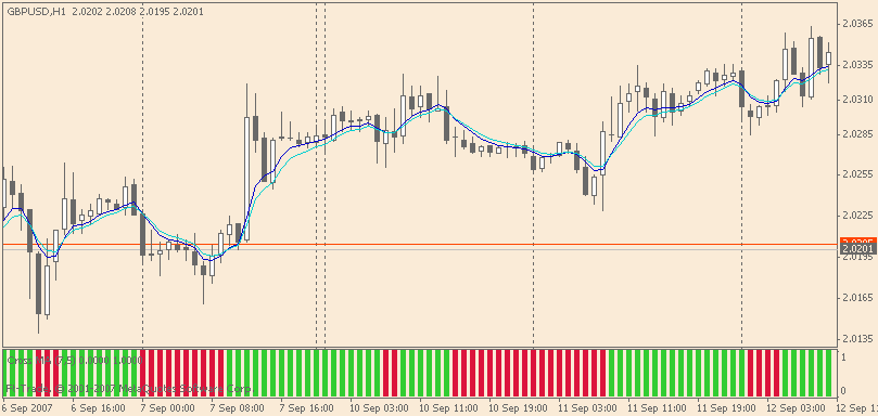
Fig. 1. An example of signal discretization - crossing of two MAs.
Under the price chart there is a discrete indicator. For descriptive reasons we didn't use "0" and "1" but the color distinction. The green signals are for buying (the fast EMA5 crosses the slow EMA7 upwards), the red signals are for selling (the fast EMA5 crosses the slow EMA7 downwards).
We can add another green and red "semaphore", e.g. a combination of SAR and ADX (fig. 2).
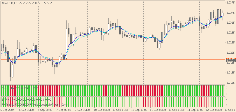
Fig. 2. The combination of 4 indicators - EMA(%), EMA(7), SAR(0.02, 0.2) and ADX (14)
As a result we will have filtered signals of EMA crossing which, for instance, enables to avoid the erroneous enter on September, 10 at 3.00; on the other hand we will be late to enter the market on September, 7.
If we keep on increasing the number of such semaphores, it will result in the system that will simply enter according to the last of the slowest indicators. Fig. 3 allows to see the intervals in which green or red stripes dominate in all indicators that speaks about the precise prognosis of movement direction. Short-term sections simply fall out of such approach because one of the indicators is not fast enough to respond to this change.
Of course, it's possible to invent a MM when each "semaphore" will be corresponded by its own share of the board lot and as the position is confirmed by new semaphores, the number of lots will grow with preponderance to a certain side, selling or buying. Or, alternatively, we can wait for the enter/exit signal till the total of probability shares of all semaphores exceeds a certain threshhold (e.g., 50/50). In our opinion, in the first case we will not only fail to profit but will even run out of means at a loss due to false enters/exits. Meanwhile, in the second (alternative) case enter and exit will be performed according to the indicator which is neither the fastest nor the slowest. It means that there will still be false enters/exits.
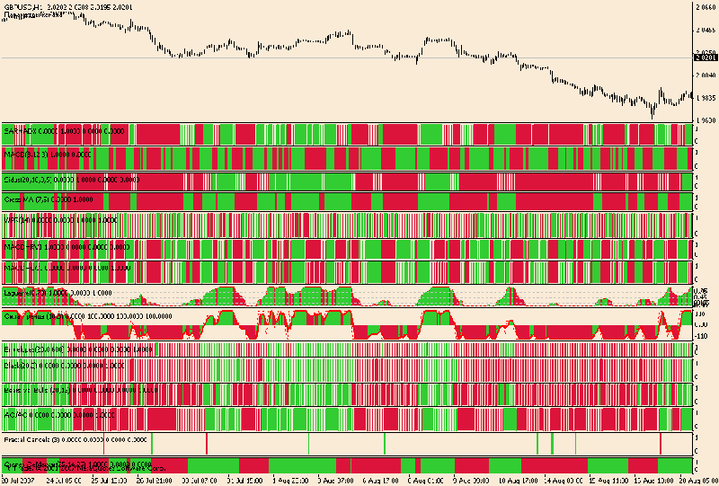
Fig. 3. Semaphores superposition - "One Day a Swan, a Crawfish And a Pike..."
So, on the one hand, signal discretization results in precise forming up the algorithm of entering/exiting the market, but, on the other hand, it leads to negative consequences, i.e. false entering the market. Unfortunately, the CAUSE of false entering is IMPOSSIBLE to understand while observing discrete (interpreted) indicator values. It is only possible at its INPUT data, the set of continuous values. It is due to the latter that one can see not only the discretization, but the intensity and the nature of these signals, their historical comparability and relative disposition as well. But here we face a problem. How can we make the computer "see", not only respond?
The MAIN PROBLEMS of the present work are:
1) finding the set of statistically supported values (combinations) of indicators that predict the further trend movement with high probability.
2) development of script samples with which a trader can check and analyze suggested tendencies without writing Expert Advisors.
As a result of a solution to the first problem we will also try to broaden the standard set of signals from known indicators and prove their statistic accuracy.
Search for the solution can be performed in 3 ways depending on what cause-and-effect relations we aim to find:
а) from the last values of indicators to the statistic analysis of the future
b) from the future bars characteristics to the statistic analysis of the last values of indicators
c) combines the two previous ways and is a feed-back system. I.e., for instance, the first step is to determine the dependence between the future bars and the previous readings of the indicators, the second step is to confirm (to check statistically) the best dependence found between the indicator and the bar prognosis.
Please find below the flow chart of the analysis.
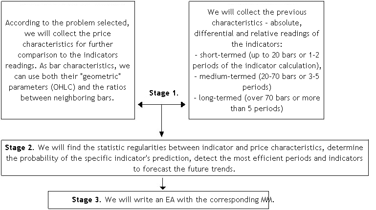
The first step implementation is placed in the script. Roughly speaking, the script will convert the rendered data into a file for its further analysis. It will allow to avoid repeated analysis and generally accelerate data processing.
For decision we should get onto the conditions we will apply over the analyzed price. There can be a plenty of variants:
- for example, on the recommendation of MACD-based trading we should wait till the histogram crosses the signal line and then open correspondingly. To give a statistic score to such enter we must know the minimum and the maximum accessible value of profit/loss in the following chart bars after the appeared signal. Hence we can draw up the digram of dependence between TakeProfit, StopLoss and probability of their actuation;
- or we can state a problem of another sort: what the correlation of the maximum and minimum price will be during the following 5 bars after the Stochastic Oscillator crosses line 80 down. The result will be the statistic support of tendency change and the determination of profit probability after such a signal;
- or find out by how many points and in what direction the price changes after 3 consecutive bull (bear) bars (https://www.mql5.com/ru/code/7262). The result is the determination of price movement direction probability after such bars;
- or to learn the price behaviour regarding the first ratio (00:00) of intraday (H1) 20-period moving average. To try to find the relation between MA position and the price movement direction. To find out the accessibility of profit and probable loss;
- we would also like to draw your attention to the fact that basically, it is possible to analyze candlesticks. For example, we look for a reversal model and analyze further price movement. The result is confirmation and estimation profit possibility in a certain model of reversal.
In general, as it has been mentioned, there can be a great number of approaches to the analysis. But, unlike experts, we can see not only the work with severely limited conditions of enter and exit, but a wider picture.
The results of such statistic estimation allow to optimize the trading system more quickly and flexibly!
Train As You Fight
For the simplest example we have chosen the candlesticks analysis and in the terms of it have given a quantitative estimate to one of the reversal models. All the more so, as this question is regularly brought up in forums: https://www.mql5.com/ru/forum/100493, https://www.mql5.com/ru/forum/107681, https://www.mql5.com/ru/forum/102975 and others.
According to authoritative sources (Who Do the Candlesticks Shine For? under the editorship of V.I.Safin or Japanese Candlestick Charting Techniques by Nison Steve), there are 15 basic reversal models. We decided to settle upon one of the popular, the hammer.
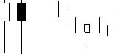
For reference, the Hammer (white or black candlestick). It is characterized by its body being located in the upper part of the bar, the upper shadow is very short or missing, the lower shadow is twice as long as the body. The appearance of such a candlestick at downtrend is the signal of the final period of bear domination in the market.
At appearance of such a candlestick we should expect the price growth. Therefore, to give the quantitative estimate to the verity of such a suggestion we collect the following information:
- the maximum and minimum price during the following Z-bars;
- probable loss L at recorded TakeProfit N of the points, for finding the optimal StopLoss;
- probable profit N at recorded StopLoss of the points, for finding the optimal TakeProfit.
The Results of Statistic Analysis
The sampling was made among currency pairs GBPUSD, EURUSD, GBPJPY for H1 and M15.
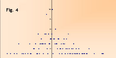
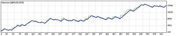
Fig. 4 shows the amount of available extremum price distributions on the following 10 bars after appearance of "the hammer" in GBPUSD.
As we can see, there is a slight shift to the positive side, but, unfortunately, not significant enough to speak safely about the priority to buy after appearance of "the hammer"!
The results of the second and the third steps of the analysis look more optimistically. After all we managed to find the best ratio between the TakeProfit and the StopLoss. After appearance of "the hammer" there was a search for the minimum and the maximum value of the candlestick. As "the hammer" has a connotation of opening the position for buying, the priority was to find the minimum price (the loss) and then the maximum. The full code of the script !Bar2Csv.mq4 you can find at the bottom of the article.
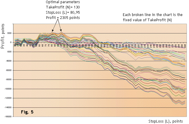
The main result which is shown in Fig. 5 is the fact that the market response to appearance of such a candlestick in H1 diagram is obviously weak. And the downtrend, in which "the hammer" appears, keeps its initial movement.
Now, as we have found out the optimal parameters of exit, we can write a primitive Expert Advisor and check the obtained optimization in tester.
The obtained profit has evidently turned out to exceed the predicted one by 700 points. It is connected with our choice of probable loss determination as priority. Testing revealed some part of loss positions had become positive.
For 15 minutes period the outlook of the StopLoss/TakeProfit relation remained the same. The only thing is, the number of such "hammers" found is 2,5 times as big, the optimal parameters being TakeProfit=150, StopLoss=65, the predicted profit=2305 points.
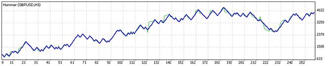
This is the work of EA for М15. As we can see the profit also exceeds the predicted profit.
For other currency pairs "the hammer" didn't prove to be "the hammer of luck". For EURUSD (H1) there was no profitable passes at all. For GBPJPY "the hammer" signals were positive only after 2006 (having been analyzed since 2004). However, in general the currency pair GBPJPY gave a larger profit than GBPUSD afterwards.
The Main Step of Your Comprehension Is Systemization
Now let's generalize our task of predicting the price performance in relation to any set of indicative values (different indicators, their combinations or the above mentioned "Japanese" reversal models).
We are not going to consider sophisticated methods of opening positions (hedges, averaging, gridding) as these are the subjects for future investigators. We'll settle upon the simple trade with fixed StopLoss and TakeProfit.
Axiom 1. For EACH bar there is a unique diagram of reachability of the maximum and the minimum price.
The green line in Fig. 6 is the maximum reached price for the bar of November, 20, 2007 (EURUSD). The red line is the minimum price. You can see these two lines grow apart at all times as new extremums are fixed.
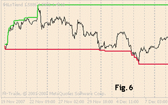
In mathematical terms there can be the following keys: P(t) is the green line, L(t) is the red line, with "t" being the number of bar depending on time.
Then for fixed TakeProfit (TP) and StopLoss (SL) we can record the condition of TakeProfit reachability tP<tL (on condition of enter for buying). This means that P(tP)=TP, L(tP)<SL (at the moment of tP the value of TakeProfit has been reached while the value of StopLoss has not yet).
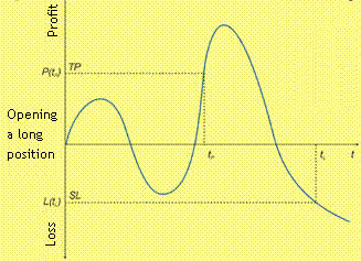
Axiom 2. Analysis of any indicative signal comes down to quantitative estimate of meeting the condition tP<tL. Or, in other words, the only and sufficient condition for successful trade is sorting out the bars in which this condition is not fulfilled.
So, we come to the main conclusion: market analysis should not be performed from indicator signals to price prediction, but from the right price to indicator readings collection.
I.e., one doesn't have to pore into the monitor to understand what curves of indicator are signals for buying or selling. The other way round, just check the indicator for stability of its readings and find out how often enter on a certain reading leads to a positive result.
Suppose, we have recorded TakeProfit (TP) and StopLoss (SL). It means that we have values tP and tL for each bar i. We choose only those bars, in which the condition tP<tL is fulfilled and create the first array М1. This array stays CONSTANT for each currency pair independent on indicators considered. It is the CONSTANT of the currency pair.
Next we define the second array of bars M2, at which we enter by indicator signals. Now, as we find common bars from arrays M1 and M2 we can estimate the result of trade for any set of indicators. Note: in principle, this operation can be used for such trade methods as martingale or averaging.
As a "bonus" to the article we present an expert indicator for a brief test in the history (of closed bars) of your signal system with TakeProfit (TP) and StopLoss (SL). The action is very simple:
Going through array М2 and counting profitable and lossmaking bars from array М1. "IndoExpert" in the diagram shows the bars at which enter was profitable and at which it was lossmaking and indicates the profit or loss obtained in the comment. The code abounds in comments, so even a beginner in MQL will easily take in it. Thanks to this indicator any beginner will probably leave all ideas to ask somebody "to code this overprofitable idea" and finds everything out himself. Let's take the articles !IndEx.mq4.
Revise once again and touch the spot of the axioms and the main conclusion.
Experience Is the Fruit of Trading Mistakes
In practice array М2 will not fully cover all successful enters of M1, moreover, it will cover lots of lossmaking ones. Therefore, if we don't want to lose desirable points, we'll have to review the applied indicator interpretation and expand/constrict its signals.
But what is to be done if the required signals are not definable at visual analysis? In this case we should collect and classify all the readings of the indicator according to all elements of M1. (We don't feel like parallelling with neural networks, but something similar takes place with them. They also collect and analyze statistics, adjusting the weights for better results. That's why we think statistic analysis is a fair alternative). The amount of indicator readings should be eneuch so it is desirable that all experiments should be carried out in diagrams with a great number of history bars (not less than 100 000).
Manipulating parameters of indicator estimation (at fixed TP and SL) we'll have N-dimentional space of deposit change diagram (with N being the number of parameters of all indicators signals).
E.g., variation parameters in "the hammer" are not only the correlation between the graphic characteristics of the bar - the shadow and the body - coefficient of relation of the upper shadow to the body and the lower shadow to the body of the candlestick. "The hammer" is inherently situated in the bear trend which means that at least two previous bars are required for its identification. As you remember, in the first example we locked the correlations between the shadows and the body and defined the trend as the angle of slope MA5. Consequently we obtained "a point" in the diagram. But to see the whole range of price prediction we should give a free hand to these correlations. And perhaps we'll achieve a perfect system stability and a steady profit with a high degree of probability.
We decided to make the experiment with MAs, which are widely known as test material (moving average - MA). The lay-out of the investination is as follows:
1. For each bar i we settle a fan consisting of N moving averages.
2. Going through the history from beginning to the bar investigated we find identical fans and save their bars' numbers.
3. Going through TP and SL in a certain diapason we count the number of profitable/loss-making selected bars. Calculate the total of profit/loss obtained at enters.
4. At positive calculation of the total we record the found fan configuration as such that gives, probably, a positive result of entering the market. And we don't fail to estimate the result of enter at the investigated bar i.
5. Then we can use the chart obtained in different kinds of research.
Those who are interested in the code itself can see it at the foot of the article OptimMA.mq4. Here you can find a detailed report of investigation performed.
1. The table of obtained data investigated further, appeared as follows:
- Bar - the number of the bar analyzed
- Time - the time of the bar analyzed
- Fans - how many identical fans have been found Вееров
- TP – the value of TakeProfit in points
- nTP – the number of TakeProfits, picked out of all identical fans found
- SL – the value of StopLoss in points
- nSL – the number of StopLosses, picked out of all identical fans found
- Profit - the total of all profits and losses of identical fans
- Expected payoff - relation nTP / (nTP+nSL)
- Profitable - whether the bar investigated is profitable while being used at entering the market with TP and SL
- Bar profit – the profit/loss obtained on the bar under investigation in consequence of entering the market with TP and SL on this bar.
2. Sample Limitation.
We thought it reasonable to sort out at the first stage the bars that do not meet some requirements.
- - Fans>10. the situation is that there are bars whose fans are practically solitary and are found in the chart only a few times (there are even such that don't recur at all). Though profit can be obtained at them, we decided not to enter at them because of lack of historical data
- - Expected payoff>80%. This is to result in increase of general profitability of enters. In further analysis it was found out that 100% expected payoff (when there are no loss-making enters during the history) is also undesirable as "profit" parameter in this situation is mainly negative
- - Profit>0.
3. Analysis.
The chart was analyzed by the following diagrams:
а) dependence of Bar Profit on nTP in section "Profit"
b) dependence of Bar Profit on nSL in section "Profit"
c) dependence of Bar Profit on Expectation in section "Profit"
All diagrams have variants according to total profit obtained and the number of bars. Normalized diagrams were also built for them.
4. Report
Diagram M5 has been analyzed for GBPUSD for 125 000 bars of history (434 days).
Range TP and SL
20..120 points
The number of moving averages in the fan
40
The fan step
3 periods
The number of unique bars found that fulfil the conditions
1153
The number of suitable conditions found
48259
Profitable trades
991
Loss-making trades
391
Expected payoff
71.71%
Loss obtained
1 172 705 points
Profit obtained
1 571 420 points
Total profit
398715
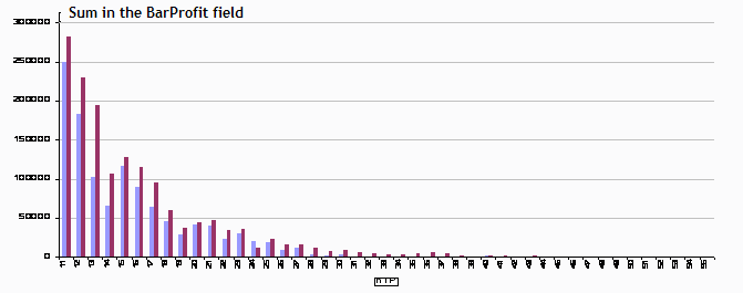
Diagram 1. Dependence of total profit (red)/loss (blue) on nTP.
Diagram 2. Total profit and loss relation depending on nTP. Values<1 mean profit. The diagram shows that for nTP=24, 42, 44 loss exceeds profit. For the rest cases it stayed about 0.6.
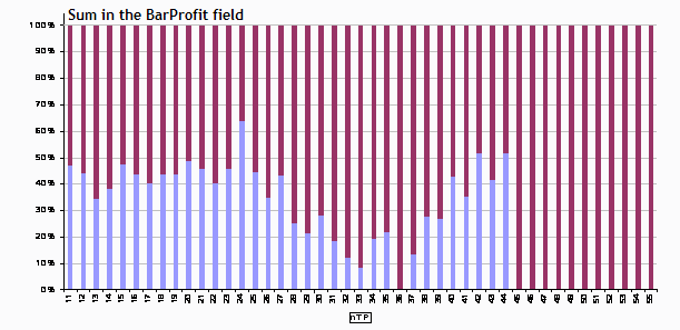
Diagram 3. Total profit normalization. The value of 50% means that profit (red) is equal loss (blue).
The other dependences which you can see in chart GBPUSD_5_fan.xls are not less interesting.
As it has been mentioned, this is just one of the countless opportunities of statistic analysis, so don't hesitate to venture. We wish you success and great profit.
Attention! We highly recommend you to familiarize yourself with the calculations principle before you transfer a script or an indicator to the chart. Due to processing of great amounts of data there can be a few seconds' stop in terminal's work.
P. S.
If you wish to share your best practice and/or give your notes, you'd better create a thread in forum.